What Is the Best Way to Practice Z Lettering for Clean, Stylish Results?
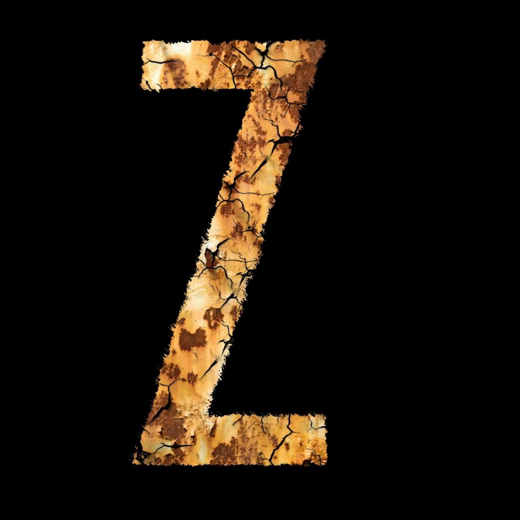
z lettering can look simple at first glance, then suddenly turn tricky the moment your pen hits the page. The letter has sharp corners, a strong diagonal, and just enough personality to show every shaky stroke. If you enjoy paper crafts, journaling, cards, labels, or classroom boards, this guide will help you build a cleaner Z without making the process feel stiff. For more ideas across styles and alphabets, you can also browse the lettering section.
A good Z is not only about decoration. It is about balance. The top stroke, diagonal stroke, and bottom stroke need to work like a tiny structure. Once that structure feels right, you can add loops, shadows, brush contrast, and flourishes. A small note from real craft tables: the letter Z is not common in many everyday words, so people often practice it less. That is exactly why it stands out when it appears on a name tag, month header, party sign, or handmade card.
Why Does Z Lettering Look So Hard at First?
The Z has fewer strokes than many letters, but it gives you less room to hide. A rounded O can forgive a small wobble. A decorative S can turn a mistake into a swirl. A Z, however, depends on angles and spacing, so tiny errors become visible fast. That sounds annoying, but it is also useful. When you practice Z well, your line control improves for K, X, N, and other angular letters too.
Sharp Angles Need Clear Control
The top and bottom strokes of a capital Z should feel related. If the top line is long and flat, the bottom line usually needs a similar weight or a planned contrast. If the bottom line suddenly flares out with no reason, the letter can look like it is falling forward. Start by drawing a plain Z with a pencil. Keep the corners clear, then ink over it slowly. Clean corners do more for style than ten extra curls.
Diagonal Strokes Show Wobble Fast
The diagonal is the backbone of the letter. Pulling a diagonal line across the page can feel less natural than a vertical downstroke, especially with a brush pen. Rotate the paper until your hand can move comfortably. Right-handed writers often tilt the sheet slightly left; left-handed writers may need a different angle. The goal is not a perfect rulebook angle. The goal is a line your hand can repeat.
Style Choices Change the Whole Mood
A block Z feels bold and sporty. A script Z feels softer. A looped Z can look lively, almost like it belongs on a gift tag or bakery label. Lettering.org’s public Z guide notes that a looped descender is often used in hand and brush lettering because it looks less plain than a school-style Z and helps continuous text feel more even. That design idea is easy to test: write “Zoe,” “Zara,” or “Jazz” three times, then compare a simple Z with a looped one. (lettering.org)
Which Z Lettering Style Should You Try First?
Jumping into the fanciest Z first can be tempting. The better route is to try three basic families, then pick the one that fits your project. A party banner may need a heavy block Z. A wedding envelope may call for a script Z. A bullet journal header might look best with a small brush Z and a tiny shadow. Style should serve the page, not fight it.
Simple Block Z for Layout Practice
A block Z is the best starting point because it teaches proportion. Draw two horizontal bars, then connect them with a diagonal bar. Keep the inner space open enough so the letter does not become a dark blob. For a cleaner look, use a ruler only for the pencil sketch, not for every final line. Slight hand-drawn edges often look warmer on stationery than machine-perfect shapes.
Script Z With a Soft Loop
A script Z works well when you want movement. Begin with a small entry stroke, curve into the top, sweep down through the diagonal, and let the lower stroke finish with a loop or tail. The loop should not swallow the letter. If the loop is larger than the main body, the Z may start reading as another letter. Keep the loop light at first, then enlarge it only when the core shape still reads clearly.
Brush Z With Thick Downstrokes
Brush lettering adds contrast through pressure. Press harder on downstrokes and use lighter pressure on upstrokes. For Z lettering, the diagonal often carries the strongest weight. Practice with slow pressure changes instead of speed. A flexible brush tip reacts to tiny hand movements, so cheap copy paper can fray the tip and make the stroke look fuzzy. It is a bit frustrating, yes, but the paper really does matter.
What Supplies Make Z Lettering Easier?
You do not need a drawer full of pens to make a good Z. In fact, too many tools can slow progress because every pen behaves differently. A small, steady setup helps you repeat the same motion and spot what needs fixing. Public spending data also points to a practical habit: the U.S. Bureau of Labor Statistics reported that average annual consumer expenditures rose 5.9% in 2023, while education spending rose 24.0% and entertainment spending rose 5.1%. The craft conclusion is simple: buy fewer supplies, but choose ones that help your practice. (bls.gov)
Smooth Paper for Cleaner Edges
Smooth paper keeps ink edges tidy and protects brush tips. Marker paper, smooth notebook paper, or practice pads made for lettering are easier for beginners than rough sketch paper. If you use watercolor paper for finished cards, test the pen first. Some felt tips snag on toothy paper, and the Z diagonal can look scratchy before you even finish the stroke.
Two Pens Before a Full Set
A simple fineliner and one brush pen are enough for early practice. Use the fineliner for skeleton letters, block outlines, faux calligraphy, and shadows. Use the brush pen for pressure practice. Black ink is better than a rainbow pack at the start because it shows shape, spacing, and contrast without distraction. Color comes later, and honestly, it is more fun when the form already works.
Pencil Guidelines That Still Matter
Guidelines are not only for school handwriting. Draw a baseline, x-height line, cap-height line, and slant line. For a capital Z, the cap-height and baseline keep the letter from drifting. For lowercase script z, the x-height and descender space matter more. Keep guide marks light so they erase cleanly. Heavy pencil lines can leave dents, especially on soft card stock.
How Can You Draw a Better Capital Z Step by Step?
A strong capital Z starts as a simple skeleton. Decoration comes after the skeleton can stand on its own. This order saves paper and time because you do not need to rescue a weak shape with extra swirls. Use the same three-step routine for block, script, and brush styles.
Start With a Light Skeleton
Write a plain Z in pencil. Look at three things before inking: the top length, the diagonal angle, and the bottom length. The bottom can be slightly longer if you want a stable base, but avoid a huge difference unless it is part of the style. For practice, draw five Z shapes in a row and circle the one with the best balance. That small review builds taste faster than filling a full page without looking.
Build Weight Only on Downstrokes
For faux calligraphy, draw the basic Z first, then thicken the parts that would be downstrokes if written with a brush. Fill those spaces evenly. This method works well for cards because it gives a brush-lettered look with a normal pen. For a brush pen, let pressure create the weight instead of drawing it later. Move slowly through the diagonal. The slower pace may feel dramatic, but the result is usually cleaner. See also: Gift Guide.
Add Flourishes After the Letter Works
Flourishes should point back to the letter, not distract from it. Try a small top entry curl, a lower exit tail, or a loop under the baseline. Keep one flourish as the main feature. A Z with a top curl, bottom loop, shadow, dots, leaves, and sparkle marks can become busy fast. Pick two accents at most for small stationery pieces, such as place cards or pantry labels.
- Practice 10 plain Z shapes before adding decoration.
- Test one looped Z, one block Z, and one brush Z on the same paper.
- Leave more white space than you think you need around the diagonal.
How Do You Use Z Lettering in Real Projects?
Lettering practice becomes more useful when you connect it to real items. A Z may appear in names, product titles, classroom themes, alphabet worksheets, sports slogans, holiday words, and journal headers. Visual sharing matters too. Pew Research Center’s 2025 Social Media Fact Sheet, based on a survey of 5,022 U.S. adults from February 5 to June 18, 2025, reported that 84% of U.S. adults said they ever use YouTube, 50% use Instagram, and 37% use Pinterest. For lettering creators, that supports a clear takeaway: clean, easy-to-see letter forms photograph better and teach better on visual platforms. (pewresearch.org)
Cards, Labels, and Classroom Boards
Names are the most natural use for Z lettering. Zoe, Zach, Zara, Zane, and Liz all give you a reason to make the Z feel special. On cards and labels, keep the rest of the word simpler if the Z has a loop or shadow. For classroom boards, use a thick block Z so students can see the form from a few steps away. Pretty is good, but readable wins.
Posters, Journals, and Study Notes
In journals, Z can anchor words like “Zen,” “Zone,” “Zero,” or “A to Z.” For study notes, use a block Z with a light gray shadow. It adds style without making the page hard to scan. A small trick: put the shadow on the same side for every letter in the header. Random shadow direction is one of those tiny things that makes a page feel messy, even when the letters are cute.
Product Tags and Small Brand Details
For handmade goods, a strong Z can become a nice brand detail on tags, stickers, and thank-you cards. Use a repeatable version. If a Z takes two minutes and three tries every time, it may not be practical for a stack of 100 tags. A simple script Z with one lower loop often works better than a complex flourish that changes each time.
What Mistakes Should You Fix Before They Become Habits?
Bad lettering habits usually start small. The good news is that Z mistakes are easy to see once you know what to check. Before starting a finished piece, compare your draft with a short checklist. It takes less than a minute and can save a nice sheet of paper.
Crowded Zigzags and Uneven Spacing
The diagonal needs breathing room. If the inner space closes too much, the Z looks cramped. If the top and bottom bars extend too far, the letter can overpower nearby letters. When writing a word, check the space before and after Z. A common issue in “Zoe” is placing the o too close to the diagonal, which makes the word feel squeezed on the left side.
Heavy Decoration Before Basic Form
Decoration cannot fix a weak Z. It usually makes the weakness louder. If the letter looks off, remove the extras and return to the skeleton. Check the angle, width, and baseline. Then add one detail back. This sounds boring, but it is how clean lettering gets made. The fancy version grows from the plain version.
Wrong Paper for Wet Ink
Bleed, feathering, and slow drying can ruin Z lettering, especially where strokes cross or thicken. Test ink on a corner or scrap from the same paper. If the paper bleeds, switch pens or use the sheet for pencil-only layout work. For glossy labels, give ink more drying time before stacking. One smudge across a perfect Z is a very specific kind of sadness.
- Check whether the Z still reads clearly from arm’s length.
- Use fewer flourishes on small surfaces.
- Match the Z style with the rest of the word.
- Test ink before using expensive card stock.
FAQ
Q1: What Is the Easiest Z Lettering Style for Beginners? A: A simple block Z is usually easiest because it teaches width, angle, and spacing without pressure changes. Once the block shape feels steady, try script or brush styles.
Q2: Should a Script Z Always Have a Loop? A: No. A loop can make the letter feel more decorative, but it is optional. Use it when the word has enough space and the loop does not hurt readability.
Q3: What Pen Is Best for Z Lettering Practice? A: Start with a black fineliner and one medium brush pen. The fineliner helps with shape and faux calligraphy, while the brush pen teaches pressure and stroke contrast.
Q4: How Many Times Should You Practice the Letter Z? A: Practice in short sets. Ten careful Z shapes with review are more useful than a full page done too fast. Circle the best one and copy what worked.
Q5: Can Z Lettering Be Used for Professional-Looking Labels? A: Yes. Keep the shape readable, limit decoration, and use the same style across the full label set. Consistency makes even a simple Z look polished.