Bold Letters vs Fancy Letters: Which Is Easier to Read?
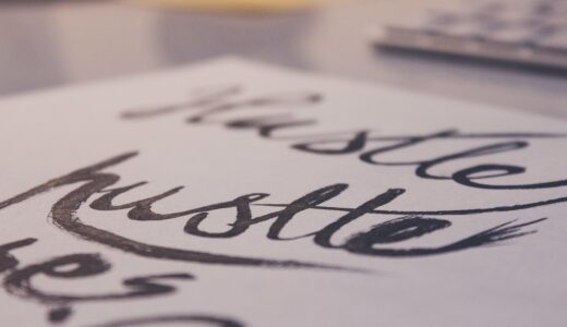
When it comes to reading text, typography plays a crucial role and is decided by two fundamental aspects: readability and visual comfort. Between bold letters and fancy decorative fonts there are great differences. Our conclusion is clear: Bold letters are better than fancy fonts. Also in the digital age, where fast reading is paramount, bold letters are more legible and better for comprehension. Decorative fonts are not only less readable than bold letters, but also less comfortable to read, due to weird strokes and uneven white space between the individual letters. In this article we will have a closer look on the cognitive, design and practical aspects that lead to our conclusion.
Why Does Font Style Affect Readability?
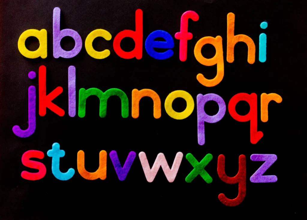
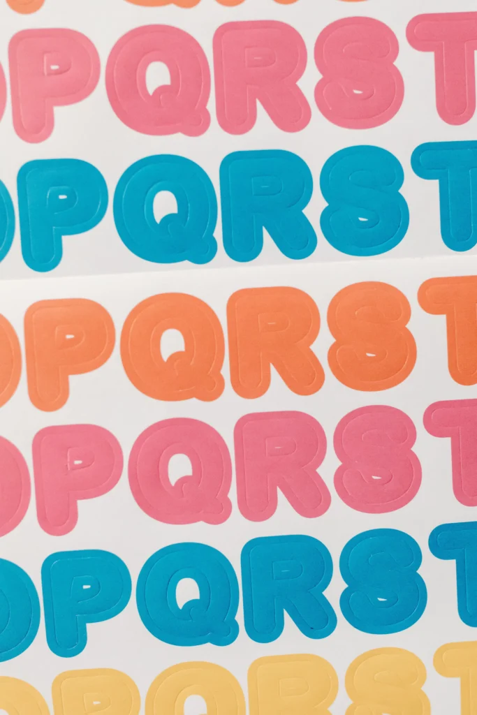
The font style in your content affects the speed of identifying characters, in order to read words. Fonts that deviate much from standard letter shapes negatively impact reading speed especially for thick content. This is one of the reasons most typographers agree simple typography is more clear and readable then decorative typography.
Cognitive Load and Visual Processing
The brain interprets written text by recognizing character patterns rather than individual characters. The use of bold characters, such as bold letters, helps to sustain structural uniformity, which in turn helps to sustain reading. In contrast, “fancy fonts,” or those that have irregular curves or excessive flourishes, can actually hurt recognition of individual characters by forcing the reader to recognize each character individually. In documents and web interfaces designed for professional use, this could even decrease reading comprehension.
Eye Movement and Fixation Patterns
A visual ergonomics study of reading found that in simple or bold fonts, such as Helvetica, Cooper Black or Studio Type, the number of fixations per line is reduced. In each fixation, too, the time is reduced because the eye can better predict the shape of the word in these types. Letterforms with many details such as serifs or script characters increase the time spent fixating a word because the reader is focusing on the letterforms and is subconsciously adjusting to read the detail. As the reader continues to read long passages of such text, he or she will eventually begin to experience fatigue while reading online.
Contrast and Perceived Sharpness
Bold letters have high contrast on light backgrounds. They make the sharpness of a letter stand out and are especially useful for displays with low resolution such as mobile phones. Fancy fonts typically have thin lines between characters that get blurred quickly. On low-resolution displays, the letters of such a font even become less readable.
How Do Bold Letters Improve Legibility in Digital Media?
For measurements of user experience such as dwell time and engagement rate in digital communication, legibility is a crucial aspect. As a rule, in web communication, designers favor bold weights for emphasis and for structural clarity – even on small screens.
Screen Resolution and Pixel Density
Pixel density of modern screens can vary greatly, ranging from low-end computer monitors to high-density smartphone screens. Bold fonts remain readable because of their thick lines which do not get ruined by the pixelation of a screen. On the other hand, so-called “fancy” fonts with fine details of serifs or ornaments can look highly irregular at small font sizes.
Accessibility Considerations
Most accessibility guidelines recommend the use of high-contrast typography to help people with visual impairments as well as those with learning difficulties such as dyslexia. Using bold fonts can help to increase the readability of text and to improve the figure-ground of text over background. Using fancy scripts can however breach accessibility guidelines due to the variable width of the lines and the excessive joining of letters together to form ligatures. This can cause problems for people who use assistive technology such as screen readers.
Scannability in Web Layouts
Online readers don’t read pages of text online from start to finish. They tend to read from the top down, and jump around to headlines and to words of interest to them. Fancy lettering does not facilitate this reading behavior in the same way that using bold does for example. For one, fancy lettering does not create effective visual anchors on a page, as opposed to using bold which indicates importance and can serve as a roadmap for readers. The primary function of fancy lettering is for aesthetic purposes, but it can interfere with semantic hierarchy by detracting from cues such as increased font weight or size differentiation that indicate importance to readers.
Are Fancy Letters Ever Suitable for Professional Use?
While fancy fonts have their place in design, it’s generally best to avoid them in design systems used for continuous reading. However, there are many cases in which to use them.
Branding and Emotional Appeal
Luxury brands can use fancy type to promote their brand’s high-end persona, for example. By using an elegant, handwritten script, such a brand can make its customers feel that they are buying an exclusive product. Some creative agencies use such ‘high-end’ fonts as well to give off a feel of originality, as they add an emotional touch to a simple message and increase the reading experience of such. In the end, fancy typeface does add a special touch of personality to a message that clearly conveys to readers that the message is reading was meant to be read, and was reading experience that is not very efficient if one were to just read the plain text version of the message.
Short Headlines and Decorative Elements
Used in the right place such as in a headline or logo, fancy letters are attention grabbers without being overwhelming to read. By pairing a very ornate display font with a clean body font, it adds a very aesthetic touch to the material, yet is still readable whether it’s a brochure or a landing page.
Cultural Contexts and Artistic Expression
Typography also can be highly symbolic, referring to heritage or to artistic traditions appropriate to certain contexts such as event invitations or to a particular editorial spread. While in these instances the very fancy lettering is used as a design motif or element rather than to supply information, it is sometimes used to supply information as well as to be of symbolic and even of emotional value.
What Role Does Typography Play in User Experience Design?
Typography sits at the intersection of aesthetics and usability within UX design frameworks. Every typographic choice—font family, weight, spacing—affects how users interact with digital interfaces.
Hierarchy Through Weight Variation
Using bold weights to differentiate titles from subtitles and body copy allows designers to provide appropriate hierarchies without relying on color. This makes for a design that is easy to follow intuitively by keeping the organization of the visual elements separate through principles such as visual grouping as described by Gestalt psychology.
Consistency Across Platforms
A consistent typographic system reinforces familiarity across brand touchpoints—from websites to mobile apps—enhancing trustworthiness perceptions among users accustomed to cohesive experiences.
Readability Metrics and Testing
By collecting data on average fixation duration or via scroll depth analytics, UX researchers are able to measure readability. These numbers consistently show higher retention for clearly readable text bolded to highlight the main content of a section compared to purely decorative text.
How Do Designers Balance Aesthetics With Functionality?
Beautiful typography and clear typography are two contradictory goals for the designer who wants to express himself through type, but at times communication must be the designer’s primary concern and beautiful typography subordinated to ensure the text is read efficiently. At such times, the designer of means will prioritize the latter over the former and produce truly expert typography.
Functional Minimalism
Even minimalism, that design philosophy which seeks to remove all elements which are deemed non essential in order to enhance the message delivery, advocates the use of strong simple communication which is found in all corporate identity designs all over the world and is encapsulated by the use of bold sans serif typefaces.
Contextual Adaptation
No single font suits every scenario; designers adapt styles based on medium constraints such as print resolution or screen brightness levels. For instance, a fashion magazine might justify ornate mastheads but revert to clean sans-serif text for articles requiring sustained reading comfort.
Data-Driven Adjustments
A/B testing allows teams to quantify typographic impact on conversion rates or session durations. Results consistently indicate superior performance from layouts emphasizing bold readability over purely decorative flair—a finding echoed across multiple UX case studies published by industry leaders like Nielsen Norman Group.
What Are Common Misconceptions About Font Weight and Style?
Just because a font is heavier doesn’t mean it’s going to be more visible. When too much of the text on the page is made bold, it can quickly become chaotic and unreadable if not developed with proper hierarchy.
Overemphasis Dilutes Impact
By making every element bold, nothing stands out in weight saturated designs. However, using strategic restraint instead, can still create sufficient contrast between main messages and ancillary information and enable appropriate organization into a hierarchy of visual elements.
Decorative Fonts Are Not Always Illegible
Just because a font is fancy doesn’t mean it has to hinder reading. Some of the modern script fonts have geometric construction that allows for moderate reading at larger point sizes as long as it is used thoughtfully with other more neutral fonts.
Font Choice Alone Doesn’t Guarantee Accessibility
When referring to true accessibility, we have to consider a wide array of design factors, including the space between letters and words (kerning) and between lines of text (leading), as well as the color contrast. So, while choosing a font is a crucial part of the process, it is by no means the only aspect of typography that we need to consider when approaching it from within the scope of inclusive design.
FAQ
Q1: Why are bold letters easier to read online? A: The letters are thicker therefore are easier to read on line because they remain clear at different resolutions and light conditions and don’t cause eye strain when reading for long periods of time.
Q2: Can fancy fonts ever be accessible? A: Yes. Some highly decorated fonts will also meet accessibility criteria if all aspects of the font maintain consistent stroke width and adequate space between letters and between words. However, they are not as reliable for general use as straightforward fonts, designed for clear reading.
Q3: Do bold fonts consume more space? A: Slightly yes; increased stroke width of bold fonts makes them larger, but so much more visible that only minimal adjustments of the surrounding layout are required.
Q4: Should all headings be in bold type? No. Uniform weight does not equal hierarchical variation. In most cases, the latter is far more important to us, than the former. Mixing regular weight headings with semi-bold can make for a much more balanced look than a single bold weight.
Q5: Fancy lettering is favored by the following industries. A: Luxury goods, fashion publications and hotels use very decorative scripts to convey high-end quality and then plain text to maintain clarity.