How Can Lettering Design Improve Your Handwriting and Artwork?
Lettering design is more than just decorative lettering, it is art & communication. Practicing lettering helps artists & writers improve their control of their lines, space & rhythm. It can make handwriting more clear and also more artistic. Working with lettering can be very discipline-oriented and therefore very peaceful & helping to improve focus and confidence. The result is smooth handwriting and visually balanced artwork.
What Is Lettering Design?
The design of lettering as opposed to writing letters, lettering design combines the principles of good typography with creative artistic composition in order to create single words or short phrases that can be expressive, capturing a mood, style or tone.
Definition and Core Concept
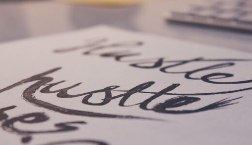
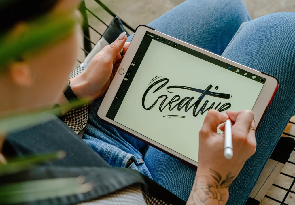
Lettering design is the art of creating individual letters, each designed and worked on by hand or digitally, to be used in specific projects. Lettering artists can work with lettering the same way as with painting or drawing, using a variety of tools such as brush pens and markers or working digitally using tools such as Procreate.
Distinction from Calligraphy and Typography
All three of these techniques use letterforms, but they serve different purposes. Calligraphy uses continuous strokes in a flowing motion and is generally used to write individual words by hand, whereas typography is concerned with making typefaces that can be used to print large amounts of text, whereas lettering is often illustrative and each word is hand drawn rather as text would be.
Common Styles in Modern Lettering
There are many forms of lettering and each can be used for their own individual reasons, including Brush for dynamic flow, Serif or Sans-Serif block letters for structure and Script for elegance. A lot of designers also like to mix up the forms in order to express a certain tone, i.e. for a playful poster you can use lots of round letters and for a brand you can use lots of clean geometric letters.
How Does Practicing Lettering Design Enhance Handwriting?
Using lettering to train fine motor skills and spatial awareness to improve handwriting. Lettering gives the user the opportunity to develop consistency within a letter in terms of size, angle and pressure. And to be able to transfer this to other letters.
Improved Muscle Memory
Lettering tasks like writing letters of a script help to train the hand muscles needed for good, smooth lines with a pen. Even doing simple straight lines or familiar curves can be very helpful for building up ‘program’ in one’s hand ready to be transferred to everyday writing.
Better Stroke Control
For this type of work stroke direction and weight are important factors, and being more aware of how each mark can affect legibility takes away from typical features of handwriting such as shaky lines and uneven spacing.
Increased Consistency in Form
Focusing on the symmetry and proportion of the letters that you are writing helps you to develop steady lettering habits even when you are writing very fast. As a result, you will have very clean notes and very clean signatures that are full of personality but are still very readable.
Why Is Lettering Design Valuable for Artists?
Lettering design offers new possibilities for the visual artist, extending the scope for creative expression beyond image. By using words as composition elements, lettering provides new ways to tell a story within a work of art.
Adds Expressive Dimension to Visual Art
Tone can be conveyed through letterforms in the same way as color or texture. A bold angular script could represent strength, for example, whilst a soft cursive could represent intimacy. When used in conjunction with an illustration or painting the lettering can heighten a sense of emotion.
Strengthens Composition Skills
Learning how to balance words within a given space by a designer will enable them to make more informed design choices when designing a poster or packaging.
Expands Creative Portfolio
Mastery of lettering adds another string to an artist’s bow, as well as offering the possibility of new work. Many artists currently use custom lettering in their work for branding and for street art/murals, and are looking for work in this area across sectors including advertising and publishing.
What Tools Are Essential for Effective Lettering Practice?
Using the right equipment during practice improves the quality of your training in terms of comfort and precision. As a beginner, it is natural to start with basic items and then progress to more specialized ones as you become more skilled at playing tennis.
Writing Instruments
Brush pens are probably the most versatile. As well as being able to draw fine lines with them, you can also vary the width of the line as you draw, depending on how hard you press the pen on the paper. Fineliners are very good for detailed outlines and drawing fine lines, as they are very consistent and do not waver much. Dip pens are similar to traditional brush pens in that they allow you to control the amount of ink that is released from the pen to draw lines, which is particularly good for calligraphic lettering.
Paper Quality
A smooth heavyweight paper is better to draw on than rough, as it won’t bleed, and allow for smooth consistent lines. Some notebooks are printed with a grid or of dots. These can be useful for drawing up complex scenes as they allow you to keep straight with out having to constantly go to the computer to realign your scene.
Digital Tools
Using graphic tablets and software such as Adobe Illustrator enables the creation of scalable vector graphics ideal for commercial printing. This also allows for easy testing of colorways and texture overlays on the computer prior to printing out physical samples.
How Can Beginners Start Learning Lettering Design?
Starting small at first is a lot more efficient and fun than launching straight into a large and complex project. A structured routine for improvement ensures continuous growth and always keeps things fun!
Basic Warm-Up Drills
Drawing simple shapes of parallel lines and loops to improve coordination, before writing out entire alphabets. Instructors often recommend 10 minutes a day of letter exercises to familiarize muscles with how to form letters.
Studying Letter Structures
Study the construction of existing typefaces to help the student notice relationships of stems to bowls to counters, all fundamental elements to a readable letter. By hand sketching the letters, the student will reinforce his/her ability to recognize and create balance in letter forms.
Creating Personal Projects
Working on small projects such as a greeting card or a quote poster to practice lessons keeps the motivation high. The finished product can give feedback on how well one did with spacing and overall style as time passes.
How Does Lettering Influence Branding and Visual Identity?
In business contexts the lettering on a letterhead can function as a logo to communicate the image of a company and immediately communicate its personality on receiving a letter before even reading it.
Communicating Emotion Through Style
A rounded handwritten logo looks friendlier, whereas a sharp geometric logo looks more professional. Some companies even get their custom lettering made specifically so that the visual tone of the logo is more in line with what the target audience perceives they to be.
Enhancing Memorability
Firstly, letterforms within online fonts are generally quite generic. However, distinctive letterforms within a unique logo script can make for a very recognizable brand. Many labels of beverages are even typographic products themselves and instantly recognizable.
Building Trust Through Craftsmanship
The handcrafted nature of our lettering project suggests authenticity as the lettering has been produced with human effort behind the design. Often consumers have an subconscious perception of high quality products that have been produced with care as opposed to mass produced products and the design associated with them.
FAQ
Q1. What is the main difference between calligraphy and lettering? A. Calligraphy is written using a special pen and is made up of connected strokes written in a continuous motion. Lettering on the other hand is drawn letter by letter and is often used as illustrations.
Q2: Digital tools or old fashion pen & paper? A: Yes. Digital tools offer lots of flexibility but will not replace key physical feedback. This will aid in refining up & down pressure which is critical for effectively writing with ‘real life’ tools to best effect for improvement.
Q3: How long does it take to start to notice improvements in handwriting after having practiced lettering? A: You can start to see improvements within weeks if you practice daily for short periods of time, focusing on making controlled movements rather than trying to speed up.
Q4: Is there a specific set of fonts that a beginner should study first? A: The classic Serif and Sans-Serif fonts are a great starting point for beginners. The structure of these classic fonts is important in highlighting the proportion rules that apply in most of the modern font styles. However, as usual, these classic font styles can be explored creatively by the beginner later.
Q5: Does practicing lettering help reduce stress? A: Yes. Because lettering involves repetitive, rhythmic motions, practicing lettering can help reduce stress in a similar fashion to many forms of mindfulness practice. This is because, unlike many other activities in which one focuses on striving for some kind of perfection, in lettering one focuses on gradual progress in developing and refining an aspect of writing.