How Do You Draw a Wildstyle Graffiti Alphabet?
The Wildstyle graffiti alphabet design is one of the most complicated forms of street art. The design of a Wildstyle letter is a combination of letter, rhythm and motion and is expressed in an abstract visual language. To draw a Wildstyle graffiti alphabet, the artist needs to build up the letters with basic shapes, connect them with arrows and extend individual parts of the letters. The artist must also attempt to create readable letters while at the same time maximising the aesthetic chaos.
What Defines a Wildstyle Graffiti Alphabet?
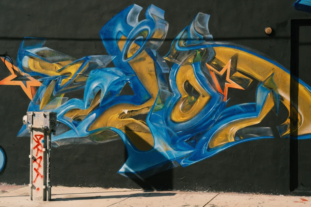
There is often recognition of a graffiti alphabet even when Wildstyle letters are overlaid so heavily that the individual characters are unreadable by those unfamiliar with the writing. Often arrows, spikes and curved lines are included and it can be seen that the whole has a flowing and symmetrical order that underpins the complex surface of the individual letters.
Complex Letter Structures
In wildstyle graffiti every letter begins with a skeleton, a simple base form of the letter using lines or boxes. From this basis out the angles are then exaggerated and the letters are connected. So there is always a basis to build from, but every letter can then be distorted in every possible way.
Interlocking Forms and Arrows
One of the primary components of wildstyle lettering are arrows that drive the viewer through the piece, following lines of movement throughout the work. The forms of wildstyle letters are also interconnected, creating one unit out of each letter as opposed to individual separate letters.
Layering and Depth
When trying to create the illusion of depth, artists use a variety of methods including overlapping strokes and 3D shading. Elements can also be highlighted or put in a drop shadow to make them stand out in front of other elements that are in the background. While depth is created by color, the artist also uses this to create a hierarchy of what is in the front and what is in the back.
How Do You Build the Foundation of a Wildstyle Piece?
Before diving into complexity, every strong wildstyle starts with solid foundations. Planning ensures that even when letters become abstracted, they remain grounded in structure.
Sketching Basic Letter Outlines
Sketch your artwork first in block or bubble letters with pencil or markers. This allows you to create the proportions and spacing that you desire. You can create your initial sketches on grid paper, or using a digital artwork software program, and then transfer your design to your walls.
Choosing Letter Flow
In analyzing flow of letters within the composition, one must also consider the transition from one letter to another. This can play a large part in creating rhythm within a wildstyle graffiti alphabet. The way the baselines of letters are angled or the way the letters are aligned can also determine how energy travels throughout the composition.
Establishing Balance
Chaotic work needs to have areas of concentrated detail and areas of space. There are many ways to achieve equilibrium by mirroring a particular shape in a work of art, or by repeating a motif such as the arrows on this piece. The artist has managed to maintain the work’s spontaneity.
What Role Does Color Play in Wildstyle Graffiti?
Colors can transform form into emotion. This selection enhances legibility and creates a new mood and more depth.
Contrasting Palettes
Using contrasting colors—such as cool blues against warm oranges—helps separate layers visually. This contrast makes complex structures easier to read from a distance.
Gradient Fills
Within each letter, Gradients create beautiful transitions between different shades and colors. As with traditional Spray paint blending techniques, these Gradients can create the illusion of light reflecting off of surfaces and also of the texture of a metal finish.
Highlighting and Shadowing
In highlighting you look for the edges where light would naturally fall and in shadowing you use that to anchor the piece to the surface it is on. And really good artists can control the opacity of their paint by how hard they are spraying it, as opposed to just using a black outline.
Why Is Letter Connection Important in Wildstyle Design?
The connection of the letters between letters of a word or words of a sentence creates coherence to what could be chaos. Connecting the letters in a meaningful way creates rhythm and avoids nonsense of wildstyle.
Structural Continuity
The extensions or arrows that make up the extension lines and arrows should function as structural elements to connect the ends of letters to the beginning of other letters. Thus, they should enable the sequence of letters to be as unbroken and uninterrupted as possible.
Visual Rhythm
Repeating rounded shapes or hard lines creates a tempo within a composition much like musical beats within a score. Some artists write their music visually.
Spatial Integration
Design connections should not overwhelm negative space but instead flow through to create adequate space within very dense design zones.
How Do Artists Add Personality to Their Wildstyle Alphabets?
Wildstyle graffiti is individual. Even two artists working with the same word or set of letters will rarely create the same piece of work.
Signature Arrows and Extensions
Artists develop their own motifs or trademarks, in the form of arrowheads, ribbon-like tails, etc. These are often recognized within the context of the urban art community of a specific artist after some time.
Custom Letter Proportions
By changing the width-to-height ratio of letters, you can change the tone of them. Tall thin letters are very aggressive while wide rounded letters are playful but energetic.
Incorporating Cultural References
Some writers embed cultural icons or even subtle symbols of local identity in their work. Thus these works link up with graffiti tradition and at the same time tell the community a story. The abstraction does not have to suffer from this.
What Tools Are Essential for Creating Wildstyle Graffiti Alphabets?
The tools we use to carry out a work on paper or on wall surfaces determine the level of precision, the texture and the scale of what we produce.
Spray Paints and Caps
Spray cans with changeable caps enable the user to select between fine lines and thick fills for detailing out the complex overlaps between letters in a wildstyle piece and for outlining.
Markers and Sketchbooks
Much finer work is undertaken by artists prior to painting very large surfaces. First ideas are developed using highly portable, alcohol-based markers in sketchbooks which artists call “blackbooks”. Those sketches form the basis of all work done subsequently, much of it outdoors.
Digital Tools
The Modern Graffiti Designer uses tablet and stylus to mock up and test designs including simulations of spray textures before finalizing to physical output. This allows for fast exploration of color options and finishing without wasting materials.
FAQ
Q1. How is wildstyle graffiti different from bubble lettering? A. Bubble lettering is read easily with soft rounded form and space between letters. Wildstyle graffiti are formed with interlocking lines and extensions that obscure the letters and create greater depth of expression.
Q2: How long does it take to master drawing a wildstyle alphabet? A: Years. It encompasses technical skills for drafting as well as intuition to know how letters will fit within space, and that’s developed by long consistent practice using many mediums.
Q3: Are there rules for choosing colors in wildstyle graffiti? A: No, there are no rules. Contrast between colors is key to good wildstyle and more experienced writers try to use contrast between layers to ensure that they can be read well even in poor lighting when they have been sprayed on the street.
Q4. Can digital painting tools attempt to mimic spray paint work with an adequate representation of the typical gradients found in the work, or are there inherent limitations to expressing such work with digital tools as opposed to aerosol and other non-digital paint mediums? There are areas in which the work can accurately mimic spray paint and other medium’s work but it will most certainly lack the unique tactile quality of how the paint actually moves due to the aerosol flow. To many artists within the graffiti world this feeling or ‘look’ of the paint is key to the artwork having the authentic graffiti feel and thus forms part of the artists overall goal when creating a work of art.
Q5: Is legibility necessary in professional wildstyle work? A: No, only partial legibility is necessary. What is more important is that there is enough coherence to allow trained viewers to identify the individual letter forms within a heavily stylized letter.