Why Is Lettering Still Worth Learning for Journals, Cards, and Creative Stationery?
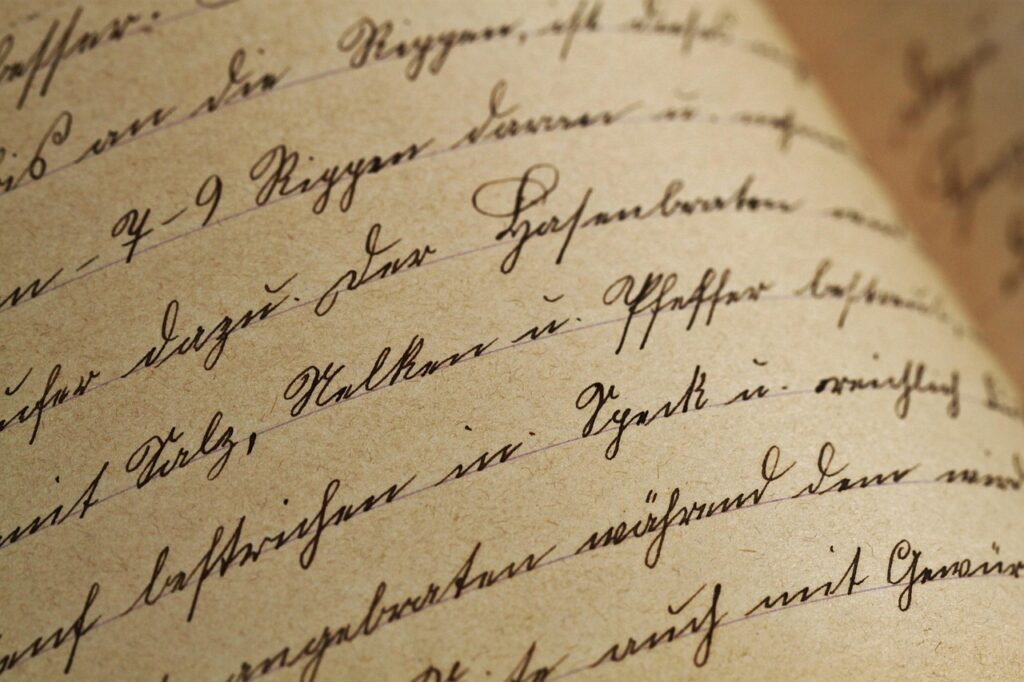
Lettering is the art of drawing letters with purpose. It is not just neat handwriting, and it is not only old-style calligraphy. You shape each letter so the words carry mood, rhythm, and personality. That is why Lettering still fits so naturally into journals, greeting cards, envelopes, school notes, party signs, and small gift packaging.
For anyone browsing Yueping stationery and sports supplies, the appeal is simple: a good pen, smooth paper, and a few steady drills can change how a page feels. Public data also backs the wider demand for writing tools. Grand View Research’s 2026 Writing Instruments Market report valued the global writing instruments market at USD 19.2 billion in 2025 and estimated USD 20.0 billion for 2026, with pens leading product revenue at 36.3 percent in 2025.
What Makes Lettering Different from Calligraphy and Plain Handwriting?
Before buying brush pens or filling a notebook with alphabets, it helps to separate three ideas that often get mixed together. Lettering, calligraphy, and handwriting can overlap, but each one has a different goal. Once that difference is clear, your practice gets less frustrating.
Lettering Draws Each Letter as a Small Shape
In lettering, you build letters like tiny designs. You may sketch a pencil skeleton first, thicken the downstrokes, clean the edges, then add shadows or color. The key is control. A word can be edited, balanced, and corrected before ink goes down. That makes lettering friendly for planners, title pages, product tags, classroom posters, and handmade cards where one phrase needs to stand out.
Calligraphy Follows Stroke Tools and Script Rules
Calligraphy is usually written with a tool that creates thick and thin strokes through pressure, angle, or nib shape. A pointed pen, broad-edge nib, or brush pen can all make beautiful calligraphic marks. The rhythm matters. You write the strokes in sequence, and the script has rules. Lettering can borrow that look, but it can also be outlined, filled, redrawn, or made playful without following a formal hand.
Handwriting Focuses on Speed and Daily Use
Handwriting is mainly about getting thoughts onto paper. Grocery lists, class notes, and quick meeting notes do not need perfect spacing. Lettering asks you to slow down. A single word like Cheers on a card may take ten minutes, and that is normal. The slower pace is part of the craft, though yes, it may test your patience on a busy Tuesday night.
Why Is Lettering Still Useful in a Digital World?
Digital tools are everywhere, yet hand-made visual details keep their charm. A lettered page feels personal because a human hand made small choices: where to stretch a loop, how wide to set the spacing, which word gets the bold stroke. That is hard to copy with a standard font.
Handwritten Style Makes Stationery Feel Personal
Stationery is often bought for a moment that matters. A birthday note, wedding envelope, teacher card, or journal cover carries more feeling when the name or headline is lettered by hand. The National Retail Federation and Prosper Insights & Analytics reported in July 2025 that K-12 shoppers planned to spend an average of USD 143.77 on school supplies, totaling USD 6.6 billion in that category. The survey covered 7,581 consumers. That number is not only about pencils and notebooks; it shows how much families still invest in tangible paper goods during one season alone.
Social Posts Need a Human Visual Hook
Lettering also works online. A phone photo of a journal quote, a hand-lettered envelope, or a small desk setup can stop the scroll because it looks tactile. DataReportal’s Digital 2026 Mid-Year Global Update reported 5.79 billion active social media user identities as of April 2026, equal to 69.9 percent of the global population. In the same report, GWI data showed that 49.0 percent of adult social media users visit platforms to keep in touch with friends and family, while 39.3 percent use them to fill spare time. Personal-looking creative content fits that behavior well.
Hand Practice Supports Memory and Focus
Lettering should not be sold as magic, but writing by hand has real research behind it. A January 2024 Frontiers in Psychology high-density EEG study recorded brain activity in 36 university students with a 256-channel sensor array. The researchers found that handwriting produced more elaborate theta and alpha connectivity patterns than typing, and they linked those patterns to memory formation and learning. For lettering, the takeaway is practical: careful hand movement can help you focus on the page, especially when you use it for headings, vocabulary cards, or study summaries.
Which Lettering Supplies Should You Start With?
A beginner does not need a drawer full of expensive tools. In fact, too many pens can slow you down because every tool behaves differently. Start with a small kit, learn how each item feels, then add specialty supplies later.
Smooth Paper That Controls Bleed
Paper matters more than many beginners expect. Rough paper can fray brush tips. Thin paper can bleed. For daily drills, choose smooth practice paper around 80 to 120 gsm. For finished cards, use heavier cardstock that handles ink without feathering. If you use markers, test one corner first. A tiny bleed on a practice sheet is fine; on a wedding envelope, not so fun.
Pens That Match Your Stroke Style
Use a small mix: one pencil, one fine liner, one small brush pen, and one broad marker. The fine liner helps with monoline lettering and clean outlines. The brush pen teaches pressure changes. The broad marker is useful for block letters, posters, and bold planner titles. Grand View Research’s 2026 report noted that students led writing instrument applications with a 57.8 percent share in 2025, which fits what stationery sellers see every season: simple, useful pens remain core products.
Simple Guides Before Fancy Tools
Guidelines beat guesswork. Use a ruler, dot-grid notebook, or printable guide sheet. Your kit can stay basic:
- Pencil and soft eraser for layout sketches
- Fine liner for outlines and monoline styles
- Small brush pen for pressure drills
- Smooth notebook or marker paper
- Ruler for margins, baselines, and centered text
When the foundation is clean, even plain black ink can look polished.
How Can You Build Better Lettering Skills Faster?
Fast progress does not come from rushing. It comes from noticing one thing at a time. If you practice ten alphabets with ten styles in one sitting, the page may look busy but your hand learns less. Keep the drill narrow and repeat it long enough to spot patterns.
Alphabet Drills With One Variable
Pick one alphabet and change only one detail. Try round letters on Monday, narrow letters on Tuesday, and wider spacing on Wednesday. Write a short word like paper, note, or gift at least twenty times. This sounds boring, and sometimes it is, but the boring part builds control. Musicians play scales for the same reason.
Spacing Practice Before Decoration
Most messy lettering is not caused by ugly letters. It is caused by poor spacing. Before adding shadows, dots, stars, or floral bits, check the gaps between letters. The space around the word matters too. On an A5 journal page, a title squeezed into the top edge feels tense. Give it a clear margin, then the whole spread looks calmer.
Real Projects That Teach Judgment
Practice sheets teach movement, but real projects teach decisions. Make a month title for your planner, label three storage boxes, design one birthday card, or letter a quote on a bookmark. Real space has limits. You learn when to shorten a phrase, when to use two lines, and when decoration should stay quiet.
Where Does Lettering Work Best for Stationery and Gifts?
Lettering works best where the reader notices the object close up. It is less about big art and more about a small moment of care. A name on an envelope, a quote inside a journal, or a label on a gift bag can make a plain item feel chosen.
Journals, Planners, and Study Notes
In journals, lettering gives structure. Use bold letters for monthly titles, small caps for habit trackers, and simple script for quotes. For study notes, use lettered headers sparingly. A clean title for Biology Terms or Match Schedule is helpful; five different styles on one page turns into noise. Keep school and work notes readable first.
Greeting Cards and Envelopes
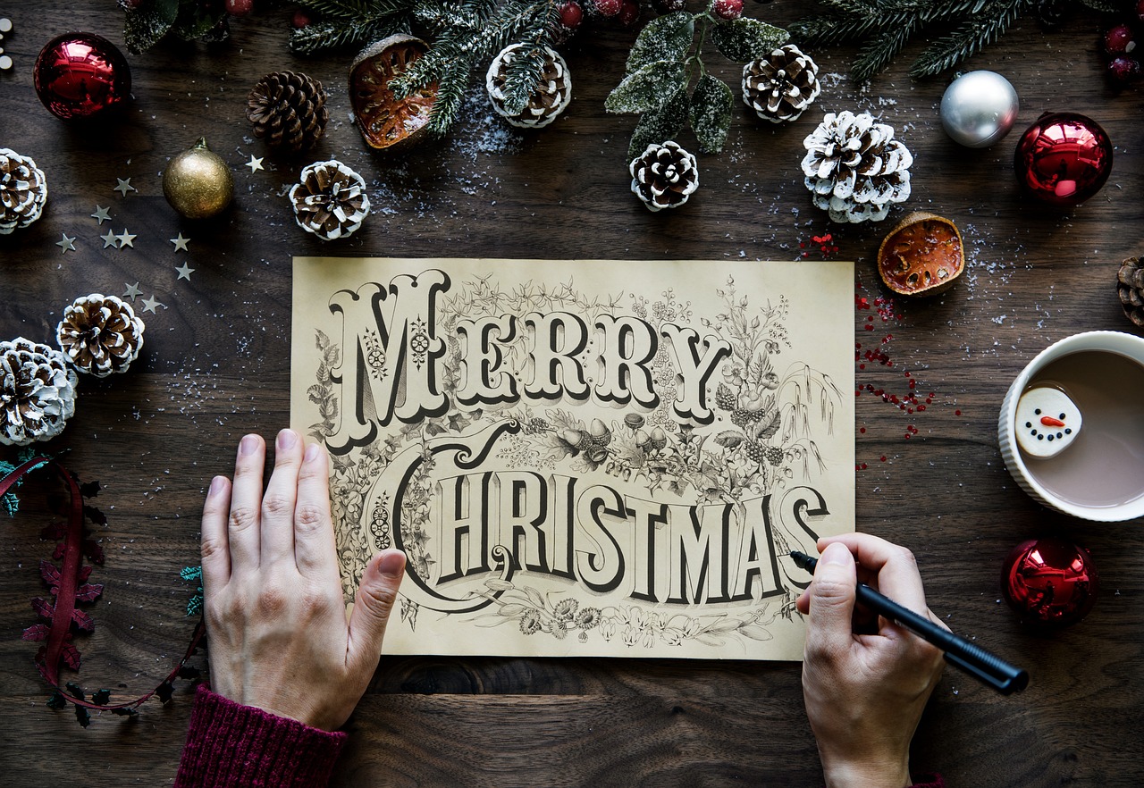
Cards are perfect for lettering because the message is short. Happy Birthday, Thank You, Best Coach, or Good Luck can be sketched, centered, and inked in less than half an hour once you have a style ready. Pinterest Predicts 2026, published in December 2025, named Pen Pals as a DIY trend tied to a letter-writing comeback, elaborate envelopes, special stationery, and stamps. Pinterest listed rising searches such as cute stamps up 105 percent, penpal letters up 35 percent, and snail mail gifts up 110 percent.
Small Business Tags and Packaging
For small shops, craft fairs, and school fundraisers, lettering can make packaging look warm without a huge budget. Think price tags, thank-you cards, table signs, or sticker mockups. Keep the brand name readable. Fancy swashes may look pretty on a desk, but if a customer cannot read the name from two feet away, the design is working against you.
What Mistakes Make Lettering Look Messy?
Every beginner makes a few predictable mistakes. That is not a problem. The trick is to fix the cause instead of blaming your hand. Most issues come from layout, tool choice, or too many ideas fighting on one small page.
Skipping the Pencil Skeleton
A pencil skeleton is the light version of your word. It sets the height, width, slant, and line breaks before ink appears. Skipping it saves two minutes and can cost the whole card. Sketch lightly, step back, then ink only when the shape feels balanced.
Mixing Too Many Styles at Once
One script word, one block word, and one small supporting style are usually enough. Too many alphabets make the page feel like a sample catalog. If you want drama, use contrast: large and small, thick and thin, dark and light. Three clear choices beat seven clever ones.
Ignoring Contrast, Margins, and Readability
Decoration should guide the eye, not trap it. Leave breathing room around the main phrase. Use shadows on one side only. Keep thin strokes thin enough to contrast with heavy strokes. Read the piece from arm’s length. If the word takes more than a second to read, simplify it.
FAQ
Q1: Is Lettering Hard for Beginners? A: It is very beginner-friendly if you start with simple block letters, pencil guides, and short words. Brush lettering takes more control, but monoline styles can look good much sooner.
Q2: What Is the Best Pen for Lettering Practice? A: A fine liner is the easiest first pen because it gives steady lines. Add a small brush pen when you want to learn thick and thin strokes.
Q3: Can Lettering Be Used for School Notes? A: Yes, but use it for headings, key terms, diagrams, and flashcards. Do not letter every sentence, or your notes will take too long to finish.
Q4: How Long Should You Practice Lettering Each Day? A: Ten to fifteen focused minutes is enough for steady progress. Repeat one alphabet, one word, or one spacing drill instead of jumping between many styles.
Q5: Does Lettering Need Expensive Supplies? A: No. A pencil, eraser, ruler, smooth paper, and one good pen can take you far. Better supplies help later, but clean spacing and patient sketching matter more.