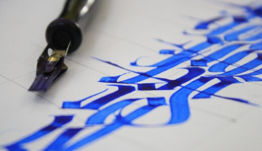
Why Does Vintage Lettering Still Make Stationery Feel More Personal?
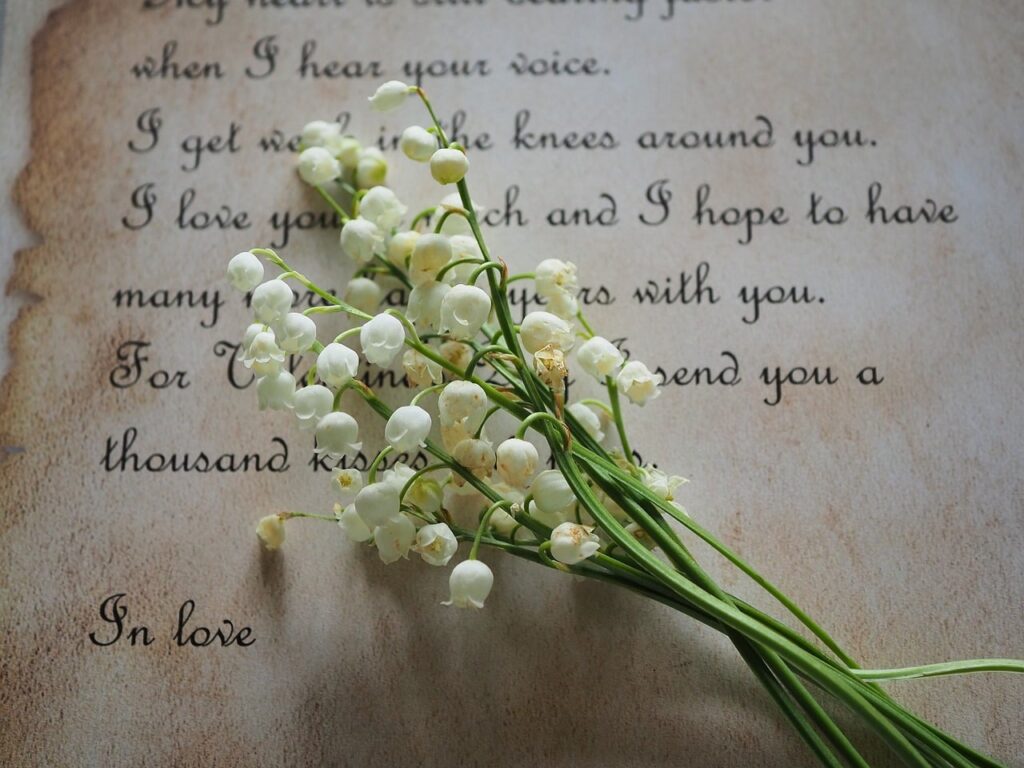
Vintage lettering has a simple pull. It can make a card, envelope, journal cover, or gift tag feel like it came from a real workbench, not from a standard template folder. If you sell, source, or design paper goods, this style is a practical way to add warmth, memory, and a hand-made feel. For more related styles and product ideas, visit the lettering collection.
The value is not only about nostalgia. Old sign painting, book covers, engraved labels, and poster titles were made to be noticed from a short distance. That habit still works on greeting cards, planner stickers, scrapbook sheets, and desk accessories. The Library of Congress holds a 1902 public-domain textbook on lettering and sign painting that discusses spacing, stroke width, shade, highlights, ornament, and color, which shows that vintage letter work was a working commercial craft long before it became a mood-board style. (loc.gov)
A Human Mark Before a Sales Message
When a buyer sees a phrase like “For You,” “Thank You,” or “A Little Note” in drawn script, the product feels closer to handwriting. It cuts some of the distance between the maker and the person receiving it. On stationery, that detail matters because the item often carries feeling. A birthday card should feel selected with care, not picked up in a hurry near the checkout lane.
Small Imperfections That Build Trust
Perfect digital type can look too clean for vintage-inspired goods. Slightly uneven terminals, ink-like curves, and soft corners give the piece a made-by-hand look. The key is still control. A wobbly baseline may look right on a kraft paper label, but it can look careless on a wedding invitation. The aim is “made by hand,” not “missed in proofing.”
A Clear Mood in One Glance
Lettering sets the mood faster than a paragraph. A thick slab serif feels sturdy and shop-like. A thin ornamental script feels soft and romantic. A shadowed block letter can bring fairground signs, diner menus, or 1950s packaging to mind. For small stationery items, where there may be room for only four words, that shortcut helps.
Which Vintage Lettering Styles Work Best for Modern Stationery?
The right style depends on what the product has to do. A planner cover needs to be easy to read every day. A greeting card can carry more character. A wedding envelope can use more decoration because people open it slowly. The Metropolitan Museum of Art notes that in the 1890s a new kind of American literary poster blended colorful composition with integrated text and image, making advertising feel more like art. That is a useful point for stationery work: the letters should belong to the whole surface, not sit on top like a late add-on. (metmuseum.org)
Victorian Flourish for Ceremony
Victorian-inspired lettering fits formal cards, certificates, bookplates, wedding tags, and premium paper sets. It often uses swashes, shaded capitals, curls, and border details. Use it for short phrases only. A full paragraph in ornate Victorian script will tire the eye quickly, especially on cream paper with small print.
Art Nouveau Curves for Soft Romance
Art Nouveau lettering is known for flowing lines, plant-like curves, and uneven balance that still feels controlled. It works well on floral stationery, thank-you notes, journal covers, and boutique packaging. Pair it with muted greens, dusty pink, warm ivory, or antique gold. Keep the supporting text plain so the curved title has room to sit properly.
Mid-Century Script for Everyday Warmth
Mid-century script has a friendly and casual look. It suits recipe cards, kitchen labels, school notes, family planners, and bright greeting cards. It can feel upbeat without looking childish. If the script is very bouncy, pair it with a clean sans serif for dates, addresses, product details, and small instructions.
How Can You Use Vintage Lettering Without Making Designs Look Old?
Vintage does not have to mean dusty. The better results usually come from using old letter shapes with current layout habits. Leave wider margins, cut down the wording, and keep the contrast clear. A good stationery design often has one decorative voice and one quiet voice. If every part shouts, the piece loses focus.
One Hero Phrase per Layout
Choose one phrase to carry the vintage lettering. On a greeting card, that may be “Happy Birthday.” On a planner sticker sheet, it may be “Today.” On packaging, it may be the brand name. Keep small details simple around it. This makes the decorative phrase look planned, and it also keeps production easier when sizes change.
Modern Space Around Old Forms
White space is not wasted space; it gives the eye a place to rest. Vintage letters often have shadows, flourishes, or thick strokes, so they need more room than plain type. If the lettering is detailed, try keeping 60 to 70 percent of a card front blank. It may feel too open on screen, but it often reads better on a shelf or in a product photo.
Color Palettes That Keep It Fresh
Old-style lettering can still look current when the color palette is kept tight. Use two or three colors instead of six. Cream and black feels classic. Brick red and navy feels heritage. Sage and charcoal feels soft and modern. Metallic ink can work, but keep it limited because too much shine can make the design feel like a costume.
What Should You Check Before Printing Vintage Lettering?
A screen mockup can look good and still fail on paper. Vintage lettering often includes thin hairlines, textured edges, stacked shadows, and small internal gaps. Those details may print differently on coated stock, uncoated paper, recycled kraft, sticker vinyl, or textured envelopes. Check the artwork at the final size, not only zoomed in on a monitor.
Stroke Weight at Real Size
Thin strokes disappear first. If a script has hairlines under 0.25 mm, it may look weak on textured paper or low-cost digital print. For small stickers and gift tags, slightly heavier strokes are safer. Print a one-page test with the smallest item, then place it on a desk. If you have to lean in to read it, the customer probably will too.
Paper Texture and Ink Spread
Uncoated paper gives vintage lettering a nice touch, but it can soften sharp edges. Kraft stock makes colors darker. Cotton paper gives ink a rich look, though fine details can feather depending on the process. If you sell stationery sets, list the paper weight and surface clearly. Buyers notice these details more than many sellers expect, especially when the product is meant as a gift.
Licensing for Fonts and Artwork
Not every “free vintage font” is free for commercial products. Check the license before using it on cards, packaging, digital downloads, or printable sheets. If the artwork comes from a public-domain scan, confirm the rights statement from the holding institution. If it comes from a modern designer, keep the receipt and license file in the project folder. It is not exciting work, but it can save trouble later. See also: Gift Guide.
Where Does Vintage Lettering Fit in Commercial Products?
No reliable public data source tracks the market size for “vintage lettering” alone, so it makes more sense to look at nearby product use. USPS reported in 2019, citing Greeting Card Association figures, that U.S. consumers bought about 6.5 billion greeting cards each year, with annual sales of about $7 billion to $8 billion. That older figure should not be treated as a 2026 count, but it does show the long-running scale of paper greetings. (news.usps.com)
Greeting Cards With Emotional Pull
Vintage lettering works especially well on birthday, sympathy, thank-you, wedding, and thinking-of-you cards because those occasions need the right tone. A blocky retro “Congrats” can feel loud and fun. A fine script “With Love” feels quiet. The same five words can change a lot when the letter style changes.
Packaging Inserts That Feel Kept
Small brands often add thank-you cards, care cards, return address labels, or coupon inserts. Vintage lettering can make these pieces feel worth keeping. A customer may throw away a plain coupon, but a good card with strong lettering may stay on a board or desk. That small second life helps the brand stay in the room longer.
Journals, Planners, and DIY Kits
For journals and planners, vintage lettering gives order to covers, tabs, dividers, and sticker sheets. In DIY kits, it helps beginners get an old-paper look without drawing every letter from the start. Keep the kit easy to use. Include alphabet samples, traceable words, and a few ready-made labels.
How Can Buyers Choose Better Vintage Lettering Supplies?
If you buy stationery supplies, a nice sample image is not enough. Think about how the item will be used. Will someone write over it, mail it, scan it, or sell it as part of a handmade product? Etsy’s 2025 annual report stated that the Etsy marketplace had 86.5 million active buyers and 5.6 million active sellers as of December 31, 2025; its 2025 buyer surveys also found that 31 percent of buyers looked for something custom or personalized on their most recent visits, while 29 percent searched for a gift. That points to steady demand for personal, giftable paper goods. (sec.gov)
Match the Tool to the Letter Shape
Brush pens suit flowing scripts. Fineliners suit engraved-style lines. Chisel markers suit block letters and sign-painting practice. For beginners, medium tips are easier than tiny nibs. Tiny tools can look professional in product photos, but they are not always comfortable after twenty minutes of real use.
Look for Printable and Editable Formats
For business use, editable vector files are more useful than flat images. SVG, EPS, or high-resolution PDF files let you resize art without fuzzy edges. For home craft, printable PDF sheets may be enough. If you need labels for jars, envelopes, tags, and cards, choose a set with matching shapes rather than one lonely alphabet.
Test With a Real Message
Before buying a large set, test the lettering with a real phrase. “Happy Birthday, Emma” tells you more than a sample alphabet. It shows spacing, awkward letter pairs, and how the style handles names. Pinterest’s 2026 trend material described a “Pen Pals” DIY trend as a letter-writing renaissance and listed rising searches such as cute stamps, pen pal letters, and snail mail gifts, which fits the renewed interest in expressive paper communication. (create.pinterest.com)
FAQ
Q1: What Is Vintage Lettering? A: Vintage lettering is drawn or styled lettering based on older signs, posters, packaging, book covers, labels, and handwritten commercial art. It usually has more character than plain type.
Q2: Is Vintage Lettering the Same as Calligraphy? A: Not exactly. Calligraphy is usually written with a pen or brush in flowing strokes. Lettering is often drawn, adjusted, shaded, and arranged as a design.
Q3: Can Vintage Lettering Work for Minimalist Stationery? A: Yes. Use one decorative phrase, plenty of blank space, and a limited color palette. The contrast between a simple layout and detailed lettering often looks clean and well finished.
Q4: What Products Suit Vintage Lettering Best? A: Greeting cards, gift tags, planner covers, stickers, labels, envelopes, packaging inserts, recipe cards, scrapbook papers, and boutique thank-you notes all work well.
Q5: How Do You Avoid a Cheap Retro Look? A: Use fewer effects, check readability, choose good paper, and avoid mixing too many vintage styles in one design. One clear lettering style is usually enough.