What Is the Best Way to Learn a Hand Lettering Alphabet?
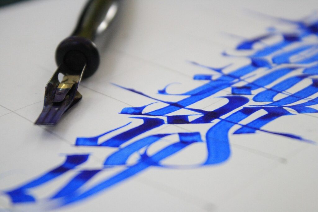
A hand lettering alphabet is not just a nice A to Z sample. It is the group of letter shapes, spacing habits, and stroke choices you use again and again when you make a journal title, card, label, or envelope. If you are collecting styles or starting from zero, the Lettering section is a useful place to keep tools and practice ideas together.
There is no reliable public dataset that tracks hand lettering alphabet practice on its own, so wider creative and stationery data gives better background. The National Endowment for the Arts reported in 2023 that 52% of U.S. adults did some form of art making in 2022, based on the Survey of Public Participation in the Arts. That matters because lettering belongs in the same everyday craft area as drawing, journaling, card making, and paper craft. (arts.gov)
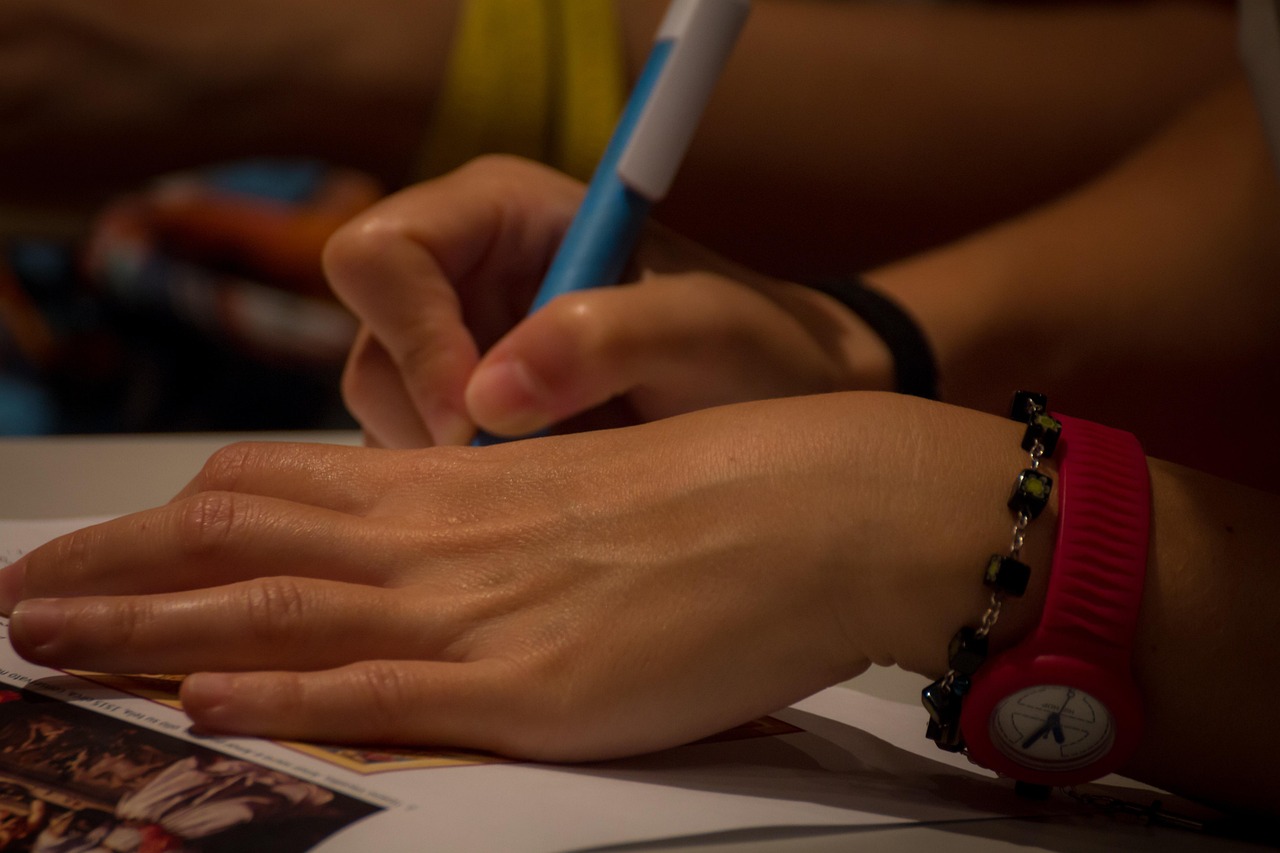
What Is the Best Way to Build a Hand Lettering Alphabet?
A useful alphabet starts with small parts, not finished letters. You do not need to copy a full page of fancy scripts on the first day. A better route is to look at the strokes inside each letter, then build the alphabet piece by piece. It can feel slow at the start, but it helps you avoid fixing the same crooked A, uneven S, or tight M later.
Start With Basic Strokes
Most hand lettering alphabets use a few repeated moves: straight downstrokes, light upstrokes, ovals, entry strokes, exit strokes, loops, and curves. Practice these in rows before you draw full letters, because the same shapes will show up again in many words. Keep the first drills plain on purpose. Ten lines of ovals may look dull, but they teach your hand how wide, round, and steady each letter should be.
Draw Lowercase Letters First
Lowercase letters show up more often in real words, so it makes sense to work on them early. Group them by shape instead of going through the alphabet in order. Letters like a, d, g, o, and q all use oval forms, while i, l, t, and h rely more on vertical rhythm. This way, you start seeing letter families instead of 26 separate drawings.
Treat Uppercase Letters as Display Shapes
Uppercase letters often work like small signs. They start names, headings, envelopes, and short quotes, so they can carry a little more style. Readability still comes first. A clear uppercase B with balanced bowls is more useful than a decorative B that takes too long to read, so save heavy flourishes for a second pass.
Which Tools Make Alphabet Practice Cleaner?
Tools cannot fix weak letter shapes, but they can make practice less annoying. Paper, pen tip, ink flow, and guide sheets all affect the final page. Fact.MR reported in September 2024 that the global stationery market was estimated at USD 27.3 billion in 2024 and forecast to reach USD 43.6 billion by 2034. In simple terms, people still buy physical writing, drawing, and paper goods because screens do not replace every job they do. (factmr.com)
Smooth Paper With Low Bleed
Use smooth paper when you practice with brush pens or markers. Rough paper can damage flexible tips and leave strokes with ragged edges. If ink bleeds through the page, your letters may look wider and blurrier than they really are. A dotted notebook, marker pad, or printed guide sheet under tracing paper is enough for early drills.
Brush Pens for Thick and Thin Strokes
Brush pens help you learn stroke contrast. Press down for a thicker downstroke, then ease the pressure for a thin upstroke. That pressure change is the base of many modern lettering styles. Start with a small brush tip if large pens feel hard to control, because big tips can make every beginner letter look oversized.
Pencils and Fineliners for Planning
A pencil sketch lets you plan spacing before ink touches the page. Fineliners are useful for monoline alphabets, shadow details, and small caps. If you sell cards, make labels, or decorate planners, a pencil and black fineliner may get more daily use than a full box of specialty pens. They are also easier to carry and replace.
How Should Each Letter Stay Consistent?
Consistency does not mean every letter has to look printed by a machine. Hand lettering should still feel handmade. The aim is controlled variation: your letters can bounce, lean, and breathe, but they should still look like they came from the same alphabet. Three light guide lines do most of that work.
Baseline, X-Height, and Cap Height
The baseline is where most letters sit. The x-height controls the height of lowercase letters like a, e, and x, while the cap height marks the top of uppercase letters. Draw these guides lightly, even if you plan to erase them later. Without guides, words often drift uphill, sink down, or shrink across the page.
Spacing That Feels Even
Good spacing is about what looks balanced, not about making every gap the same width. The space between two straight letters, such as H and I, will look different from the space between rounded letters, such as O and C. Step back from the page for a quick check. If one pair feels squeezed and another pair feels too far apart, adjust the gap before adding decoration.
Repeatable Angles and Curves
Pick one slant angle for a script alphabet and stay close to it. Choose one curve style for rounded letters as well. If your lowercase o is tall and narrow, let a, d, g, and q share that same feel. Repetition makes the alphabet look planned, even when the style is loose.
What Styles Work Best for Real Projects?
A hand lettering alphabet becomes more useful when the style matches the job. A planner header needs to be quick to read. A wedding envelope can be softer and more detailed. A classroom label should be clear from a few steps away. Before adding curls, shadows, or color, think about where the alphabet will be used.
Bounce Lettering for Casual Notes
Bounce lettering moves letters a little above and below the baseline. It works well for planners, gift tags, lunch notes, scrapbook pages, and relaxed quotes. Keep the bounce small when you start. If every letter jumps in a different direction, the word starts to look shaky instead of playful.
Serif Lettering for Classic Headings
Serif letters have small feet or finishing strokes at the ends. They look steady on page titles, book labels, place cards, and signs. A simple serif alphabet can be drawn with a pencil skeleton first, then thickened where needed. Add the serifs last so they line up cleanly. See also: Gift Guide.
Script Letters for Invitations and Cards
Script lettering connects letters or brings them close to connecting. It suits invitations, envelopes, thank-you cards, and short phrases. Pay close attention to entry and exit strokes, because they decide how letters meet. If the join between r and s looks awkward, write that pair ten times, as letter pairs are where many style problems show up.
How Can You Practice Without Wasting Pages?
Practice pages fill up fast. That can feel good, but random repetition does not always improve the alphabet. A small plan gives each page a clear job. Google Trends explains that its search data shows relative interest rather than exact search volume, so trend checks can help with topic ideas, but they should not replace hands-on testing with real projects and real readers. (support.google.com)
Ten Minute Stroke Drills
Set a timer for ten minutes and work on one stroke family. Try ovals on Monday, downstrokes on Tuesday, loops on Wednesday, and connector strokes on Thursday. Short drills are easier to keep up than one long weekend session. Your hand also learns better when practice is regular.
One Word Per Page
Choose one word and write it in three sizes: small, medium, and large. Then try it in two styles, such as monoline and brush script. This method shows where the alphabet starts to fail. A style that looks fine in one letter may become messy inside a word like “summer,” “welcome,” or “celebrate.”
A Weekly Alphabet Check
Once a week, draw the full alphabet on one page. Add the date so you can compare it later. Circle three letters that improved and three that still need work. Keep old sheets instead of throwing them away, because after four weeks the progress is easier to see, especially in tricky letters like S, G, R, and lowercase k.
Where Can a Hand Lettering Alphabet Add Value?
Lettering is practical. It can turn a blank label into a clear shelf system, a plain envelope into a keepsake, and a simple journal page into something you want to open again. Pinterest Business listed “Pen Pals” and a letter-writing renaissance in its 2026 marketing playbook, which points to wider interest in personal, hands-on messages. That does not prove a lettering sales boom, but it does show that handwritten style still has cultural pull. (business.pinterest.com)
Journals, Planners, and Labels
For daily use, keep alphabets readable and easy to repeat. A neat sans serif alphabet works for habit trackers, pantry labels, file tabs, and calendar headers. Add color only after the letters are clear. Pretty ink cannot save a label that is hard to read at breakfast.
Greeting Cards and Envelopes
Cards and envelopes allow more personal style. Try a script name with a small serif address, or a bold monoline word with a shadow. Keep the envelope address easy to read for mailing. Postal workers are not checking your flourishes, and that is probably for the best.
Retail Packaging and Gift Tags
Small shops often use lettering for tags, thank-you notes, product names, and seasonal packaging. A steady alphabet can make handmade goods look more finished. If you prepare many tags, make a style sheet with letter height, spacing, colors, and sample words. It keeps the look consistent when orders pile up.
FAQ
Q1: What Is a Hand Lettering Alphabet?
A: A hand lettering alphabet is a full set of drawn letterforms from A to Z. Unlike normal handwriting, each letter is planned with shape, spacing, style, and decoration in mind.
Q2: Is Hand Lettering the Same as Calligraphy?
A: Not exactly. Calligraphy is usually written with controlled strokes from a pen or brush. Hand lettering is drawn, so you can sketch, adjust, thicken, erase, and refine each letter.
Q3: What Should a Beginner Practice First?
A: Start with basic strokes, lowercase shape families, and spacing. Full decorative alphabets can wait until your lines, ovals, and baseline control feel steady.
Q4: How Long Does It Take to Get Better at Lettering?
A: With ten to fifteen minutes of focused practice on most days, many beginners see cleaner spacing and smoother strokes in a few weeks. Personal style takes longer, and that is normal.
Q5: Which Alphabet Style Is Best for Everyday Projects?
A: A clean monoline or simple serif alphabet is best for labels, planners, and notes. Add script, bounce, shadows, or flourishes when the project has room for a more decorative look.