How Can Lettering for Slogan Make Promotional Products Hard to Ignore?
When you plan lettering for slogan work, you are not only picking nice letters. You are deciding how quickly a buyer, student, fan, or person walking past can read the line and keep it in mind. For more ideas across stationery, event goods, and sports-themed designs, the Lettering category is a useful place to start.
A slogan does not get much time. On a pen, someone may see it once during a meeting. On a banner, it needs to read from the other side of a hallway. On a team sticker, it should feel strong without turning messy. Good lettering gives the short line a clear voice, and it keeps that line readable when the artwork moves from screen proof to finished product.
Why Does Lettering for Slogan Matter on Real Products?
A slogan only works when people can read it, say it again, and connect it with the item they are holding. This is why lettering choice is not only a style issue. It affects trust, attention, and how long the message stays in use.
A Fast First Read
Most people do not study a slogan the way they read a book title. They glance at it and move on. A clean lettering style helps the eye find the main words first, especially on small items such as notebooks, pens, bookmarks, stickers, lanyards, and wristbands. Keep the line short, put the strongest word near the start, and stay away from shapes that make common letters look the same.
Trust Built by Clean Signs
For signs and retail displays, lettering quality can affect buying behavior in a direct way. FedEx Office reported in a consumer survey released in May 2012 that 76 percent of American consumers had entered a store they had never visited before because of its signs, while 68 percent had bought a product or service after a sign caught their eye.
The same survey said 52 percent were less willing to enter a store with misspelled or poorly made signs. The point is plain: careless slogan lettering can make a good offer look poorly handled. (newsroom.fedex.com)
Useful Items That Keep Messages Moving
Promotional products are still a large channel for slogan design. PPAI’s 2024 U.S. Distributor Sales Volume Report estimated U.S. promotional products distributor sales at $26.78 billion in 2024.
Apparel made up 26.6 percent of category sales, writing products 5.2 percent, and school pride and sports teams 9.0 percent of program categories. These figures match what we see in daily orders: shirts, pens, banners, and school spirit pieces all need words that stay clear after printing. (ppai.org)
What Makes a Slogan Easy to Read at a Glance?
Readable slogan lettering starts before the design file is made. It starts with the words. If the slogan is too long, too crowded, or too clever for the imprint area, even good lettering will have a hard time.
Short Words Before Fancy Forms
A practical product slogan often has three to seven words. This is not a strict rule, but it is a useful range for most promotional items.
Read the slogan from arm’s length before you approve it. If you have to lean in, the lettering is probably trying to carry too much. For a pen barrel, a cap, or a slim ruler, a two-word or three-word line often works better than a full sentence.
Mixed Case for Longer Lines
All caps can feel strong, and it works well for very short slogans such as TEAM READY or GO FURTHER. For longer lines, mixed case often reads faster because the word shapes are easier to pick out.
The U.S. Access Board’s review of variable message sign research notes that Garvey and related studies found lowercase words 12 to 15 percent more legible than uppercase for highway sign word recognition, and that mixed case is recommended for longer instructions. A school banner is not a highway sign, but the reading situation is close enough: people are moving, distracted, and not giving the message much time. (access-board.gov)
Strong Contrast and Quiet Space
Contrast and spacing do much of the work in slogan lettering. A dark navy slogan on a black bottle may look good on screen, then become hard to see under indoor light.
A white slogan on a red rally towel, with enough margin around it, usually reads better. Quiet space around the words is not wasted space. It gives the message room, so the eye can find it faster.
Which Lettering Style Fits Your Slogan Best?
Lettering style should fit the tone of the slogan and the product. A sports slogan, a stationery quote, and a corporate giveaway message should not all use the same type style.
Bold Sans Serif for Action
Bold sans serif lettering is a reliable choice for active, current, and sporty slogans. It works well on water bottles, gym bags, event signs, clipboards, and team merchandise.
Use it when the message needs force, such as Train Hard, Stay Sharp, or Built for Game Day. Thick strokes also handle many production methods better than thin decorative lines.
Script Lettering for Warmth
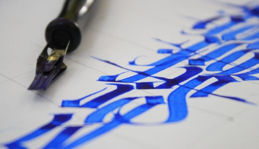
Script lettering gives notebooks, greeting cards, planners, gift tags, and lifestyle items a hand-made feel. It suits softer lines such as Make Today Count or Notes Worth Keeping.
The risk is readability. If the loops are too tight or the baseline moves too much, the slogan becomes decoration instead of a message. Use script for one key phrase, then add a plain supporting font if the layout needs it.
Vintage and Varsity for Team Spirit
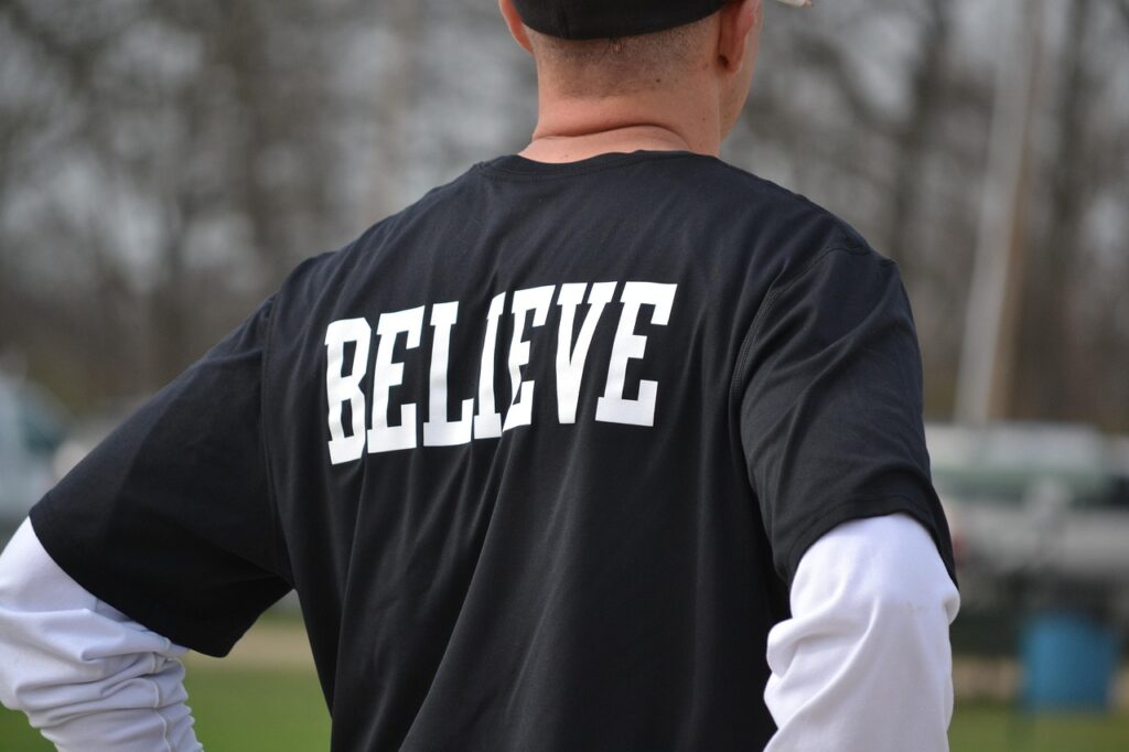
Varsity, slab, and vintage lettering suit clubs, camps, sports teams, and school events. These styles already carry a feeling of group identity.
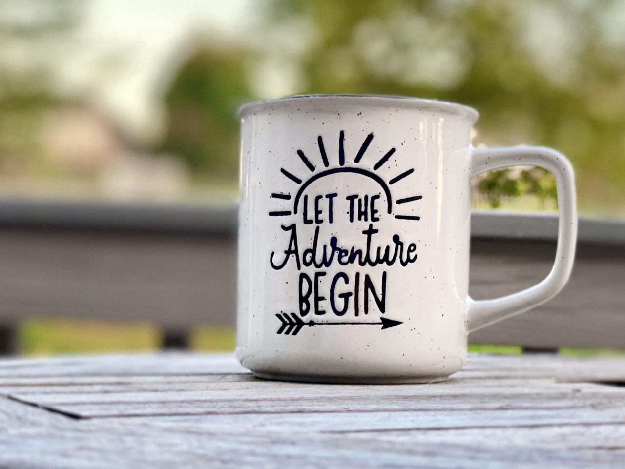
They look natural on pennants, patches, hoodies, tote bags, and reusable cups. Keep the slogan direct. A varsity font with a long sentence can feel too heavy, like shouting in a small room.
How Should You Match Lettering to Product Materials?
The same slogan file can act very differently on paper, fabric, metal, plastic, or rubber. Before final artwork, check the surface texture, imprint size, ink spread, and the way the item will be used.
Paper Goods and Stickers
Paper can hold fine detail better than many rough materials, so planners, cards, notebooks, and sticker sheets can use more refined lettering. Even so, small stickers still need simple shapes.
Thin hairlines may fill in after printing, while small gaps inside letters such as e, a, and o may close up. A proof at actual size will show these issues before the order moves forward.
Pens Bottles and Small Imprint Areas
Small promotional items require tight control over lettering. ASI’s 2026 Ad Impressions Study on writing instruments reported that 88 percent of consumers would keep a promotional writing instrument because it is useful, and 64 percent said they would use one every day. See also: Gift Guide.
That daily use is valuable, but the imprint area is limited. A slogan on a pen should not compete with the logo. Choose one message, use plain letterforms, and keep stroke weight strong enough for pad printing or laser marking. (members.asicentral.com)
Apparel Banners and Event Boards
Fabric and large-format products need a different check process. On shirts, ink can spread a little into cotton fibers. On banners, viewing distance matters more than small details.
For a five-foot event banner, test the slogan from across the room, not only on a laptop. For a hoodie or jersey, check how the lettering sits when the fabric bends. Flat mockups do not always show the real result.
How Can Color and Spacing Make the Message Stronger?
Color gives the message its mood, but spacing keeps it under control. When both are planned together, slogan lettering looks cleaner and easier to read. When they are treated only as decoration, the layout can become busy quickly.
High Contrast Comes First
For digital previews and product pages, WCAG 2.2 from W3C gives a useful contrast benchmark: normal text should have a contrast ratio of at least 4.5:1, while large text needs at least 3:1. Product decoration is not always web text, but the same idea helps in product work.
If the slogan has to sell, guide, or identify, contrast should come before low-contrast color trends. A clean read is more important than a color set that only looks good in a mockup. (w3.org)
Letter Spacing That Helps Breathing
Letter spacing is not just a design slider. Tight spacing can make bold letters hit each other, especially in all caps.
Wide spacing can make a short slogan feel neat, but too much space breaks the word apart. Test the slogan at the smallest real size. If the letters still read as one word, the spacing is probably safe.
Color Choices That Travel Across Markets
For export orders, color meaning can change by market, school, team, or event. Red can feel energetic, blue can feel stable, green can suggest outdoor or eco themes, and black can feel strong or formal.
Do not depend on color alone. The lettering shape should still carry the slogan when the design becomes one-color embroidery, vinyl cutting, engraving, or black-and-white print.
How Do You Prepare Lettering Artwork for Production?
Production-ready artwork helps keep the slogan from changing during production. A good preview is not enough. The file has to match the method, the material, and the supplier’s real limits.
Vector Files and Clear Outlines
Use vector artwork for most slogan lettering on promotional products. Outlined text prevents font substitution and keeps the letter shapes stable.
For layered designs, label spot colors clearly. If the slogan includes a custom script or hand-lettered mark, clean the curves so the cutter, engraver, or printer does not follow rough points.
Minimum Line Weight Checks
Every process has a smallest safe line. Screen printing, embroidery, debossing, laser engraving, UV printing, and vinyl cutting all behave in their own way.
Ask for the minimum stroke width and minimum gap before sending final files. This one question can prevent fuzzy letters, broken strokes, or filled-in counters on a bulk order.
Proofing Before Bulk Orders
Always review a real-size proof. For larger orders, ask for a pre-production sample when the schedule allows.
Check spelling, case, spacing, logo distance, color contrast, and placement. Also check the basic details: left and right alignment, safe margins, and whether the slogan is upside down when the item is used. It sounds simple, but a batch of bottle openers can prove otherwise.
FAQ
Q1: What Is the Best Lettering for Slogan Designs? A: The best lettering is the style that fits the message and stays readable at the final product size. Bold sans serif works well for sports and events, while script suits warm stationery or gift items.
Q2: Should a Slogan Use All Caps? A: All caps can work for very short, energetic slogans. For longer lines, mixed case is often easier to read because the word shapes are clearer.
Q3: How Many Words Should a Product Slogan Have? A: Three to seven words is a practical range for many products. Small items such as pens, badges, and stickers usually need shorter lines.
Q4: Can the Same Slogan Lettering Work on Every Product? A: Not always. Paper can hold fine detail, while fabric, rubber, metal, and small plastic items may need thicker strokes and simpler shapes.
Q5: What Should You Check Before Approving Slogan Artwork? A: Check spelling, real-size readability, contrast, spacing, stroke width, imprint area, and file format. For bulk orders, a physical sample is the safer step.