Which Lettering Styles Are Best for Notes, Cards, and Creative Signs?
What Makes a Lettering Style Look Good?
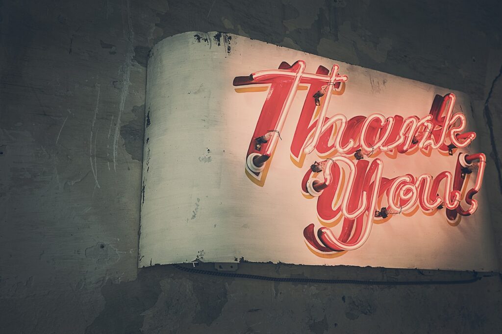
Good lettering styles need to do more than look nice. They should make the words easy to read, suited to the page, and right for the job. A birthday card can use soft brush letters for a personal feel, while a sports event poster usually needs bold block letters that people can read from a distance. This choice affects the whole piece, so lettering still matters in stationery, school notes, handmade labels, and brand visuals.
There is also a large audience for visual lettering. DataReportal reported in its Digital 2026 Global Overview Report, using October 2025 data, that 6.04 billion people used the internet worldwide and 5.66 billion social media user identities existed globally. In the United States, its 2026 country report listed 324 million internet users and 254 million social media user identities at the end of 2025. These figures do not prove that one lettering style is the best option, but they do explain why clear letter art can move fast through digital pages, product photos, and short videos.
Letter Shape Comes First
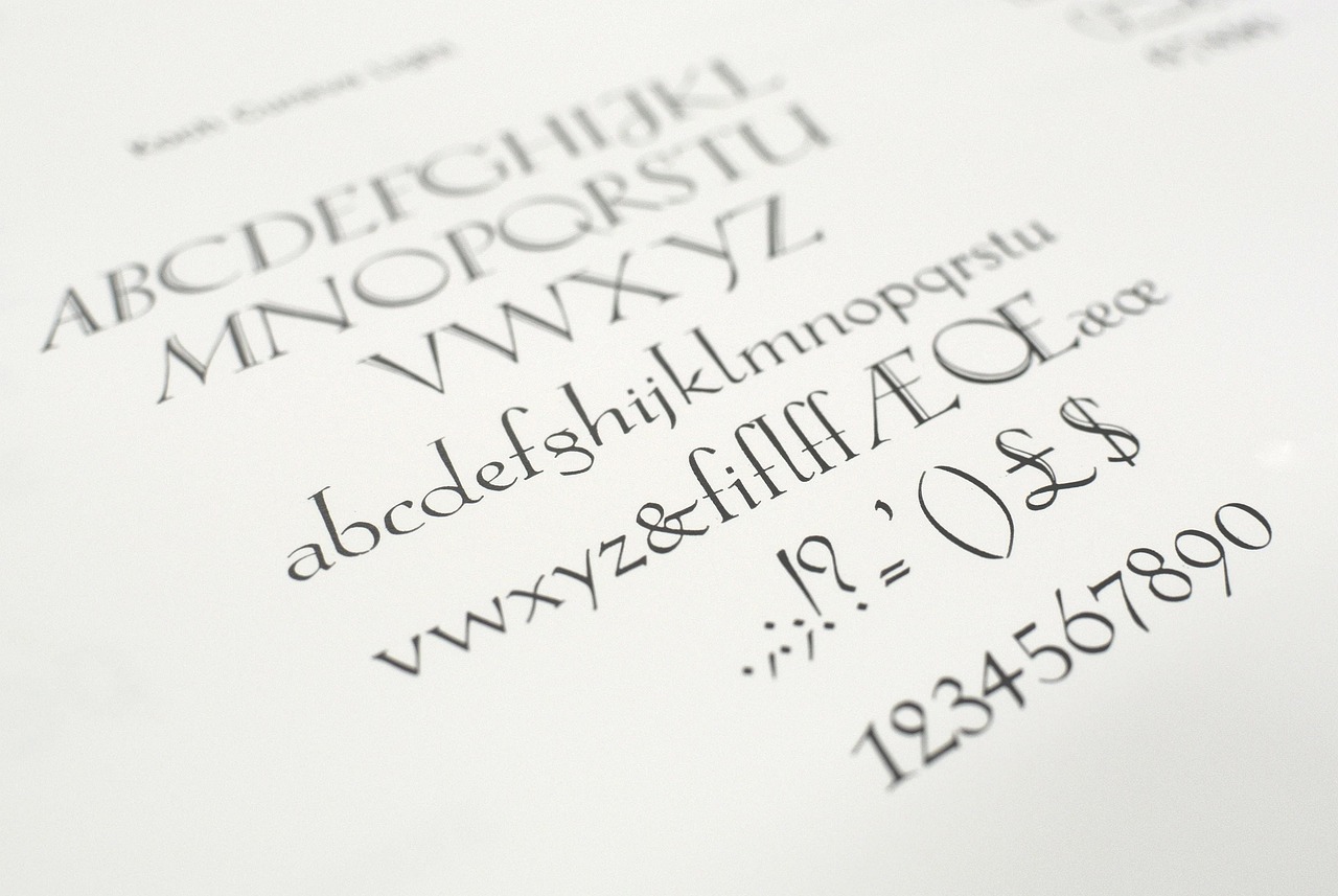
Before color, shadow, or decoration, the basic shape has to be readable. Round letters look casual, tall narrow letters feel clean, and wide block letters give a firm look. If the word is short, such as “Team” or “Sale,” heavier shapes can work well. If the phrase is long, keep the forms plain so the reader does not have to work through the design.
Stroke Weight Sets the Mood
Stroke weight means how thick or thin the lines look. A monoline style uses one even line width, so it feels tidy and simple to control. A brush style uses thick downstrokes and thin upstrokes, which gives the lettering more movement. Heavy strokes suit headers, banners, and signs, while thin strokes are better for journals, place cards, and soft stationery layouts.
Spacing Keeps Words Clear
Spacing is not the loud part of lettering, but it often decides whether the work looks finished. Keep similar gaps between letters, and do not let words run into each other. Script letters need enough room because loops can easily touch the next letter. A fancy “Happy Birthday” can lose its appeal if the center starts to look tangled.
Which Lettering Styles Should You Try First?
If you are new to lettering, start with styles that teach hand control without making every page feel like practice homework. Block, brush, and serif styles are useful because they cover many common projects. They also work with everyday stationery tools such as pencils, gel pens, markers, brush pens, and fine liners. With these three styles, most notes, cards, signs, and labels already have a solid base.
Block Lettering for Clear Labels
Block lettering uses strong and simple shapes. It is a safe choice for classroom posters, planner tabs, sports schedules, club signs, and product labels. Draw the outside shape first, then fill it in or shade one side. For beginners, block letters are forgiving because small errors can often turn into shadows, highlights, or texture.
Brush Lettering for Warm Cards
Brush lettering works well for greeting cards, envelopes, scrapbook pages, and thank-you notes. The main rule is easy to remember: press more on downstrokes and lift pressure on upstrokes. You do not need to write fast, and slower strokes often look cleaner. When you are still learning, a small brush pen usually gives better control than a large marker.
Serif Lettering for Classic Displays
Serif lettering adds small feet or finishing strokes to each letter. It gives menus, certificates, quote cards, and wedding stationery a more classic look. Start with plain capital letters, then add matching serifs at the ends. Keep the serifs the same size because uneven serifs can make the word look shaky, even when the main letters are drawn well.
How Do Lettering Styles Change the Feeling of a Project?
Lettering is part of the visual tone. The same word can feel playful, high-end, sporty, or calm depending on shape and weight. This matters for personal craft work and for commercial design. The U.S. Bureau of Labor Statistics reported in the Occupational Outlook Handbook that graphic designers earned a median annual wage of $61,300 in May 2024, with about 20,000 openings projected each year from 2024 to 2034. Those numbers are not only about hobby lettering, but they show that visual communication has real value in the workplace.
Round Letters Feel Friendly
Round lettering fits kids’ stationery, classroom boards, cute notes, stickers, and casual social posts. Rounded corners make the message feel soft and easy to approach. Use this style when the wording should feel open, such as “Welcome,” “Lunch Menu,” or “Good Luck.” If the project allows it, small dots, stars, or icons can add a light touch without making the page too busy.
Condensed Letters Save Space
Condensed lettering is tall and narrow. It helps when a large word must fit into a small space, such as a notebook spine, a locker label, or a narrow sign. Keep the strokes clean because tight letters can become hard to read quickly. One useful method is to draw guide boxes first, then place each letter inside one box.
Decorative Letters Need Restraint
Decorative lettering includes flourishes, shadows, stripes, patterns, and illustrated details. It can look good, but too much decoration can cover the message. Put the extra detail on one key word instead of every word. For example, in “Summer Sports Day,” decorate “Summer” and keep the rest plain, so the eye has a focus and the sign still reads quickly.
What Tools Help Different Lettering Styles Work Better?
The right tool depends on the style you want to make. A pencil is still useful, even when the final piece will be finished with markers. Brush pens can make smooth thick and thin strokes, but they do not fix poor spacing by themselves. Fine liners make clean edges, and markers are good for filling large shapes. If a pen bleeds through thin paper, change the paper before blaming your hand.
Pencil Sketches Build Clean Structure
Pencil sketching helps you plan height, spacing, and balance before ink goes down. Draw light guide lines for the top, middle, and bottom of each letter. For cards and signs, sketch the longest word first because it sets the size for the rest of the layout. Wait until the ink is dry before erasing, since early erasing can damage an otherwise good page.
Brush Pens Create Thick and Thin Lines
Brush pens suit script, bounce lettering, and expressive headers. Hold the pen at a steady angle so the stroke does not change for the wrong reason. Use light pressure for thin lines and stronger pressure for thick lines. Practice rows of basic strokes before writing full words, because ten minutes of drills can help more than copying one alphabet for an hour.
Fine Liners Add Sharp Details
Fine liners are useful for outlines, small caps, shadows, hatching, and tiny decorative marks. They work especially well with block and serif lettering. Use a thicker pen for the main outline and a thinner pen for inner detail. If the project is a planner page, test the pen on the back page first so ink ghosting does not catch you off guard. See also: Gift Guide.
How Can You Use Lettering Styles for School, Office, and Branding?
Lettering looks creative, but it also solves basic reading and sorting problems. It helps people find sections, read signs, notice a package, or enjoy a card. USPS addressing guidance gives a useful real-world example here: for mailpieces, it recommends simple sans serif type, dark ink on a light background, a uniform left margin, and clear address lines. That postal advice is not a craft rule, but the point is practical. Readability matters most when the reader needs to act fast.
Notebook Headers Guide the Page
For school notes, meeting notes, and study sheets, use one bold lettering style for main headers and one simple style for subheads. This keeps the page organized without making it look like a poster. A practical setup is block caps for chapter names, monoline script for reminders, and plain handwriting for the body text. That mix gives structure while leaving enough space for the notes themselves.
Event Signs Need Fast Reading
Event signs need to be read from a distance. Sports days, classroom fairs, market stalls, and office events all work better with thick letters, strong contrast, and short wording. Avoid thin script for directions such as “Registration,” “Exit,” or “First Aid.” Save the script for welcome boards and photo corners, where people have more time to look.
Packaging and Social Posts Need Personality
For small brands, handmade shops, and stationery sellers, lettering can make packaging feel more personal. DHL’s 2026 E-Commerce Trends Report surveyed 29,000 online shoppers and 5,800 e-commerce businesses across 29 countries between December 15, 2025, and February 11, 2026. The report does not rank lettering styles, so it would not be fair to claim that “brush lettering sells best.” Even so, clear product photos and a recognizable visual mood help shoppers judge a product faster.
How Can Beginners Practice Lettering Without Getting Stuck?
Practice should be easy to repeat. You do not need a large tool set or a perfect desk. A pencil, ruler, eraser, black pen, and one color marker are enough for the first few weeks. The main goal is to build muscle memory, learn spacing, and find two or three styles you can use without thinking too much.
Start With a 15 Minute Drill
Set a timer for 15 minutes. Spend five minutes drawing straight lines, curves, and ovals. Then spend five minutes writing one alphabet slowly. Use the last five minutes to letter three real words, such as “Notes,” “Practice,” and “Today.” Short drills fit into a lunch break or evening routine, and they remove the pressure to finish a full piece every time.
Build a Small Style Sheet
Create one page with your favorite styles: block caps, rounded lowercase, brush script, serif caps, and shadow letters. Add a short sample word under each style so you can compare them quickly. This sheet becomes a small menu when you design a card, label, or sign. It also shows progress clearly, which helps on days when practice feels slow.
Check Readability Before Decoration
Step back from the page before adding extras. Can you read the word in two seconds, and can someone else read it without a hint? If yes, add shadow, color, or small icons. If not, fix the letter shapes first. Decoration should support the word, not sit in front of it.
FAQ
Q1: What Are the Easiest Lettering Styles for Beginners? A: Block lettering, monoline lettering, and rounded lettering are usually easiest because they use simple shapes and steady strokes.
Q2: Which Lettering Style Is Best for Greeting Cards? A: Brush lettering works well for warm, personal cards, while serif lettering suits formal cards and invitations.
Q3: Can You Mix Different Lettering Styles on One Page? A: Yes, but keep it to two or three styles. Use one bold style for the main word and a simpler style for smaller text.
Q4: What Paper Is Best for Brush Pens? A: Smooth, bleed-resistant paper is best. Rough paper can fray brush tips and make strokes look uneven.
Q5: How Long Does It Take To Get Better at Lettering? A: With 15 minutes of focused practice several times a week, many beginners see cleaner strokes and better spacing within a month.