How to draw and use bold letters without losing readability
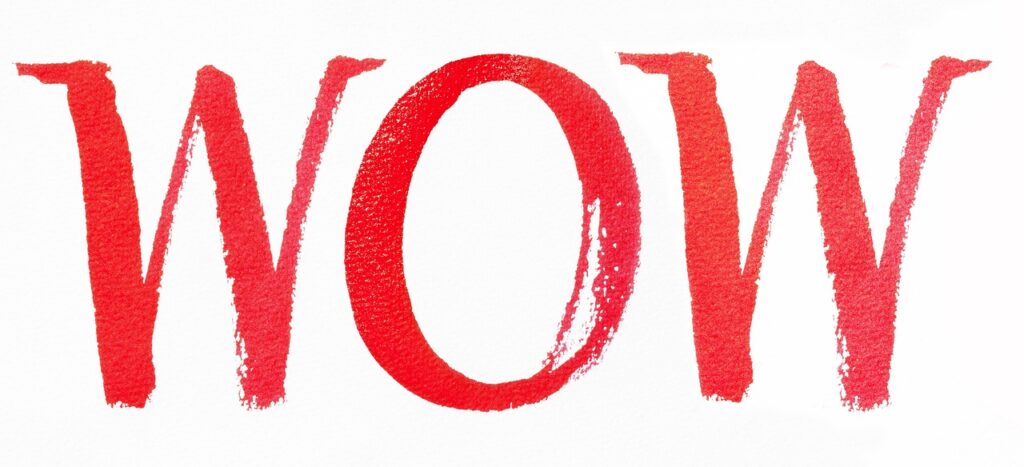
What bold letters are and why they matter
Bold letters are letterforms with heavier strokes than regular writing. They are used to create emphasis, build hierarchy, and improve visibility. In hand lettering, boldness may come from a thicker alphabet drawn with markers, brush pens, or outlined block shapes. In digital typography, it usually means choosing a designed font weight rather than simply making letters look darker. Strong bold lettering depends on more than weight. It also needs clear spacing, open counters, suitable contrast, and a style that fits the project. For more alphabet practice and layout ideas, visit our lettering guides.
Bold lettering works well for notebook headers, classroom posters, planner titles, sports signs, greeting cards, labels, and web headings. It becomes less effective when every word is bold, when letters are squeezed together, or when decoration takes priority over readability. The aim is not to make every letter as thick as possible. It is to make the important words easy to notice and easy to read.
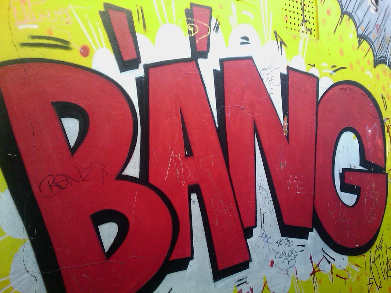
Bold letters are not the same in handwriting, fonts, and Unicode symbols
The phrase bold letters can refer to several related but different things. In handwriting and lettering, boldness is created by widening strokes, filling outlined shapes, or adding shadow and contrast. In typography, bold is a font weight designed by the type designer. In web design, CSS can request a weight such as 700, and variable fonts may support a range of weights rather than only fixed regular and bold styles, as documented by Google Fonts and MDN. (developers.google.com)
There is also a separate issue with “fancy” copied characters, such as mathematical bold, script, or double-struck letters. Unicode documents these characters for mathematical and symbolic use, and the Unicode chart for Mathematical Alphanumeric Symbols states that general text should use standard Latin or Greek letters with markup instead. In practical terms, an important heading should normally be typed as standard text and styled in bold, not pasted as special Unicode symbols. (unicode-org.github.io)
This distinction matters for search, accessibility, editing, and consistency. Real text can usually be resized, searched, translated, copied, and restyled. Decorative symbol alphabets may look appealing in a social caption, but they can cause problems for screen readers, translation tools, and devices with inconsistent font support. For lettering artwork, the safer approach is to use decorative forms visually while keeping essential information in readable letters.
Why bold lettering attracts attention
Bold letters help create hierarchy because the eye tends to notice larger, heavier, and higher-contrast shapes before smaller surrounding text. Nielsen Norman Group has long reported that web users often scan pages rather than read every word, and its usability writing guidance identifies elements such as headings, large type, bold text, bullets, and tables as aids to scanning. (nngroup.com)
The same principle applies to paper projects. A bold title on a notebook page marks the start of a section. A bold price card helps shoppers identify the key number first. A bold team name on a sports poster can anchor the whole design. In each case, letter weight is doing editorial work: it tells the viewer what to read first, what to compare, and what can wait.
That advantage disappears when bold is overused. If every word is heavy, there is no hierarchy. If the letter spacing is too tight, thick strokes merge into dark blocks. If the color contrast is weak, the word may look strong as artwork but still be hard to read. Effective bold lettering relies on restraint: choose the key words, make them prominent, and keep the supporting text lighter.
How to draw bold letters by hand
Hand-drawn bold letters are easier to control when you separate structure from decoration. Start with a light pencil skeleton of the word before adding thickness. This helps you check alignment, letter width, and spacing before you commit with ink or marker.
- Write the basic word lightly. Start with simple uppercase or lowercase forms. Avoid complicated flourishes until the structure is stable.
- Mark the thick areas. For block letters, thicken the main strokes evenly. For brush-style lettering, make downstrokes heavier and upstrokes lighter.
- Draw the outside edges. Create an outline around each letter. Keep similar strokes similar in width so the alphabet feels intentional.
- Check the counters. Counters are the inside spaces in letters such as A, B, D, O, P, R, and e. If they close up, the word becomes harder to read.
- Adjust spacing before filling. Thick letters need more room than thin writing. Look at the space between shapes, not only the distance between pencil lines.
- Fill or shade last. Once the outline reads clearly, fill it with solid color, hatching, gradients, shadow, or pattern.
A useful exercise is to draw the same word three times: first as plain block letters, then as rounded bubble letters, and finally as brush-inspired bold script. Compare which version reads fastest from across the room. The most decorative version is not always the strongest choice for a title, label, or sign.
Common bold letter styles and where to use them
Different bold styles solve different lettering problems. A classroom banner, a planner heading, and a sports sign may all use bold letters, but they do not need the same alphabet. The table below offers a practical way to choose a style before you start drawing.
| Style | Best use | Strength | Watch out for |
|---|---|---|---|
| Block letters | Posters, labels, school projects, signs | Clear structure and strong visibility | Can look stiff if spacing is uneven |
| Bubble letters | Cards, notebooks, playful displays | Friendly shape and easy filling space | Too much rounding can blur similar letters |
| Brush bold letters | Quotes, headings, handmade invitations | Expressive rhythm and contrast | Thin joins may break if copied small |
| Slab-style letters | Sports posters, retro titles, badge layouts | Stable, confident, and easy to outline | Heavy serifs need extra spacing |
| Shadowed bold letters | Covers, display boards, title pages | Adds depth without changing the main letter | Shadows must be consistent in direction |
For beginners, block letters are usually the most reliable starting point because they teach proportion, spacing, and stroke consistency. Once those basics feel natural, bubble letters and brush bold letters become easier to control. For finished work, choose the style that supports the message. A safety sign needs clarity more than ornament; a birthday card can afford more personality.
Readability rules for bold letters
Readability is not only a digital issue. The same visual principles matter on paper, whiteboards, labels, and posters. If a viewer has to pause to decode the word, the lettering is not doing its job.
- Use enough contrast. For web content that aims to conform to WCAG, W3C explains that normal text needs a contrast ratio of at least 4.5:1, while large-scale text has a lower minimum of 3:1. These numbers are web accessibility requirements, but the underlying lesson also helps print work: pale letters on a pale background are risky. (w3.org)
- Keep inner spaces open. Bold strokes reduce the white space inside letters. If O, e, a, B, or R starts to fill in, reduce the stroke width or enlarge the letter.
- Do not crowd the word. Thick letters need more side bearing and line spacing. A word may need to be wider than your first sketch suggests.
- Avoid long passages in all caps. All-cap bold text can work for short labels and titles, but it becomes tiring in sentences or paragraphs.
- Match tool size to paper size. A broad marker on a small label may destroy detail, while a fine pen on poster board may not look bold from a distance.
Digital designers should also be careful with images of text. W3C accessibility guidance treats text and images of text differently because real text can be adapted more easily by users and technology. When the wording is important, use live text where possible and reserve image lettering for decorative or supplementary artwork. (w3.org) See also: Gift Guide.
Using bold letters in digital layouts
When creating digital headings, worksheets, printable signs, or blog graphics, use the actual font family and weight instead of relying on software to fake a heavier style. A real bold weight is drawn for balance. Artificial bolding may thicken strokes unevenly, close counters, and disrupt spacing.
Variable fonts give designers more control because they can include a range of weights in a single font file. Google Fonts documentation shows weight ranges in CSS requests, and MDN explains that variable font axes such as weight can be addressed through CSS. This is useful when 700 feels too heavy but 600 gives the heading enough emphasis. (developers.google.com)
Another useful concept is grade. A readability study discussed font grade as a way to change the apparent darkness of a typeface without changing character width in the same way a weight change can. That matters in interfaces where switching to a heavier weight can cause text reflow or crowded lines. (thereadabilityconsortium.org)
For most everyday WordPress, classroom, or stationery layouts, the practical checklist is simple: choose a readable font, use a real bold weight, limit bold text to headings or key phrases, check spacing after changing weight, and test the result at the final size. A design that looks clear on a large monitor may feel cramped on a phone or a small printed label.
A practical checklist before you finish
Before publishing, printing, or tracing your bold lettering, review it from the reader’s point of view.
- Can the main word be read quickly at the intended distance?
- Is only the most important text bold, or is everything competing for attention?
- Are similar letters, such as I and L or O and D, still distinct?
- Do the counters stay open after filling, shading, or adding texture?
- Is there enough contrast between the letters and background?
- Do shadows, outlines, and highlights follow a consistent direction?
- Does the style match the message, audience, and surface?
Bold letters are most effective when they combine strength with discipline. Start with a clear skeleton, build weight consistently, protect the white space inside and around each letter, and add decoration only after the word is readable. Whether you are designing a planner title, a poster, a sports banner, or a digital heading, bold lettering should guide the reader first and impress them second.
Frequently asked questions
Are bold letters the same as block letters?
No. Block letters are one common form of bold lettering, but bold letters can also be rounded, brush-style, serif, slab, or shadowed. Bold describes visual weight; block describes a construction style.
Can I use copied bold Unicode letters for headings?
They may look decorative, but they are not the best choice for important headings. Unicode guidance separates mathematical styled symbols from general text styling, so normal text with proper formatting is usually safer for readability, editing, and accessibility. (unicode-org.github.io)
What tools are best for drawing bold letters?
For beginners, a pencil, ruler, eraser, and medium marker are enough. Brush pens are useful for thick-and-thin script, while broad markers work well for posters and filled block letters. Choose the tool after deciding the final size of the word.
Do bold letters always improve readability?
No. Bold letters improve emphasis when used selectively, but too much weight can reduce readability by crowding shapes and closing inner spaces. Contrast, spacing, size, and letterform clarity matter as much as stroke thickness.
How much spacing do bold letters need?
There is no single measurement that works for every style. As a rule, increase spacing as stroke width increases, then judge the word as a set of shapes. The spaces between letters should feel visually even, not mechanically identical.