Which Different Lettering Styles Work Best for Cards, Journals, and Creative Projects?
What Are Different Lettering Styles?
Different lettering styles change how plain words feel before a buyer, reader, or gift receiver reads every letter. A birthday card can feel warm and casual, a journal header can look tidy, and a product label can be strong enough to catch the eye on a shelf or screen. If you need ideas for pens, paper, and creative supplies, the Lettering section is a useful place to start.
Lettering is not just nice handwriting. It is drawing letters with a plan. You shape each letter for a reason, then adjust spacing, stroke weight, contrast, and small details. That difference is easy to see in real work. A shopping list needs speed, a wedding envelope needs care, and a café chalkboard needs to read well from six feet away, sometimes more when the queue is long.

Lettering Sits Between Handwriting and Typography
Handwriting is personal and usually quick. Typography uses typefaces that are already made. Lettering sits between the two because you draw letters for one design or one product use. You may sketch the word hello several times, then keep the version with the cleanest flow. That is why lettering works well for cards, bullet journals, signs, planners, labels, scrapbooks, and branded stationery.
Style Comes From Shape, Rhythm, and Tool
A lettering style changes when the letter shape changes. Rounded letters feel friendly, tall narrow letters feel neat, and heavy block letters feel strong. Rhythm matters as well. Letters sitting on a straight baseline look controlled, while bouncing letters feel more casual. The tool gives the final result its edge. A brush pen makes thick and thin strokes, a fineliner gives clean lines, and a chisel nib gives a clear calligraphy look.
Historical Scripts Still Shape Modern Projects
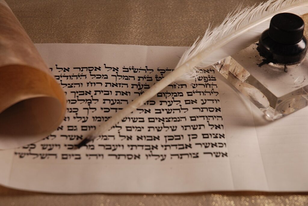
Modern lettering still takes ideas from older writing systems, even when the final piece looks new. The Smithsonian Institution catalog for calligraphy materials describes main traditions by tools and scripts, including the edged pen, the Roman alphabet, and East Asian brush writing. This background helps explain why Roman capitals still look formal, blackletter still feels historic, and brush lettering still shows movement. Source: Smithsonian Institution, accessed in 2026.
Which Core Styles Should You Know First?
You do not have to learn every style at the same time. A small set of useful styles is better than a folder packed with random alphabet screenshots. Start with styles that solve common jobs: clear headers, warm messages, strong display words, and simple decorative accents.
Serif and Sans Serif Lettering
Serif lettering has small finishing strokes at the ends of letters. It often feels classic, editorial, and a little more formal. Sans serif lettering removes those finishing strokes, so the result looks clean and current. For a notebook cover, sans serif letters can keep the layout fresh. For a certificate, serif letters usually feel more official.
- Use serif lettering for certificates, formal cards, vintage labels, and bookish designs.
- Use sans serif lettering for planners, minimal packaging, classroom signs, and clean social posts.
- Pair both styles when you need contrast, such as a bold sans serif word with a small serif subtitle.
Script and Brush Lettering
Script lettering follows the flow of connected handwriting. Brush lettering uses pressure to make thick downstrokes and thin upstrokes. These styles are common for wedding cards, gift tags, quotes, and seasonal crafts because they feel made by hand. A small wobble is not always a problem. In many cases, it makes the piece feel warmer than a perfect digital font.
Cursive has also come back into public discussion. The National Education Association reported in March 2026 that more than half of U.S. states now require or strongly encourage cursive instruction, compared with 14 states around a decade earlier. The same report notes that the 2010 Common Core standards included keyboarding but did not require cursive. That does not mean script lettering is better for every project, but it does show that connected writing still has cultural value. Source: National Education Association, March 2026.
Blackletter, Bubble, and Decorative Lettering
Blackletter uses sharp, dense strokes and a medieval feel. It suits certificates, gothic themes, tattoo-style art, and posters that need a heavier mood. Bubble lettering goes the other way: round, soft, and playful. Decorative lettering includes shadows, inline details, dots, flowers, banners, and small drawings. These styles are useful, but they need control. Add one main effect, not six.
How Do You Choose a Lettering Style for a Real Project?
The best style is not always the most detailed one. It is the style that fits the reader, the item, and the viewing distance. Before starting, ask three quick questions: Who will read it? Where will it appear? How fast does the message need to land?
Greeting Cards Need Warmth and Space
Cards are usually read close up, so small details can work well. Script lettering can make Thank You or Happy Birthday feel personal. Still, leave enough space around the main phrase. Many handmade cards look busy because the words sit too close to the border or fight with stickers, ribbon, and patterned paper. A clean layout with one strong phrase often works better than a crowded design.
Journals Need Readable Headers
Journal lettering has to be easy to repeat. You may write Mood Tracker, Weekly Plan, or Books to Read every month, so the style should not take too long. A simple sans serif header with a small shadow is faster than a full script with many flourishes. For bullet journals, a two-style system is usually enough: one readable header style and one accent style for dates, tabs, or short quotes.
Packaging Needs Instant Recognition
Packaging asks more from lettering because shoppers make quick decisions. A jar label, gift box, or stationery set needs clear words first and mood second. A 2024 Deloitte Digital study on personalization found that 80% of surveyed consumers preferred brands offering personalized experiences and reported spending 50% more with those brands. For stationery sellers, the point is simple: hand-lettered names, initials, and custom messages can make a product feel more personal when the design is still easy to read. Source: Deloitte Digital, June 2024.
What Tools Make Each Lettering Style Easier?
Good tools do not replace practice, but they do remove small headaches. Rough paper can damage a brush tip, and a pen that bleeds can ruin a neat monoline alphabet. When the pen and paper work together, you can focus on letter form instead of fighting the page.
Pencils and Fineliners for Clean Layouts
Pencils are still the safest starting tool. Use a light pencil sketch to plan height, slant, and spacing before adding ink. Fineliners work well when you want steady line weight. They are a good choice for serif, sans serif, monoline script, doodle lettering, and small journal headers. Keep two sizes nearby, such as 0.3 mm and 0.8 mm, so the main word and the small details do not look the same.
Brush Pens for Thick and Thin Strokes
Brush pens are made for contrast. Press on downstrokes and release pressure on upstrokes. Large brush tips suit envelopes, posters, and quote pages. Small brush tips are better for planners and place cards. Beginners often press too hard from start to finish. Slow down and let the pen glide rather than dig into the paper.
Paper Choice Changes the Final Line
Smooth paper helps protect brush tips and keeps ink edges cleaner. Marker paper, smooth notebook paper, and coated practice sheets can all help. Rough paper is useful for pencil texture or vintage effects, but it can wear down felt tips quickly. If you sell or gift finished pieces, test the exact pen and paper together first. One quick test sheet can save a whole afternoon, and that is a lesson most makers learn the hard way. See also: Gift Guide.
How Can You Practice Lettering Without Wasting Paper?
Practice should be small, repeatable, and easy to compare. Random copying can be relaxing, but it does not always build control. A focused 15-minute session often teaches more than two hours spent decorating one quote until the design feels overworked.
Start With a Small Alphabet Set
Pick one style and write only eight to ten letters first. Choose letters with shared shapes, such as a, d, g, o, and q. Then add tall letters like h, l, and k. This helps you see the structure behind the style. Once those letters match, move into full words. Short words like home, cake, and plan show spacing problems quickly.
Use Timed Drills, Not Long Marathons
Set a timer for ten minutes and repeat one stroke, one letter group, or one word. Then stop and compare the first line with the last line. You should see better control, even if the page looks plain. For brush lettering, practice the basic strokes before full alphabets: entrance stroke, downstroke, overturn, underturn, oval, and exit stroke.
Save Samples to Track Style Growth
Keep one page each week and date it. Write the same phrase, such as Lovely Little Letters, in the same style. After four weeks, compare the pages side by side. You will notice better spacing, smoother curves, and cleaner pressure changes. This habit also helps small stationery brands build a style library for future cards, labels, and seasonal sets.
What Mistakes Make Lettering Look Messy?
Messy lettering usually comes from simple issues, not from a lack of talent. Spacing, stroke logic, and too many effects cause most problems. Fix those three areas and even beginner work starts to look more planned.
Poor Spacing Hurts Readability
Letter spacing is called kerning in type design, but you do not need a technical term to fix it. Look at the white space between letters. If Love has a large gap after L but a tight space between v and e, the word will feel uneven. Turn the paper upside down to check the spacing as shapes instead of words. It is a simple trick, and it works well.
Mixed Stroke Logic Looks Confusing
In brush lettering, thick strokes should usually sit on downstrokes. In block lettering, stroke width should stay steady unless you plan a shadow or inline effect. Random thickness makes letters look shaky. If a style has rules, follow them first. After that, you can change the rules on purpose.
Too Many Effects Fight the Message
Shadows, highlights, outlines, dots, gradients, and banners all have their place. They just should not all be used on one small design. Use one main effect and one small accent. A black outline with a pale shadow can look clean. Add stripes, sparkles, and flowers on top, and the word may become hard to read.
- Choose one main lettering style per design.
- Limit colors to two or three for most small projects.
- Check the design from arm’s length before adding details.
- Use plain paper drafts before writing on a card, envelope, or product tag.
There is also a market reason to keep improving these skills. A public summary from Global Market Insights stated that art and creative supplies accounted for about USD 19 billion, or 16% of the stationery products market, in 2025, with a projected 4.7% CAGR through 2035. The summary linked this growth to craft communities and hand lettering content across social platforms. Forecasts can change, but the market direction is still worth noting: creative paper goods still have space for personal, handmade style. Source: Global Market Insights public market summary, 2026.
FAQ
Q1: What Are the Easiest Different Lettering Styles for Beginners? A: Start with monoline sans serif, simple serif, and basic faux calligraphy. These styles need fewer tools and make spacing easier to check.
Q2: Is Brush Lettering the Same as Calligraphy? A: Not exactly. Brush lettering uses a flexible brush tip and pressure changes, while calligraphy can use dip pens, pointed pens, broad nibs, brushes, or other traditional tools.
Q3: How Many Lettering Styles Should You Use in One Design? A: Two styles are usually enough. Use one bold display style for the main word and one simpler style for the smaller text.
Q4: What Paper Is Best for Lettering Practice? A: Smooth paper is best for brush pens and fineliners because it helps reduce fraying and bleeding. Pencil lettering can also work well on regular sketch paper.
Q5: Can Lettering Help Personalized Stationery Sell Better? A: It can, especially when names, initials, or short messages look custom and stay easy to read. Public consumer research from Deloitte in 2024 supports the wider value of personalization, though results still depend on product quality, audience, and design taste.