Creative lettering ideas for journals, cards, and classroom projects
What creative lettering means in practical stationery work
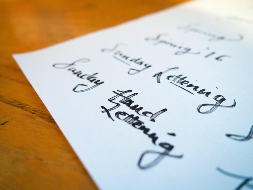
Creative lettering is the intentional design of words so the letters do more than carry information. They set mood, create hierarchy, guide the eye, and give a page a clear focal point. In stationery, journals, greeting cards, posters, and classroom displays, this usually means drawing or building letterforms rather than simply writing a neat line of text.
Most readers looking for creative lettering want practical ideas: styles they can try, materials they can use, and a process that keeps a page planned rather than crowded. This guide focuses on repeatable paper-based projects while keeping the difference between hand lettering, calligraphy, and typography clear enough to help you choose the right technique.
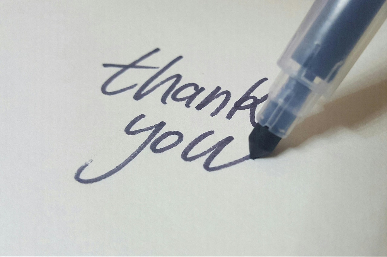
Lettering sits close to calligraphy and typography, but the process is not the same. Merriam-Webster describes calligraphy as artistic or elegant handwriting and the art of producing it, while lettering educators commonly separate calligraphy as writing letterforms from hand lettering as drawing or illustrating them. (merriam-webster.com) In practical terms, creative lettering is less about perfect handwriting and more about designing letters as shapes.
If you want more lettering-related ideas for notebooks, signs, and paper projects, explore the Lettering section for related guides.
Start with the message before choosing a style
Useful creative lettering starts with one question: what should the reader notice first? A journal title, flashcard heading, party sign, and thank-you card all need different levels of decoration. Before choosing pens or colors, write the words in plain form and mark the most important word. That word can become larger, darker, wider, curved, shaded, or illustrated, while the supporting words stay simpler.
A reliable planning sequence is:
- Message: Decide the phrase, title, label, or instruction.
- Hierarchy: Choose the main word and the supporting words.
- Shape: Fit the phrase into a rectangle, circle, banner, wave, arch, or centered stack.
- Style: Pick one decorative lettering style and one simple companion style.
- Finish: Add shadows, highlights, color blocks, borders, or small illustrations only after the structure works.
This sequence helps prevent a common beginner problem: decorating too early. When every letter has a shadow, outline, flourish, and color change, the reader has to work harder. Strong creative lettering usually has contrast. One area carries the expression, while the rest gives the eye a place to rest.
Eight creative lettering styles that work on paper
The following style ideas suit common stationery and educational projects because they can be done with pencils, fineliners, brush pens, markers, or gel pens. Use the table as a planning tool: instead of choosing a style because it looks attractive on its own, match it to the purpose of the page.
| Style | Best use | Why it works | Simple control tip |
|---|---|---|---|
| Faux calligraphy | Cards, labels, journal quotes | It creates thick-and-thin contrast without needing a flexible nib. | Write the word first, then thicken only the downstrokes. |
| Block shadow letters | Classroom posters, project covers, headings | Large forms are readable from a distance and easy to color. | Keep every shadow going in the same direction. |
| Bounce lettering | Casual planners, party signs, friendly notes | Changing the baseline adds movement and a handmade feel. | Let only some letters bounce; keep the word readable. |
| Serif display caps | Book labels, study headers, formal cards | Small finishing strokes make plain capitals feel structured. | Use light pencil guidelines for cap height and spacing. |
| Ribbon letters | Gift tags, celebration cards, banners | Folded strokes add dimension without heavy shading. | Mark the fold areas before adding color. |
| Negative-space lettering | Art journal pages, covers, posters | The letters appear through the background, making the layout feel designed. | Outline the letters in pencil before filling the surrounding area. |
| Monoline script | Minimal stationery, habit trackers, captions | Even line weight is clean, quick, and easy to repeat. | Focus on consistent spacing rather than decoration. |
| Illustrated letters | Seasonal cards, subject displays, themed notebooks | Small drawings inside or around letters reinforce the topic. | Limit illustrations to the main word so the page does not become noisy. |
A practical pairing rule is to combine one expressive style with one quiet style. For example, use block shadow letters for the main word Science and small monoline capitals for project notes. Use faux calligraphy for Thank you and simple printed caps for the recipient name. The contrast makes the page feel intentional.
Tools and paper choices that affect the result
Creative lettering does not require unusual tools. Beginners often make faster progress with a pencil, eraser, ruler, and two or three dependable pens. The important point is to understand what each tool does well.
- Pencil: Best for guidelines, composition boxes, and first drafts. Use light pressure so the marks erase cleanly.
- Fineliner: Good for outlines, monoline lettering, small details, and controlled corrections.
- Brush pen: Useful for pressure-based strokes, bounce lettering, and expressive headings.
- Marker: Good for block letters, shadows, and high-contrast display words.
- Gel pen: Useful for highlights, dark-paper accents, sparkle effects, and small decorative marks.
Paper matters because ink behavior changes with surface texture and absorbency. Smooth paper usually helps fineliners and brush pens glide cleanly. Rough paper can create a more textured handmade look, but it may wear brush tips faster. Very wet markers may bleed through thin notebook paper, so test a corner or back page before committing to a final spread.
For classroom or group projects, choose methods that work with ordinary supplies. Faux calligraphy, block shadows, and outlined capitals are strong options because they do not depend on expensive pens. This keeps the activity accessible while still teaching hierarchy, spacing, and shape control.
A repeatable workflow for cleaner lettering projects
A polished lettering piece may look spontaneous, but it is usually built in layers. Historic lettering instruction also treated letterforms as a craft that benefits from tools, structure, and practice. Edward Johnston’s early twentieth-century handbook, Writing & Illuminating, & Lettering, is described by Project Gutenberg as a technical guide connecting practical technique, letter forms, craftsmanship, and design. (gutenberg.org)
- Draft the phrase small. Make three thumbnail layouts before drawing large. Try a centered stack, a curved arrangement, and a banner shape.
- Draw a container. A rectangle, oval, arch, or ribbon gives the words a boundary and helps spacing.
- Place the largest word first. Fit the main word before adding smaller words around it.
- Sketch skeleton letters. Use simple single-line forms to check spacing, rhythm, and alignment.
- Build weight and style. Add thickness, serifs, shadows, curves, or flourishes only after the skeleton works.
- Ink in stages. Outline first, let the ink dry, erase pencil lines, then add color and highlights.
- Review readability. Step back or take a quick photo. If the words are hard to read, reduce decoration before adding more.
This workflow is especially helpful for cards and display projects because it separates composition from decoration. If the layout is weak, extra color rarely fixes it. If the layout is strong, even simple black-and-white lettering can look finished. See also: Gift Guide.
How creative lettering improves journals, cards, and learning materials
Creative lettering works because letters are visual forms as well as language. AIGA’s Eye on Design has discussed handwriting as a gestural act that can help designers understand letter structure, and an AIGA teaching resource describes hand-drawn type as custom lettering that cannot be produced merely by typing on a keyboard. (eyeondesign.aiga.org) That design perspective helps explain why handmade headings still matter in paper goods: small variations can add emphasis, warmth, and personality.
For journals and planners
In journals, lettering creates navigation. Monthly pages, habit trackers, reading logs, and study spreads are easier to scan when headings follow a consistent style. A simple system might use bold block capitals for months, monoline script for section labels, and small icons for categories. The goal is not to decorate every line. It is to help the reader return to the page and understand its structure quickly.
For cards and gift tags
On cards, tone matters. Rounded letters feel friendly; narrow capitals feel formal; loose bounce lettering feels cheerful; serif capitals feel more traditional. A useful card layout has three parts: a large greeting, a smaller personal message, and one visual accent such as a border, flower, star, ribbon, or underline. Leaving margin space around the greeting makes the design feel calmer and more intentional.
For classroom projects
For classroom posters, book reports, vocabulary cards, and bulletin boards, readability should lead the design. Use thick letters for the main label, strong contrast between text and background, and limited decorative detail. Students can still be creative with subject-related details, such as leaf textures for biology terms, ruler marks for math headings, or map-line patterns for geography displays.
Common lettering mistakes and simple fixes
Most lettering problems are planning problems rather than talent problems. These fixes can make an immediate difference.
- Uneven spacing: Look at the spaces between letters, not just the letters themselves. Pencil the word lightly and adjust before inking.
- Too many styles: Limit each piece to two lettering styles. If the page needs variety, change size or color instead of adding another style.
- Weak contrast: Make the main word clearly larger, bolder, darker, or more decorative than the supporting text.
- Crowded margins: Leave breathing room around the lettering. Empty space is part of the composition.
- Unclear shadows: Choose one light direction. If shadows move left on one letter and right on another, the word will feel unstable.
- Overworked color: Use a limited palette. Two colors plus black often look cleaner than five unrelated colors.
Before finishing, ask two questions: can the phrase be read in three seconds, and does the decoration support the meaning? If the answer to either question is no, simplify the weakest area.
Frequently asked questions
Is creative lettering the same as calligraphy?
No. They overlap, but they are not identical. Calligraphy is usually based on writing controlled strokes with a tool, while hand lettering focuses on drawing or constructing letterforms. A finished word may look similar, so the difference is often in the process rather than the final appearance.
Can beginners do creative lettering without brush pens?
Yes. A pencil, eraser, ruler, and fineliner are enough for many styles, including block letters, faux calligraphy, serif capitals, banners, and outlined display words. Brush pens are useful, but they are not required for expressive lettering.
What is the easiest creative lettering style to start with?
Faux calligraphy is a practical starting point because it teaches thick-and-thin contrast without requiring pressure control. Write the word normally, identify the downstrokes, thicken those areas, and fill them in evenly.
How do I make lettering look balanced?
Use pencil guidelines, place the main word first, and keep a consistent margin around the design. Balance does not mean every side must be identical; it means the visual weight feels controlled. If one corner is heavily decorated, another area may need space or a smaller accent.
How many lettering styles should I use on one page?
For most journals, cards, and classroom pages, one decorative style plus one simple supporting style is enough. More styles can work, but they require stronger control of spacing, scale, and color.