Is Roman Lettering Style Better than Modern Calligraphy for Clean Designs?
What Makes Roman Lettering Style Look So Timeless?
If you need lettering that looks calm, formal, and usable on a notebook label, roman lettering style is a safe place to start. It fits well in lettering because it combines hand work with clear design rules. The letters feel old, but they do not feel out of date. A clean Roman capital on a cream card can look as neat as a fresh black fineliner at the start of the week.
Monumental Capital Roots
Roman lettering comes from inscriptional capitals, the kind carved for public messages, temples, columns, gates, and memorial stones. That public use shaped the style, so the forms had to be readable from a distance, serious in tone, and balanced across a full line. The Victoria and Albert Museum reports that the original Trajan Column frieze runs for over 200 meters and contains 155 scenes with more than 2,500 figures. Its cast has stood in the V&A Cast Courts in two parts since 1873, and the museum notes that copies of the lettering were sold to art schools for £7 a panel. That tells us these letters became a teaching model, not only an old decoration. (vam.ac.uk)
Brush Logic before Stone
The best Roman capitals do not look like rigid geometry. They still look as if a trained hand made them. Adobe Fonts explains that the Trajan typeface, designed by Carol Twombly in 1989, was based on the inscription at the base of Trajan’s Column, and that the letters are believed to have been written first with a brush before being carved. For practice, this point is useful because it changes how you draw the stroke. Work as if a flat brush made the line first, then clean up the edge. Most of the life comes from the change in pressure.
Balanced Thick and Thin Strokes
The classic look comes from contrast. Vertical strokes often carry more weight, while horizontals and curves are usually lighter. Do not make every stroke the same block width, or the letters will turn flat. A Roman E with a solid spine and lighter arms looks steady. A Roman O with a slight axis and uneven weight feels more human. This is why the style works well for certificates, journal headings, sports award cards, and handmade shop signs.
How Should You Draw the Basic Roman Lettering Style Forms?
Start with the alphabet as a few related groups, not as twenty-six separate jobs. Roman lettering rewards repeated habits. You will get cleaner work if you group letters by structure, draw slowly, and leave decoration until the basic skeleton sits correctly.
Start with Simple Capital Groups
Begin with straight letters such as I, H, E, F, L, and T. These letters teach stem weight, horizontal arms, and clean endings. Then move to round letters such as O, C, G, and Q, because they show where curves start to cause trouble. After that, work on diagonals such as A, V, M, N, W, X, Y, and Z. Last, add B, P, R, and S because bowls and curves need more control. A small practice card with four lines per group is enough for one session.
Build Width before Decoration
Roman capitals do not all need the same width. O, C, D, G, M, N, and Q often need more space. E and F are narrower, while L can stay slim but still needs a firm foot. If every letter sits inside the same square, the word may look mechanical. Try writing ROMAN, then mark the visual center of each letter. You will see that M needs air, while I needs very little. That small difference is normal.
Add Serifs with a Light Touch
Serifs are small finishing strokes, not blocks stuck onto the alphabet. Keep them curved, modest, and connected to the main stroke. Edward Johnston’s 1906 book Writing and Illuminating and Lettering records details from the Trajan inscription, including letter heights that step down from about 4 1/2 inches in the upper lines to about 3 7/8 inches in the last line, plus thin parts roughly half the width of thick stems. For desk practice, the point is simple: change size and weight on purpose, not by accident. (gutenberg.org)
Which Tools and Paper Help You Practice Roman Lettering?
You do not need a museum-level setup. Still, the wrong tool can slow your hand down for the whole afternoon. A clean Roman style needs steady guidelines, smooth paper, and a pen that shows contrast without dropping too much ink.
Pencil Layouts before Ink
Use a 2H or HB pencil for a light skeleton. Draw cap height, baseline, and a middle guide before you think about ink. For a greeting card, a cap height of 8 to 12 mm is easy to handle. For an A4 poster title, 25 to 40 mm gives you room to shape serifs. Ink only after the word spacing feels steady. Rushing this step is how a good V turns into a strange fork, and nobody wants that on a gift tag.
Broad Nibs and Brush Pens
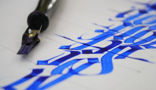
A broad-edge nib teaches stroke angle quickly because it shows every change in movement. A small flat brush gives softer curves. A brush pen can also work, though many flexible tips make Roman letters too springy if you press too hard. Frontiers in Psychology published a 2024 high-density EEG study with 36 university students; it found that handwriting with a digital pen produced more widespread brain connectivity patterns than keyboard typing. For lettering practice, the working lesson is practical, not mystical. Slow hand movement helps you see shape, rhythm, and mistakes. (frontiersin.org)
Smooth Paper with Clear Guidelines
Choose smooth paper for ink and slightly toothy paper for pencil drills. Dot grid pages are useful because they guide width without taking over the design. If ink feathers, change the paper before blaming the pen. Many beginners buy three new pens when one better sheet would solve the problem. Keep a scrap page beside you to test flow, especially with black pigment ink.
- Use pencil first for layout and correction.
- Keep one broad nib, one fineliner, and one brush pen nearby.
- Practice one alphabet group per session, not the whole alphabet every time.
How Can Spacing Make Roman Capitals Look Professional?
Spacing is where Roman lettering either looks clean or starts to fall apart. The letter shapes may look good alone, but a word is judged as one line. Your eye should move from left to right without hitting odd gaps.
Equal Visual Space, Not Equal Math
Do not measure every gap with the same ruler distance. The space between A and V can be tight because their diagonals open toward each other. The space after L may need more room because its foot sticks out. O beside T may feel loose if you leave too much air. Squint at the word and check the gray rhythm. If that rhythm looks even, the spacing is probably close.
Line Height from Historic Examples
Historic inscriptions often changed letter height across lines to help viewing and show hierarchy. The same idea still works on paper. You can make the first line of a certificate slightly taller than the name line, or make a team motto smaller than the team name. A Roman Inscriptions of Britain record for a Trajan building inscription from York, dated AD 107 to 108, describes a stone tablet measuring 1.118 by 1.143 meters and notes capital letters with unusual serifs. Even in Roman work, real examples show variety. Clean does not mean identical. (romaninscriptionsofbritain.org)
Small Dots and Clean Word Gaps
Ancient inscriptions often used separators between words. You can borrow that idea, but use it with care. A centered dot between short words can look classic on a label, menu card, or award ribbon. Do not use it everywhere. On a long quote, plain spacing is easier to read. For modern stationery, a small dot between initials or short phrases gives a little formality without making the page look like a museum wall. See also: Gift Guide.
Where Does Roman Lettering Style Work Best Today?
Roman lettering is strongest when the message needs calm authority. It is not the right fit for every mood. It can look too formal on a playful birthday doodle, but it works well when the design needs clarity, respect, or tradition.
Certificates, Labels, and Cards
Use Roman capitals for names, award titles, date lines, place cards, and handmade labels. The style fits ivory paper, navy ink, dark green ribbon, and gold edging. Keep the wording short, because Roman letters need room to breathe. A card that says BRAVE WORK or FIELD DAY 2026 will usually look better than a full paragraph forced into capitals.
Posters, Team Signs, and Covers
For sports and school posters, Roman capitals can give a team name a classic crest feeling. Try one strong main word, smaller supporting text, and a simple line ornament. If the poster will hang on a gym wall, test it from three meters away. If it reads at that distance, it will probably read online too. If it does not, widen the spacing and remove the extra flourish.
Digital Titles with Human Warmth
Digital Roman fonts are useful for mockups, but hand lettering adds a human feel. A scanned Roman heading can become a sticker, planner cover, product label, or social post. Keep the edges a little imperfect, because too much cleanup removes the hand-made look. The goal is not to copy a font perfectly. The goal is to make a clear letter that still carries your hand.
What Common Mistakes Should You Avoid?
Most Roman lettering mistakes come from doing too much. Too many serifs, too much contrast, too much spacing, and too much worry can all make the work stiff. Bring the style back to bones, rhythm, and clean endings.
Heavy Serifs on Every Stroke
Large serifs can make letters look clumsy. Keep them smaller than you first expect, then step back and look again. If the serif is the first thing you notice, it is probably too strong. The main stroke should lead the letter. The serif should only finish the motion, like a quiet end note.
Wide Words with Weak Rhythm
Long words in Roman capitals can become stiff. Break a phrase into two lines when needed, especially on cards, posters, and certificates. For example, CLASSIC LETTERING PRACTICE may read better as CLASSIC LETTERING on one line and PRACTICE below. Use hierarchy instead of squeezing letters until they lose shape and rhythm.
Perfect Fonts Used as Handwriting
Copying a digital font stroke for stroke can teach proportion. It can also make your hand tense if you follow it too tightly. Study the font, then draw with a pencil and leave small differences. A warmer O or a quieter R tail can make the page feel made by hand, not pasted from a file.
FAQ
Q1: Is Roman Lettering Style Good for Beginners? A: Yes. Start with straight capitals, light pencil guides, and short words. The style looks formal, but the basic strokes are easy to break into steps.
Q2: What Pen Should You Use First? A: A pencil and fineliner are enough at the start. Add a broad-edge nib later when you want stronger thick and thin contrast.
Q3: Should Roman Letters Always Be All Caps? A: Traditional inscriptional Roman lettering is capital based. For modern stationery, you can pair capitals with a simple lowercase style, but keep the main title in caps.
Q4: How Much Spacing Should Roman Lettering Have? A: Use visual spacing, not equal measured gaps. Round letters, diagonals, and narrow letters all need different amounts of air.
Q5: Can You Use Roman Lettering Style for Sports Designs? A: Yes. It works well for team names, award certificates, event posters, and crest-style layouts when you need a strong classic tone.