How Can Lettering ABC Make Alphabet Practice Look Clean and Creative?
Why Does Lettering ABC Still Matter for Creative Practice?
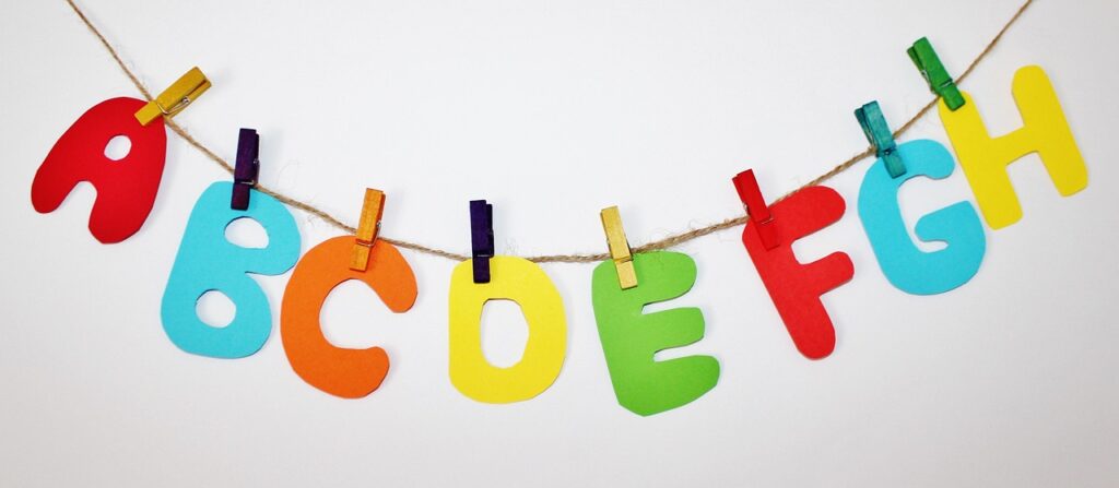
Lettering abc looks simple, but it is often the quickest way to get better hand control before making cards, planner headers, classroom sheets, gift tags, or small signs. If you need more alphabet practice ideas and stationery uses, the Lettering section is a good place to browse. One ABC sheet works like a small design check: 26 uppercase forms, 26 lowercase forms, repeated strokes, spacing habits, and style choices all sit on one page.
A Full Alphabet Builds Visual Control
Single words can cover up weak letters. A full alphabet makes them easy to see. When you write A through Z, you can tell which shapes lean too far, which letters take too much width, and which curves look tight. This is why an ABC page is useful for beginners, teachers, and product testing. One sheet can show how a brush pen bends, how ink sits on paper, and how one style handles tall forms like H and round forms like O.
Letter Names Support Real Classroom Goals
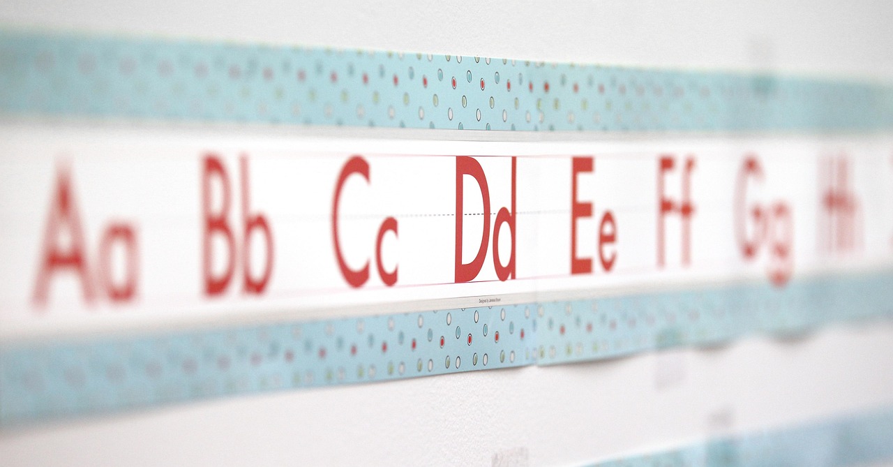
The alphabet has a real classroom use, not only a craft use. The Common Core State Standards for kindergarten reading foundational skills list recognizing and naming all upper and lowercase letters as a standard, and the language standards include printing many upper and lowercase letters. In a classroom, lettering practice is not just decoration. It can link letter shape, letter name, and early writing confidence in one hands-on task. (thecorestandards.org)
Hand Practice Still Has a Place
Digital templates help, but hand practice still has value. A 2025 study in the Journal of Experimental Child Psychology tested 50 prereaders learning nine new letters and 16 pseudowords across handwriting, tracing, and typing conditions. The children in handwriting groups showed higher accuracy across posttest tasks than the typing groups. For lettering, the point is simple: when the hand moves through each letter shape, the learner notices form, direction, and rhythm. (sciencedirect.com)
What Supplies Make Lettering ABC Easier to Learn?
You do not need a desk full of pens. Too many tools can slow practice because each pen feels a little different. A starter setup is enough: smooth paper, a pencil, a fine liner, and one or two brush pens. Add color after the alphabet starts to feel steady. That small setup can make many useful ABC sheets.
Smooth Paper Protects Brush Tips
Brush pens do not work well on rough paper. The tip catches fibers, the line edge turns fuzzy, and the pen can fray before the first week of practice is over. Smooth marker paper, layout paper, or a clean practice pad gives the tip less drag. With wet markers, test one corner first. If ink feathers into the paper like a small spiderweb, keep that sheet for pencil layouts, not final lettering.
Safe Markers Matter for Shared Use
If lettering supplies go into schools, workshops, or family craft kits, labeling is part of the product work. The U.S. Consumer Product Safety Commission says art materials sold to consumers in the United States must have a toxicological review for chronic hazards and proper labeling; it also notes the ASTM D-4236 conformance statement after review. For children’s art materials, the CPSC guidance also references CPSIA limits such as 90 parts per million for lead in surface coatings and 100 parts per million for total lead in substrate. Buyers often check this information before adding markers to a shared kit, so it should be easy to find. (cpsc.gov)
Pencils Keep Early Layouts Flexible
A pencil is still the lowest-cost layout tool on the desk. Use it to mark x-height, baseline, cap height, and slant before ink touches the page. A soft pencil also helps with pressure control. Press down for a heavier stroke, lift for a lighter stroke, and repeat the same movement. It feels old school, but it works, and erasing one crooked guide line is better than throwing away a finished card.
How Should You Practice Each Letter Without Getting Stuck?
Useful lettering practice is short, repeatable, and focused on one issue at a time. Do not try five styles, six colors, and a quote in the same session. Pick one alphabet, one pen, one page size, and one goal. The goal might be smoother curves, cleaner spacing, or simply finishing A to Z without rushing the last seven letters. Many beginners rush that last part, even when the first half of the page looks fine.
Start With Basic Strokes
Most lettering alphabets come from a few movements: vertical lines, oval curves, entry strokes, exit strokes, crossbars, and small loops. Practice these for three to five minutes before writing the full alphabet. For brush lettering, keep downstrokes heavier and upstrokes lighter. That pressure change gives modern lettering its brush look. If every stroke has the same pressure, the alphabet can still be neat, but it will read more like monoline writing.
Group Letters by Shape
Alphabetical order is useful when you need a finished display sheet, but shape groups are better for practice. Work on O, C, G, and Q together because they share round movement. Try I, H, T, and L together because they use a straight structure. Practice n, m, h, and r as one family because the arches repeat. This grouping saves time and makes repeated mistakes easier to spot.
Use Short Sessions and Real Words
Ten focused minutes usually works better than an hour of tired tracing. After one ABC line, write real words that include the letters giving you trouble. If your S is weak, write “sun,” “silver,” and “season.” If your lowercase r looks odd, try “river,” “green,” and “bright.” Real words show spacing problems that alphabet rows can hide, especially around narrow letters like i and wide letters like w.
Which Lettering ABC Style Fits Your Project Best?
A good alphabet should fit the job, not only look nice. A classroom chart needs clear forms. A wedding place card can use flourishes if the names stay readable. A sports poster needs stronger weight and quick reading from a few feet away. Match the style to the project before choosing the pen, or the design may fight you from the first line.
Monoline Alphabets for Clean Labels
Monoline lettering uses one line width. It works well for notebooks, file labels, planner tabs, flashcards, and simple packaging notes. Beginners often start here because there is no pressure change to manage. Use a fine liner or gel pen, keep the slant steady, and leave a small gap between letters. The page looks clean without much extra work.
Brush Lettering for Cards and Quotes
Brush lettering gives greeting cards, quote pages, and gift tags a warmer hand-made feel. The style depends on pressure, so the pen size has to match the project. A large brush tip on a tiny tag can look cramped. A small brush pen on an A3 poster may look too light. For most beginners, medium tips are easier because the hand can see the pressure change more clearly.
Block Letters for Posters and Banners
Block letters are bold, readable, and easy to color. Draw the outer shape first, then add inline details, shadows, or patterns if the project needs them. This style works well for classroom boards, club notices, birthday banners, and sports day signs. If the project will be seen from far away, skip thin decorative lines. Big spaces, high contrast, and simple fills do more work. See also: Gift Guide.
How Can Teachers, Parents, and Sellers Use Lettering ABC Pages?
Lettering abc pages can serve as practice sheets, product samples, or project starters. That range is useful for stationery buyers and sellers. One alphabet sheet can show line quality, color strength, bleed-through, and paper texture without a long product demo. It is a small sample, but it gives honest information.
Classroom Warmups With Clear Lines
For learners, use wide guidelines and leave room for uneven starts. A page with three rows is often better than a crowded worksheet. Try one uppercase row, one lowercase row, and one short word row. Add a small picture prompt only when it helps the task, not just because the page looks empty. Clear space makes the hand calmer and lets the teacher see the letter shapes.
Journal Headers and Planner Pages
For journals, an ABC page can become a personal style bank. Write the alphabet in two or three styles, then use those letters for monthly headers, habit trackers, recipe pages, or study notes. Pinterest Trends explains that its trend graphs index a search term from 0 to 100 within the selected period, which is a useful reminder for content planning: visual search interest can change by season, so alphabet ideas for back-to-school, holidays, and planners may peak at different times. This helps sellers plan samples and posts without guessing the whole calendar. (help.pinterest.com)
Retail Kits With Honest Product Notes
For stationery sellers, a good kit description should say what the tools do well. Note whether paper suits brush pens, markers, pencils, or mixed media. Mention if a pen is better for small lettering or large headers. Do not promise “perfect lettering in one day.” A plain line such as “good for daily alphabet drills and card practice” sounds less flashy, but it helps buyers choose the right item.
What Common Mistakes Make Lettering ABC Look Messy?
Most messy alphabet sheets have simple causes. The letters do not sit on the same baseline, spacing changes too much, or the pen and paper do not match. These problems can be fixed with slower strokes and a better setup. You do not need special talent, but you do need to look at the page before adding more ink.
Uneven Spacing Between Letters
Spacing is not always an equal measurement. It is equal visual space. The gap between A and V may need to look smaller than the gap between H and I because the shapes create different white space. After finishing a row, squint at it for a few seconds. Odd gaps stand out when the small details blur.
Heavy Pressure on Every Stroke
Beginners often press too hard because they want more control. The page then looks tight, and brush tips wear down faster. Relax your grip, slow the upstroke, and let the downstroke carry the weight. If your hand gets sore after a few minutes, stop and shake it out. Lettering should not feel like opening a stuck jar.
Wrong Paper for Wet Ink
Paper choice affects how long a piece lasts, especially for keepsakes. The Library of Congress preservation guidance notes that paper quality, storage conditions, acidity, fiber length, and lignin all affect deterioration; it also says good quality paper stored in cooler conditions with 30 to 40 percent relative humidity can last a long time, even hundreds of years. For a practice sheet, cheap paper is fine. For a framed alphabet or memory card, choose better paper and test the ink first. (loc.gov)
- Use smooth paper for brush pens and markers.
- Add pencil guides before final ink.
- Test bleed-through before making cards or signs.
- Keep finished keepsakes away from strong light and damp spaces.
FAQ
Q1: What Is the Best Way to Start Lettering ABC? A: Start with one simple monoline alphabet, pencil guides, and short daily practice. Move to brush lettering after spacing and basic shapes feel steady.
Q2: Do You Need Brush Pens for Lettering ABC? A: No. A pencil, fine liner, or gel pen is enough for clean alphabet practice. Brush pens help when you want thick downstrokes and thin upstrokes.
Q3: How Many Minutes Should You Practice Each Day? A: Ten to fifteen minutes is enough for most beginners. Practice one stroke group, one alphabet row, and three real words instead of filling pages with no clear target.
Q4: What Paper Works Best for Beginner Lettering? A: Smooth practice paper works best for brush pens because it reduces drag and fraying. For keepsakes, choose better quality paper and test how the ink behaves.
Q5: Can Lettering ABC Be Used for School Activities? A: Yes. It can support alphabet recognition, handwriting practice, classroom labels, flashcards, and creative warmups, as long as the supplies are age appropriate and properly labeled.