Cursive letters guide for readable handwriting and lettering practice
What cursive letters are
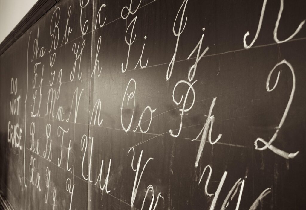
Cursive letters are handwritten letterforms designed to move smoothly from one character to the next, often with joining strokes within a word. For learners, the aim is not decorative perfection. It is readable movement: consistent shapes, clear joins, steady spacing, and a rhythm that does not slow writing down. That makes cursive useful in two related ways. It can support everyday handwriting for notes, signatures, and reading older documents, and it can also provide a base for lettering projects, invitations, labels, journals, and classroom displays. The most effective approach is to group similar letters, practice joins deliberately, and check legibility before adding style.
The phrase “cursive letters” usually refers to both lowercase and uppercase script forms. Lowercase letters matter most for everyday fluency because they connect often inside words. Uppercase cursive letters are usually more decorative, and many handwriting systems do not require every capital to connect to the next letter.

For more lettering-related ideas and guides, you can also browse the Lettering section.
Why cursive still matters in a digital writing environment
Cursive is no longer the only practical way to write quickly, and it should not be treated as a replacement for typing. It still has a place when the task calls for hand control, personal style, or the ability to read handwritten material. A student may use cursive for signatures and short notes. A crafter may use it for graceful labels. A teacher may introduce it as one part of handwriting instruction. A hobbyist may study it as a bridge between everyday penmanship and calligraphy.
Education policy around cursive varies. The Common Core English language arts standards emphasize writing, language conventions, spelling, and composition, but the original Common Core standards did not make cursive a separate national standard. Some states and districts have added their own cursive or joined-handwriting expectations. For example, public education materials from California and South Carolina describe instruction in cursive or joined italics at appropriate grade levels. The practical takeaway is simple: do not assume every school teaches cursive in the same grade or with the same script model.
Cursive also has reading value. Archives, libraries, and historical document programs often note that older handwritten records can be difficult for modern readers because handwriting styles and cursive instruction have changed. Learning common cursive letter shapes helps readers recognize names, dates, signatures, and family records that may not be easy to interpret from print knowledge alone.
The basic anatomy of cursive letters
Readable cursive depends on a small set of visual features. Once you understand them, individual letters become easier to learn and easier to troubleshoot.
- Entry stroke: the beginning movement that leads into a letter.
- Exit stroke: the ending movement that prepares the pen for the next letter.
- Baseline: the writing line on which most letters sit.
- X-height: the height of short lowercase letters such as a, e, i, m, n, o, r, s, u, v, w, and x.
- Ascender: the upper part of tall lowercase letters such as b, d, f, h, k, l, and t.
- Descender: the lower loop or stroke in letters such as g, j, p, q, y, and sometimes z.
- Slant: the angle of the letters. A slight, consistent slant is usually easier to read than a dramatic slant that changes from word to word.
These features are more important than copying a single alphabet perfectly. If the baseline wanders, the x-height changes constantly, or the joins are unclear, even attractive letters become hard to read. Handwriting research and occupational therapy materials often evaluate legibility through factors such as letter formation, size, spacing, alignment, and missing or extra strokes. Those same factors are useful for anyone practicing cursive at home.
Lowercase cursive letters by movement group
Many beginners try to memorize the alphabet from a to z. A better method is to practice cursive letters by movement family, because letters with similar shapes share related motor patterns. Different handwriting programs use different group names, but the principle is consistent: group letters by how the pen moves.
| Movement group | Common letters | What to watch |
|---|---|---|
| Oval and counterclockwise letters | a, c, d, g, o, q | Keep the oval closed enough that a does not look like u and o does not look like a loose loop. |
| Short upward-curve letters | i, t, u, w, r, s | Maintain even x-height and place dots or crosses after the word, not during every stroke. |
| Hump letters | n, m, v, x, y, z | Separate humps clearly so n, m, u, and w do not become a row of identical waves. |
| Loop letters | b, e, f, h, k, l | Keep loops narrow and tall enough to distinguish e from l and h from b. |
| Descender letters | g, j, p, q, y | Bring the descender below the baseline consistently, then return smoothly to the next letter. |
Start with large letters on lined paper. Oversized practice makes it easier to see whether the direction, spacing, and joins are correct. Once the movement is reliable, reduce the size gradually. If you begin too small, the hand often hides mistakes instead of fixing them.
Uppercase cursive letters and when to connect them
Uppercase cursive letters are where style differences become most visible. A capital A, G, Q, S, or Z may look very different depending on whether the model comes from traditional school penmanship, modern joined italics, monoline lettering, or decorative calligraphy. This is why learners should not worry when two charts disagree. The key question is whether the capital is recognizable in context.
In everyday handwriting, uppercase cursive letters usually appear at the beginning of names, sentences, titles, and initials. Many writers leave a small space after a capital and begin the lowercase connection with the next letter. Others use a capital exit stroke. Both approaches can be acceptable if the result is legible and consistent.
For lettering projects, uppercase letters often act as focal points. You can make them larger, more open, or slightly more decorative than lowercase letters. Still, the capital should not overpower the word. A highly ornamented capital followed by cramped lowercase letters creates imbalance. A practical rule is to choose one main flourish per capital and keep the rest of the word calm.
How to connect cursive letters without losing legibility
Joining is the feature that makes cursive feel different from print, but it is also where many mistakes happen. A join should guide the eye from one letter to the next without changing either letter into a different shape.
Practice high-frequency joins first
Instead of practicing random pairs, begin with common combinations such as in, it, th, he, er, an, on, ing, and ell. These pairs and clusters appear often enough in English that the practice transfers quickly into real writing. The combination “ing” is especially useful because it includes a short letter, a hump movement, and a descender.
Lift the pen when clarity improves
Some people think cursive means the pen must never leave the page until the word ends. In practical handwriting, strategic lifts are normal. Many writers lift before or after difficult letters, before punctuation, and after capitals. A small lift is better than a forced join that makes the word unreadable. See also: Gift Guide.
Check the join, not just the letter
A letter may look correct in isolation but fail inside a word. For example, a cursive r can collapse into an i-like shape if the entry stroke is too low. A cursive o may look like a if the exit stroke is misplaced. After practicing a letter alone, write it in three word positions: beginning, middle, and end.
A practical practice routine for beginners
A good cursive routine is short, focused, and measurable. Ten attentive minutes usually help more than thirty rushed minutes of copying. Use a smooth pen or pencil, paper with visible lines, and enough space for the hand to move freely.
- Warm up with strokes for one minute. Make rows of small loops, ovals, humps, and upward curves. The goal is rhythm, not decoration.
- Choose one letter family. Practice three to five related letters rather than the whole alphabet.
- Write isolated letters. Check starting point, stroke direction, height, and baseline control.
- Add two-letter joins. Combine the target letter with easy neighbors, such as a to n, o to n, l to e, or i to n.
- Move into words. Use short, familiar words so spelling does not distract from movement.
- Review one line. Circle the clearest example and mark one thing to improve next time.
Beginners often want worksheets for every possible word, but the most useful worksheet is one that repeats a small skill with enough variation to keep the brain engaged. Copying a perfect alphabet page once is less effective than writing five everyday words clearly every day for a week.
Common cursive mistakes and how to fix them
Most cursive problems are not mysterious. They usually come from inconsistent size, unclear letter starts, poor spacing, or overdecorated strokes. The fixes are simple, but they require attention.
| Problem | Likely cause | Practical fix |
|---|---|---|
| Words look like one long wave | Hump letters are too similar | Slow down on n, m, u, and w; make each turn distinct. |
| Letters float above or below the line | Weak baseline control | Use lined paper and pause briefly after every three words to reset alignment. |
| Loops become tangled | Loops are too wide or slanted inconsistently | Narrow the loop and keep tall letters parallel. |
| Spacing feels crowded | Exit strokes are too long or words are too close | Shorten joins and leave a clear finger-width or visual space between words. |
| Writing is pretty but hard to read | Too many flourishes | Remove extra swashes until the base letter is clear. |
For young learners, difficulty with cursive may also reflect fine-motor development, visual spacing, attention, or the amount of direct instruction received. If handwriting causes pain, unusual fatigue, or major school difficulties, families should seek guidance from a qualified teacher, occupational therapist, or relevant school support professional rather than relying only on generic worksheets.
Using cursive letters in lettering projects
Cursive handwriting and decorative lettering overlap, but they are not the same. Handwriting values speed and consistency. Lettering values composition, spacing, and visual effect. When using cursive letters in a project, slow down and treat each word as a shape.
- Plan the word first. Lightly mark the beginning, center, and end so the word does not run out of space.
- Choose a slant angle. A consistent slant gives the word unity.
- Limit flourishes. Add them to capitals, descenders, or final letters, but not everywhere.
- Use contrast carefully. Thick downstrokes and thin upstrokes can create a calligraphy effect, but they should follow the letter structure.
- Test readability at a glance. If a label, card, or sign cannot be read quickly, simplify it.
For stationery, journals, greeting cards, and classroom materials, a clean monoline cursive style is often more practical than elaborate script. It reproduces well with regular pens, markers, gel pens, brush pens, and digital styluses, and it leaves room for borders, icons, color blocks, or other design elements.
Frequently asked questions
Are cursive letters the same as calligraphy?
No. Cursive is a handwriting style based on connected or flowing letters. Calligraphy is a broader lettering art that focuses on deliberate strokes, tools, contrast, and composition. A person can write cursive without doing calligraphy, and a calligrapher may use scripts that are not everyday cursive.
Should beginners learn lowercase or uppercase cursive first?
Lowercase letters usually deserve more practice because they appear more often and form most word joins. Uppercase letters can be learned alongside them, but beginners should not spend all their time on decorative capitals before they can write simple lowercase words clearly.
Is it wrong to lift the pen in cursive?
No. Practical cursive often includes small pen lifts, especially around capitals, difficult joins, punctuation, and letters that would become unclear if forced to connect. Legibility matters more than never lifting the pen.
How long does it take to learn cursive letters?
It depends on age, previous handwriting habits, fine-motor control, and practice consistency. Many learners can recognize and form the basic alphabet after several focused sessions, but fluent, readable cursive usually takes repeated practice with real words and sentences.
What is the best paper for practicing cursive?
Lined paper is the most useful starting point because it supports baseline control, letter height, and spacing. Younger learners may benefit from wider lines. Lettering hobbyists may prefer guide sheets under smooth paper so practice marks do not appear in the final project.