Alphabet in calligraphy for beginners with styles, tools, and practice steps

What the alphabet in calligraphy means
The alphabet in calligraphy is more than A to Z written neatly. It is a system of letterforms shaped by tool angle, stroke order, spacing, rhythm, and style. Ordinary handwriting is usually designed for speed and legibility. Calligraphy is built more deliberately, so the full alphabet feels consistent, expressive, and visually balanced.
For beginners, the most useful starting point is one alphabet style. Study its basic strokes, then practice letters in related groups instead of copying all 26 letters at random. This makes it easier to understand why an italic a, a Roman capital A, and a modern brush-lettered A can all belong to the Latin alphabet while looking and behaving very differently.
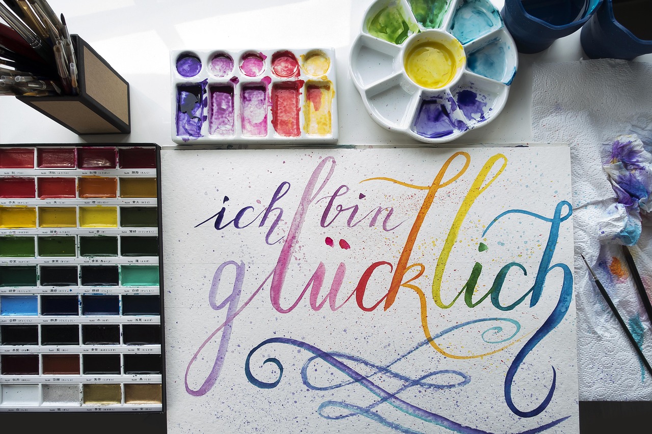
This guide focuses on the Latin alphabet because it is the alphabet most often used in English-language lettering practice. For more lettering topics and project ideas, visit the lettering section.
Calligraphy, lettering, and typography are related but not identical
Before practicing an alphabet, it helps to separate three terms that are often used together. Calligraphy is written. Lettering is usually drawn. Typography arranges repeatable typeforms for print or digital use.
In calligraphy, the pen, nib, brush, or marker creates the stroke directly. Pressure, direction, speed, and tool angle affect the finished letter. In hand lettering, an artist may sketch, outline, refine, and fill a letter as an illustration. In typography, the alphabet becomes a designed set of reusable characters that can be typeset again and again.
These boundaries can overlap. A calligrapher may make drawn corrections after writing a word. A lettering artist may imitate a calligraphic style. A type designer may study historical scripts. For learners, the practical distinction is this: when you study the alphabet in calligraphy, you are learning how letters are formed through controlled strokes, not only how they look when finished.
A short history of calligraphic alphabets
The Latin calligraphy alphabet has been shaped over many centuries by writing tools, manuscripts, inscriptions, and printing traditions. Public museum and reference sources, including the Getty Art and Architecture Thesaurus and Library of Congress manuscript materials, describe calligraphy as work made primarily of elegant letters or flourishes, often by hand with a pen. That definition helps explain why calligraphy can be both functional writing and visual art.
Several historical scripts still influence modern calligraphy practice:
- Roman capitals are associated with inscriptional forms and remain a foundation for formal uppercase letters. Their proportions teach spacing, symmetry, and strong vertical structure.
- Uncial uses rounded, broad forms. It is useful for learning how letter width, curves, and repeated shapes create harmony across an alphabet.
- Caroline or Carolingian minuscule became known for clarity and regularity. Reference sources such as Getty describe Caroline minuscule as a clear script developed in Carolingian centers in the late eighth century and used widely in Europe for books and documents.
- Blackletter is dense, angular, and dramatic. It shows how a consistent pen angle and compact rhythm can make an alphabet feel formal and architectural.
- Italic and chancery hands are slanted, lively, and efficient. They are common starting points because they balance beauty, readability, and practical writing movement.
Modern calligraphy usually adapts these traditions rather than copying them exactly. Brush lettering, pointed pen scripts, monoline alphabets, and casual wedding-style calligraphy all borrow from earlier hands while serving contemporary uses such as cards, envelopes, signs, journals, and digital layouts.
Common alphabet styles and when to use them
There is no single correct calligraphy alphabet. The best style depends on the project, tool, paper, and tone you want. The table below compares widely used styles for beginners and hobbyists.
| Style | Visual character | Typical tool | Good for | Beginner note |
|---|---|---|---|---|
| Roman capitals | Formal, balanced, inscriptional | Broad-edge pen, pencil, brush | Headings, certificates, display words | Start slowly and focus on proportions. |
| Foundational hand | Round, readable, even | Broad-edge nib | Practice pages, cards, general lettering | Helpful for learning spacing and pen angle. |
| Italic calligraphy | Slanted, elegant, active | Broad-edge nib or marker | Quotes, invitations, journals | Keep the slant consistent before adding flourishes. |
| Blackletter | Angular, dense, historical | Broad-edge nib | Posters, titles, decorative initials | Requires patience because spacing can become tight. |
| Copperplate style | Looped, delicate, high contrast | Pointed pen | Envelopes, formal names, wedding stationery | Pressure control matters more than speed. |
| Modern brush calligraphy | Expressive, casual, flexible | Brush pen | Cards, planners, social graphics | Learn thick downstrokes and thin upstrokes first. |
If you are new to calligraphy, avoid changing styles every day. Spend at least several practice sessions with one alphabet so your hand can learn its rhythm. Once the basic structure feels familiar, comparisons become more useful because you can see what actually changes: slant, x-height, contrast, spacing, joins, and decorative entry or exit strokes.
The building blocks of a calligraphy alphabet
A strong alphabet begins before the first full letter. Most styles are built from a small set of strokes. When these strokes are consistent, the alphabet looks intentional even when individual letters are still developing.
Baseline, x-height, ascenders, and descenders
The baseline is where most letters sit. The x-height is the height of short lowercase letters such as a, e, n, and o. Ascenders rise above the x-height in letters such as b, d, h, and l. Descenders drop below the baseline in letters such as g, j, p, q, and y.
Guidelines are not only for beginners. They help control the architecture of the alphabet. Without them, letters tend to drift upward, shrink, or change slant from word to word.
Stroke contrast and tool angle
Many calligraphy alphabets depend on contrast between thick and thin strokes. A broad-edge nib creates contrast through angle: the same pressure can make a thick vertical stroke and a thin horizontal or diagonal stroke. A pointed pen creates contrast through pressure: more pressure opens the tines and makes a wider line. A brush pen creates contrast through both pressure and direction.
This is why copying only the outline of a letter can be misleading. To understand the alphabet in calligraphy, study how each stroke is made, not only the final silhouette.
Spacing and rhythm
Beginners often focus on letter shape and overlook spacing. Spacing is what turns separate letters into readable words. A beautiful m beside a cramped i can still make a word look uneven. Practice spacing by writing short repeated groups such as minimum, ocean, hand, and letter. These combinations show whether your vertical strokes, curves, and joins are working together.
How to practice A to Z without wasting time
Practicing the alphabet from A to Z can be satisfying, but it is not always the most efficient method. Letters share structures, so grouping them helps you improve with less guesswork. See also: Gift Guide.
- Warm up with basic strokes. Practice straight downstrokes, light upstrokes, ovals, entry strokes, and exit strokes for five to ten minutes.
- Group similar lowercase letters. In many styles, i, u, n, and m share a repeated vertical rhythm. Letters such as o, c, e, and a share oval logic.
- Practice problem letters separately. Many learners struggle with s, r, g, k, and z because their structure is less repetitive. Give them their own line instead of hiding them inside a full alphabet sheet.
- Move from letters to syllables. Practice combinations such as la, re, th, ing, and tion. This teaches joins and spacing better than isolated letters.
- Write short words. Use words with varied shapes, such as paper, bright, letter, quiet, and motion.
- Review one issue at a time. On each page, check only one or two things: slant, spacing, oval shape, pressure, or baseline control.
A simple practice page might include three lines of warmups, two lines of a letter group, two lines of words, and one final line where you write a short phrase slowly. This structure gives you repetition without making the page feel mechanical.
Tools and paper for learning a calligraphy alphabet
The right tools make practice easier, but expensive supplies are not required. For broad-edge styles, a chisel-tip calligraphy marker or broad-edge dip nib can teach pen angle clearly. For pointed pen styles, a flexible pointed nib, compatible holder, and suitable ink are common. For modern brush calligraphy, small and medium brush pens are usually easier to control than very large flexible brushes.
Paper matters because rough or absorbent sheets can cause feathering, snagging, and uneven ink flow. Smooth practice paper, marker paper, or high-quality layout paper is usually more forgiving. If you use dip ink, test the paper first. Some paper that works well with pencils or gel pens does not handle wet ink cleanly.
Keep your setup simple at the beginning:
- One alphabet exemplar in the style you want to learn
- One main pen or marker
- Smooth practice paper with guidelines
- A pencil and ruler for layout
- A clean cloth or tissue for nib and ink control
Using too many tools too early can hide the real issue. If every practice line uses a different pen, it becomes difficult to know whether the problem is your movement, the paper, the ink, or the tool.
Common mistakes when learning the alphabet in calligraphy
The first mistake is treating calligraphy as decorative handwriting only. Good calligraphy is built on structure. Flourishes usually look better after the basic alphabet is stable.
The second mistake is practicing too quickly. Slow writing is not a sign of failure. It gives you time to observe angle, pressure, spacing, and stroke endings. Speed can come later, especially in scripts designed for practical writing.
The third mistake is mixing alphabets without noticing their rules. A blackletter o, an italic h, and a brush-script r may all be attractive separately, but they can look mismatched in the same word. Style mixing works best when it is intentional, such as pairing Roman capitals for a heading with italic lowercase for supporting text.
The fourth mistake is judging a page only by individual letters. Calligraphy is read in words and lines. A slightly imperfect letter may disappear in a well-spaced word, while a technically neat alphabet can still look weak if the rhythm is uneven.
Frequently asked questions
What is the easiest calligraphy alphabet for beginners?
Many beginners find foundational hand, italic calligraphy, or modern brush calligraphy approachable. Foundational hand teaches round forms and spacing. Italic teaches slant and movement. Brush calligraphy is accessible because brush pens are widely available, although pressure control still takes practice.
Should I learn uppercase or lowercase letters first?
Lowercase letters are usually more useful for continuous writing because they appear more often in words and sentences. Uppercase letters are important for names, headings, and decorative initials, but a full page of capitals does not teach word rhythm as quickly as lowercase practice.
How long does it take to learn a calligraphy alphabet?
A beginner can understand the basic structure of one alphabet in a few focused sessions, but consistency takes longer. Progress depends on practice frequency, tool choice, paper, and how carefully you review mistakes. Short, regular practice is usually better than occasional long sessions.
Can I create my own calligraphy alphabet?
Yes, but it helps to study an existing style first. Once you understand proportions, stroke contrast, spacing, and repeated shapes, you can adjust terminals, slant, width, and flourishes while keeping the alphabet coherent.
Do I need a dip pen to practice calligraphy?
No. Dip pens are useful for traditional broad-edge and pointed pen scripts, but beginners can also learn with calligraphy markers, brush pens, pencils, or digital styluses. The key is to choose a tool that clearly shows the stroke behavior of the style you want to practice.
Final thoughts
Learning the alphabet in calligraphy means learning a visual system. Each letter has its own shape, but the alphabet works best when all letters share the same logic of stroke, proportion, spacing, and rhythm. Start with one style, use simple tools, practice related letter groups, and review your pages with a specific goal. Over time, A to Z becomes more than a sample sheet; it becomes a flexible foundation for cards, envelopes, journals, signs, and personal lettering projects.