How to draw graffiti letters that stay readable
What graffiti letters are and why structure comes first
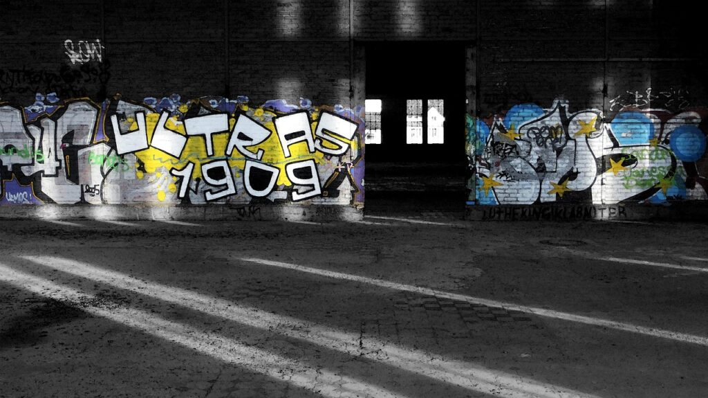
Graffiti letters are stylized letterforms used to carry a name, word, or short phrase with energy, rhythm, and identity. For beginners, the most reliable path is to study the basic skeleton of each letter before adding weight, movement, outlines, color, or decorative effects. Museum collection notes on graffiti-related work, including MoMA’s discussion of letterform taxonomies and style writing, treat graffiti as a lettering practice in which individual characters can be studied, compared, and transformed. The practical lesson is simple: a strong graffiti word still depends on readable letters, even when the finished style is bold, rounded, angular, stretched, or partly abstract.
This guide is for legal, paper-based practice by lettering learners, sketchbook artists, stationery fans, and educators. It does not encourage writing on property without permission. Start in a notebook, learn the forms, and move to walls, boards, murals, or public spaces only when the location is explicitly permitted.
Main graffiti letter styles beginners should know
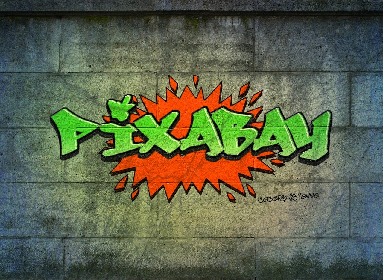
Graffiti culture has many local names and style variations, so any short list is necessarily simplified. Even so, several categories appear often in art writing, museum interpretation, graffiti glossaries, and design education. Knowing these basic types helps you choose a useful next exercise instead of jumping straight into lettering that is too complex to control.
| Style | Typical look | Readability | Good practice goal |
|---|---|---|---|
| Tag or handstyle | A fast signature-like word, usually line based | Medium to high if controlled | Flow, rhythm, spacing, and personal handwriting |
| Throw-up | Quick rounded letters, often with a fill and outline | High when shapes are simple | Consistent bubble forms and clean outlines |
| Straight letters | Blocky or simple stylized letters with clear structure | High | Letter construction, width, baseline, and balance |
| Bubble letters | Inflated, rounded forms with soft corners | High | Volume, curves, highlights, and friendly shapes |
| Wildstyle | Interlocking, angled, extended, and abstracted letters | Low to medium | Advanced structure, connections, arrows, and controlled complexity |
| 3D letters | Letters with depth, shadow, or perspective | Medium to high | Light direction, depth lines, and dimensional consistency |
Tags and handstyle
A tag is the simplest visual unit of graffiti writing, but simple does not mean easy. Good handstyle depends on controlled speed, repeated practice, spacing, pressure, and the shape of connecting strokes. Think of it as expressive handwriting rather than a finished poster title. Beginners can practice tags with a pencil, brush pen, felt-tip marker, or chisel-tip marker. The aim is to make every letter feel like part of the same word, not a set of unrelated marks.
Throw-ups and bubble letters
Throw-ups and bubble letters are useful early exercises because they teach mass. Instead of writing a thin line, you give every letter a body. A common beginner mistake is to inflate each letter randomly. Better practice is to draw a light skeleton first, then build even thickness around it. Keep counters, such as the holes inside A, O, P, and R, large enough to read. Rounded forms can look playful, but they still need structure.
Straight letters
Straight letters are the best bridge between ordinary alphabet drawing and more advanced graffiti letters. They keep the word readable while leaving room for style choices such as tilted stems, thick outlines, split fills, bevels, shadows, and color contrast. If you are designing a name for a notebook cover, poster, sticker, or sports team banner, straight letters are often more useful than wildstyle because the reader can understand them quickly.
Wildstyle and 3D letters
Wildstyle is often the style beginners admire first, but it should not be the first style they try to master. Dense arrows, overlaps, extensions, and connections only work when the underlying letters are solid. A useful rule is this: if the word is unreadable before you add extensions, extra arrows will not fix it. 3D lettering requires the same discipline. Every depth line should move in the same direction unless you are deliberately using a more advanced perspective system.
A practical sketching process from pencil to color
The easiest way to improve graffiti letters is to separate the work into stages. If you try to solve structure, outline, color, highlights, and decoration at the same time, the word can become messy before you understand why. A staged process also makes it easier to compare attempts in a sketchbook and see which choices improved the final piece.
- Choose a short word. Start with three to six letters. Your name, initials, or a simple word such as move, flow, team, or style is easier to manage than a long phrase.
- Write the plain skeleton. Draw the word in simple capital letters or lowercase letters. Keep the baseline steady and leave generous space between characters.
- Decide the attitude. Make the word calm, fast, heavy, sharp, rounded, sporty, playful, or mechanical. One clear direction is better than five competing ideas.
- Add letter weight. Build thickness around each skeleton. Keep similar strokes similar in width so the word feels unified.
- Refine spacing. Look at the negative spaces between letters. If one gap is much wider than the others, adjust it before inking.
- Add an outline. Use a darker pen or marker only after the pencil structure works. The outline should clarify the word, not hide weak construction.
- Plan color. Choose a fill, outline, shadow, and highlight. Limit the palette at first so the letter design remains the focus.
For more lettering ideas and related sketching topics, browse the Lettering section.
Letter anatomy that makes a word readable
Readability in graffiti does not mean the letters must be plain. It means the viewer has enough visual clues to identify the word. Even highly stylized letters usually preserve some relationship to the alphabet: vertical stems, bowls, crossbars, counters, diagonals, and terminals.
Stems are the main vertical or diagonal strokes in letters such as H, N, T, M, and R. If stems lean, they should lean with intention. Random angles make the word unstable. Bowls are rounded parts of letters such as B, D, O, P, and R. In bubble and throw-up styles, bowls often become the dominant shapes. Crossbars appear in A, E, F, H, and T. They are small, but they help the eye recognize the letter quickly. Counters are interior spaces. If they close accidentally, A can look like a triangle, P can become a blob, and O can lose its center.
Negative space is just as important as the drawn strokes. A clean gap between two letters can make a word feel balanced; a trapped or awkward gap can distract the viewer. When sketching, turn the page upside down for a moment. This quick check helps you see spacing and shape problems without being distracted by the meaning of the word.
Color, contrast, and effects without losing the letters
Color can make graffiti letters exciting, but it can also make them harder to read. Beginners often add too many gradients, highlights, drips, stars, shines, and shadows at once. A stronger approach is to create a clear hierarchy: fill first, outline second, shadow third, details last.
- Use contrast deliberately. A dark outline around a light fill usually reads clearly. A light outline around a dark fill can also work if the background is controlled.
- Keep one light direction. If highlights sit on the upper left of one letter, keep them in the same position on the rest of the word.
- Limit early palettes. Two or three fill colors plus one outline color are enough for most practice pieces.
- Separate fill and background. If the background is busy, make the outer outline stronger or add a simple border shape behind the word.
- Use drips and arrows sparingly. Effects should support movement, not cover the alphabet.
A simple color plan for a first finished sketch might be blue fill, black outline, pale blue highlight, and gray drop shadow. Once that works, try split fills, warm-to-cool color shifts, chrome effects, or 3D blocks. The best effects grow from the letter structure rather than sitting on top of it.
Paper, markers, and safety choices for practice
Because this is a lettering skill, paper practice is not a lesser version of the art. It is the workshop. Many well-known graffiti-related works and studies treat the alphabet itself as material for analysis, and sketching lets you slow down decisions that would be rushed on a wall.
For everyday practice, use a smooth sketchbook, pencil, eraser, fineliners, brush pens, alcohol markers, water-based markers, colored pencils, or acrylic paint pens. Marker paper reduces bleeding with alcohol markers. Mixed-media paper is better for paint pens and heavier coloring. A ruler can help with block letters and 3D depth lines, although freehand practice is still important for flow.
Safety matters, especially for younger artists and classroom settings. U.S. Consumer Product Safety Commission guidance explains that art materials sold to consumers in the United States are expected to carry an ASTM D-4236 conformance statement after toxicological review. The Art and Creative Materials Institute describes AP seals for products evaluated as non-toxic when used as intended and CL seals for products that require cautionary labeling. In practical terms, read the label, follow age guidance, avoid poorly ventilated spaces, and choose water-based or low-odor materials for indoor sketching when possible. See also: Gift Guide.
Spray paint and solvent-based markers are different from ordinary pens. They may involve fumes, flammability concerns, overspray, and local rules about use and disposal. Occupational safety guidance treats spray operations as activities that require ventilation and hazard controls in workplace contexts. For hobby practice, the safer and more appropriate path is to build skills on paper first and use aerosol products only in legal, well-ventilated, permitted settings while following the product label.
Common mistakes and how to fix them
Mistake one: copying effects before learning letters. Wild arrows, drips, and shines may look like graffiti, but they cannot replace structure. Fix this by drawing the same word as straight letters before adding any decorations.
Mistake two: uneven letter weight. If one letter is thin and the next is heavy, the word may feel accidental. Fix this by drawing a center skeleton and judging the thickness around it before you ink.
Mistake three: crowding the word. Beginners often run out of space at the end of a page. Fix this by boxing in the full word area first and lightly placing each letter before refining.
Mistake four: too many colors. A complicated palette can hide the design. Fix this by using a single fill color, one outline, and one shadow until the letterforms are strong.
Mistake five: closed counters. When interior holes disappear, letters become harder to read. Fix this by drawing counters early and protecting them through the coloring stage.
Mistake six: unclear style direction. A word that is partly bubbly, partly sharp, partly 3D, and partly handwritten can look confused. Fix this by choosing one dominant style for each sketch. You can explore another style in the next version.
A practice plan for steady improvement
A useful practice routine is short, repeatable, and measurable. Instead of trying to create one perfect drawing, make several small versions and compare them. Use the same word for several pages so you can see how changes in structure, spacing, and weight affect the result.
- Day 1: Draw the plain alphabet in block capitals. Focus on consistent height and spacing.
- Day 2: Turn five letters into straight graffiti letters. Add weight but no effects.
- Day 3: Sketch one short word in three versions: straight, bubble, and angular.
- Day 4: Add outlines and shadows to the best version from Day 3.
- Day 5: Study negative space. Redraw the same word with better spacing.
- Day 6: Add a limited color palette and highlights.
- Day 7: Review the week and mark what improved: readability, flow, color, outline, or confidence.
This plan is simple, but it builds the habits that matter: observing letter anatomy, making controlled choices, and revising rather than guessing. Over time, the goal is not to make every piece look the same. The goal is to understand why one version works better than another.
Frequently asked questions
What is the easiest graffiti letter style for beginners?
Straight letters are usually the easiest serious starting point because they keep the alphabet readable while allowing style. Bubble letters are also beginner-friendly, especially for learning rounded volume and simple outlines.
Should I learn tags before wildstyle?
Yes. Tags, handstyle, straight letters, and simple throw-ups teach flow, spacing, and letter identity. Wildstyle depends on those foundations. Without them, complex extensions can make a word look busy rather than skilled.
Can I practice graffiti letters with normal stationery?
Yes. A pencil, eraser, sketchbook, fineliner, and a few markers are enough to begin. Better paper and higher-quality markers can improve the finish, but they will not replace letter practice.
How do I make graffiti letters look 3D?
Choose one direction for depth lines, such as down and to the right. Draw the same depth from every outer corner, connect the ends, then shade the side planes consistently. Keep the original front face readable.
How can I keep my graffiti letters legal and appropriate?
Practice in sketchbooks, on personal boards, digital canvases, permitted murals, or organized art spaces. Do not mark public or private property without clear permission, and always follow product labels and local rules for paints and markers.