L lettering styles and practice ideas for cleaner hand-drawn letters
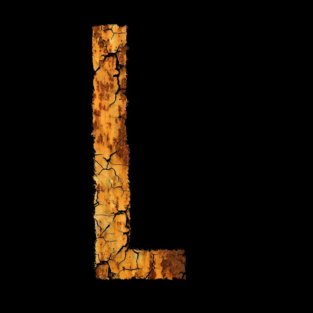
Why L lettering is harder than it looks
L lettering looks straightforward: one vertical stroke, one horizontal stroke, and a generous amount of open space. That simplicity is also what makes the letter so revealing. A weak downstroke, a short foot, an awkward loop, or uneven spacing is easy to spot because there are few details to hide behind. For journal titles, handmade cards, classroom posters, labels, envelopes, and practice sheets, the letter L is a useful test of control, rhythm, and proportion.
This guide explains how to approach L lettering in several practical styles, from clean block letters to script capitals. It focuses on the decisions that affect the finished letter: stroke direction, weight, spacing, embellishment, and tool choice. For more lettering ideas across different alphabets and decorative styles, the Lettering section offers related inspiration for stationery and hand-drawn design projects.
The basic structure of the letter L
Before adding shadows, flourishes, colors, or decorative fills, it helps to understand the plain structure of the letter. Uppercase L usually has a strong vertical stem and a baseline stroke extending to the right. Lowercase l is often a simple upright stroke in print lettering, while script lowercase l may include a loop, entry stroke, exit stroke, or gentle lean.
The main challenge is balance. If the vertical stem is too tall and thin, the uppercase L can look fragile. If the foot is too long, it may feel heavy or stretched. If the bottom stroke is too short, the letter may read as a vertical mark rather than a complete L. Good L lettering gives the viewer enough information without overdecorating the form.
Three proportions to check first
- Height: Decide whether the letter should match surrounding capitals, sit slightly taller as a decorative initial, or act as a large monogram.
- Foot length: For a stable uppercase L, the lower horizontal stroke should feel intentional, not like an afterthought.
- Stroke weight: Thick downstrokes and lighter side strokes create a calligraphic feel, while even stroke weight gives a cleaner print style.
These checks are useful even when the final result is playful. Decorative lettering still works best when the underlying skeleton is clear.
Popular L lettering styles and when to use them
There is no single correct way to draw the letter L. The right style depends on the project, the surrounding words, and the mood you want to create. A school label may need a bold, readable L. A wedding envelope may benefit from a graceful script form. A scrapbook title can handle more color and shadow, while a small planner tab usually needs a simpler treatment.
| Style | Visual character | Useful for | Key caution |
|---|---|---|---|
| Block L | Clean, square, sturdy | Posters, labels, classroom displays | Avoid making the foot too narrow |
| Serif L | Traditional, structured, bookish | Initials, headings, invitations | Keep serifs consistent in size |
| Script L | Flowing, elegant, connected | Cards, envelopes, names, quotes | Do not let loops hide the letter shape |
| Bounce L | Casual, lively, hand-drawn | Journals, stickers, creative notes | Use bounce deliberately, not randomly |
| Shadow L | Dimensional, bold, display-focused | Title pages, signs, craft projects | Place shadows in one consistent direction |
Block L
A block L is the most forgiving place to start. Draw the outer shape first, then refine the inner corners and line weight. It can be filled with color, stripes, dots, floral patterns, or simple hatching. Because the shape is geometric, small alignment errors are easy to see, so light pencil guidelines are helpful.
Serif L
A serif L adds small finishing strokes to the top and bottom of the stem. These details give the letter a more traditional tone. Consistency matters: if the top serif is thick and angled, the bottom serif should not look as though it belongs to a different alphabet. Serif lettering works well with paper textures, muted ink colors, and formal layouts.
Script L
Script L lettering is expressive, but it is easy to overwork. A capital script L may start with an entry loop, sweep down in a weighted stroke, and finish with a curve along the baseline. Lowercase script l often rises above nearby letters and returns in a loop. The loop should be open enough to read clearly, but not so wide that it dominates the word.
How to draw a cleaner uppercase L
A clean uppercase L comes from planning before inking. Even when the final style feels loose, a simple sequence can prevent many common problems.
- Set a baseline and cap height. Light guidelines make the letter easier to size against other letters.
- Sketch the skeleton. Draw a simple vertical line and horizontal foot before adding thickness.
- Choose the weight. Decide whether the stem and foot are equal weight or whether the stem is heavier.
- Build the outer edges. Add thickness on both sides or mainly to one side, depending on the intended style.
- Refine the corner. The inside corner where the stem meets the foot should look deliberate, not cramped.
- Add decoration last. Shadows, highlights, dots, and flourishes should support the letter rather than repair a weak shape.
One useful habit is to rotate the page slightly when drawing the vertical stroke. Many people get smoother lines when the hand moves in a comfortable direction instead of forcing the wrist into a stiff position. For brush pens, the downstroke is usually easier to control when the nib angle stays steady from top to bottom.
Spacing around L
The letter L creates a large open area above its horizontal foot. In words such as “love,” “learn,” “light,” or “lettering,” that empty space can make the next letter feel too far away. When drawing a word, look at the spaces between letter shapes rather than measuring only the distance between strokes. In hand lettering, optical spacing matters more than mathematical spacing.
How to practice lowercase l and script loops
Lowercase l can be surprisingly difficult because it often appears in repeated patterns. Words such as “lettering,” “little,” “lullaby,” and “lovely” expose inconsistency quickly. If one l leans left and the next leans right, the word may feel unsteady. Practice should focus on rhythm as well as shape.
For print lowercase l, start with rows of simple vertical strokes. Keep the height, spacing, and angle consistent. Then add neighboring letters such as i, t, e, and h to check how the l works inside real words. For script lowercase l, practice a tall loop with a narrow oval rather than a wide balloon shape. The loop should rise smoothly, turn at the top, and return with enough space inside to stay legible.
Practice drills that build control
- Stem rows: Draw ten upright strokes with equal height and spacing.
- Loop rows: Draw repeated lowercase l loops without connecting them to other letters.
- Word rows: Practice short words such as “line,” “lily,” “label,” and “letter.”
- Contrast rows: Use a brush pen to alternate heavy downstrokes with light upstrokes.
- Size rows: Repeat the same l at large, medium, and small sizes to learn how detail changes with scale.
Small lettering usually needs fewer details. A tiny loop, shadow, or inner line can become blurry at normal reading distance. Larger lettering gives more room for decoration, but it also makes uneven curves easier to see.
Tools and paper choices for L lettering
The tool changes the appearance of the letter as much as the drawing style. A pencil creates soft construction lines and allows easy adjustment. A fineliner produces crisp edges for block or serif L lettering. A brush pen creates thick-and-thin contrast, which is especially useful for script and bounce styles. Markers are practical for large filled letters, but they may bleed through thin paper.
Paper matters because lettering often involves slow strokes, layered ink, or repeated correction. Smooth paper helps brush pens glide and can reduce fraying on flexible tips. Thicker paper is better for markers and filled decorative letters. For practice, inexpensive paper is useful, but it should still be smooth enough that the tool does not catch or feather too much. See also: Gift Guide.
A simple stationery setup
- A pencil for guidelines and rough shapes
- An eraser that removes construction marks without damaging the surface
- A black fineliner for outlines and small details
- A brush pen for script contrast and expressive strokes
- A ruler or grid sheet for alignment
- Smooth practice paper or a lettering pad
Beginners do not need every specialty tool at once. A pencil, one reliable black pen, and smooth paper are enough to understand the form. Color, metallic ink, and decorative markers can come later, after the basic L shape feels stable.
Decorative ideas that keep the letter readable
Decoration should make L lettering more appealing without making the letter harder to recognize. Because the uppercase L has a strong corner and open upper area, it works well with shadows, inline details, floral accents, and patterned fills. The key is to choose one main effect rather than stacking too many effects together.
Shadow and highlight
A shadow L can look dimensional with very little effort. Choose one light direction, then place the shadow on the opposite side of the vertical stem and baseline stroke. If the shadow falls down and to the right, every shadow segment should follow that same direction. Add a thin white highlight inside the main stroke only if the letter is large enough to show it clearly.
Inline and outline
An inline L has a smaller line running inside the main stroke. This works especially well on block and serif letters. Keep the inner line parallel to the outer edges, and leave enough space at the corner so the inline detail does not crowd the shape. An outline L, by contrast, leaves the inside open and can be filled with color or pattern later.
Flourishes and swashes
Flourishes are common in script capitals, but they need restraint. A flourish should grow naturally from an entry or exit stroke. If it is attached randomly, it can look decorative but disconnected. For the letter L, a lower swash extending from the foot can be attractive, especially in a name, quote, or envelope design. Check that it does not collide with nearby letters.
Common mistakes in L lettering
Many L lettering problems come from adding style before solving structure. A beautiful color palette cannot fix a letter that is poorly balanced. Before finalizing a piece, step back and check the design at normal viewing distance.
- The foot is too short. The letter may look unfinished or too similar to a simple vertical line.
- The corner is muddy. Heavy ink at the stem-and-foot junction can make the shape look clogged.
- The loop is too wide. In script lettering, an oversized loop can distract from the word.
- The slant changes unexpectedly. A single leaning L may work as a style, but inconsistent slant across a word looks accidental.
- The decoration competes with readability. Patterns, shadows, and flourishes should not hide the basic letterform.
- The spacing ignores the open area. L often needs optical adjustment because its shape leaves extra white space.
A practical correction method is to place tracing paper over the letter and redraw only the skeleton. If the skeleton looks balanced, the issue may be decoration or ink control. If the skeleton already looks weak, simplify the style and rebuild the form from guidelines.
Frequently asked questions
What is the easiest L lettering style for beginners?
A simple block L is usually the easiest starting point because it has clear straight edges and does not require loop control. Once the proportions feel steady, beginners can add an outline, shadow, or serif details.
How do I make a script capital L look elegant without overdoing it?
Start with one strong downstroke and one controlled entry or exit curve. Avoid adding multiple large loops at the beginning. Elegance often comes from smooth spacing, consistent pressure, and a clear letter shape rather than heavy ornament.
Why does my lowercase l look uneven in words?
The most likely causes are inconsistent height, changing slant, or uneven spacing between repeated strokes. Practice rows of lowercase l forms, then place them inside short words to check rhythm in context.
Can I mix block L lettering with script lettering?
Yes, but the contrast should be intentional. A block capital L can pair well with smaller script words if the sizes, spacing, and line weights are planned. Avoid mixing too many decorative styles in one small layout.
Should I use pencil guidelines for hand lettering?
Guidelines are useful for both beginners and experienced lettering artists. They help control height, baseline, slant, and spacing. Light pencil marks can be erased after the ink is dry, leaving a cleaner final piece.
Final thoughts on practicing L lettering
L lettering is a small subject with broad value. It teaches proportion, spacing, stroke confidence, and restraint. A strong L can be plain, ornate, modern, vintage, playful, or formal, but it should always remain readable. Start with the skeleton, choose one style direction, and add decoration only after the structure works.
For stationery projects, practice pages, handmade cards, and visual notes, the letter L is worth revisiting often. Its simple shape makes it a reliable measure of improvement: straighter stems, cleaner loops, better spacing, and more deliberate finishing details all show up clearly in this one letter.