Lettering design principles for stationery, posters and brand visuals
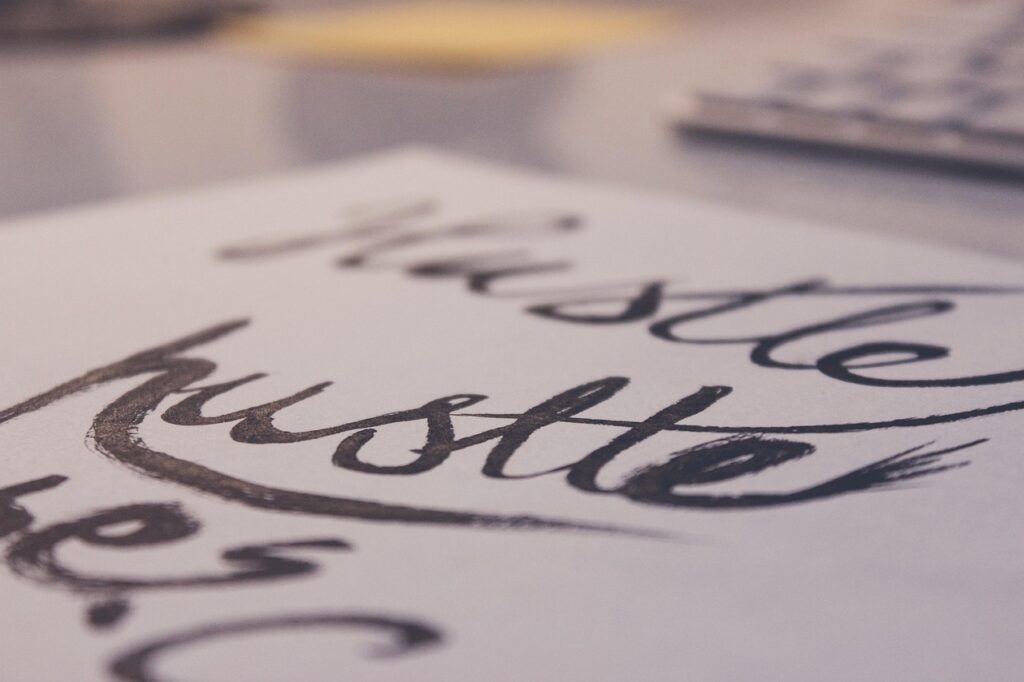
Lettering design is the craft of drawing custom letterforms for a specific message, surface and visual mood. Unlike ordinary typed text, it treats words as artwork: shape, spacing, contrast, rhythm and composition all affect how the message is received. For stationery, posters, packaging, event graphics and social visuals, strong lettering should do more than look decorative. It needs to be readable at the intended size, suit the material, support the tone of the message and remain practical for print or digital use. This guide explains the core principles behind effective lettering design, how it differs from calligraphy and typography, and how to plan a piece from rough concept to final artwork.
What lettering design means in practice
Lettering design is often described as drawing letters rather than simply writing or typesetting them. That distinction matters because the designer can adjust each letter for a specific composition. A logo wordmark, greeting card phrase, notebook cover, sports poster slogan or product label may all use lettering, but each one needs a different balance of expression and clarity.
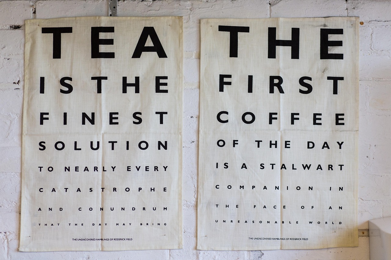
Professional design organizations such as AIGA commonly discuss typography as the broader discipline of arranging and designing letterforms for communication. Within that larger field, lettering is more custom and situational. It may borrow the energy of handwriting, the structure of serif type, the movement of brush scripts or the impact of block letters, but the final forms are usually built for one particular phrase rather than a reusable font family.
For readers exploring more examples and ideas, the lettering section collects related lettering topics and visual inspiration.
Lettering, calligraphy and typography are related but not identical
Many beginners use these terms interchangeably. Separating them makes it easier to choose the right method for a project.
| Discipline | Main action | Typical use | Key design concern |
|---|---|---|---|
| Lettering | Drawing custom letters | Logos, posters, cards, packaging, murals | Composition, letter shape and message fit |
| Calligraphy | Writing letters with a tool or gesture | Invitations, certificates, expressive scripts | Stroke movement, rhythm and hand skill |
| Typography | Arranging existing type or designing type systems | Books, websites, labels, signage, interfaces | Hierarchy, consistency and readability |
In real projects, the boundaries often overlap. A calligraphic sketch can become the starting point for a lettering piece. A typeface can inspire the proportions of a hand-drawn word. A lettering design may later be digitized into a logo or repeated graphic system. The useful question is not which label sounds more impressive, but whether the method supports the final purpose.
The core principles of effective lettering design
A successful lettering piece is rarely the result of decoration alone. It usually comes from a sequence of visual decisions that make the words more expressive without making them harder to read.
Start with the message and tone
Before choosing a brush style, serif shape or bold block layout, define the emotional role of the words. A motivational sports slogan may need speed, pressure and contrast. A wedding card may need warmth and elegance. A classroom stationery label may need friendliness and immediate recognition. The same phrase can feel playful, formal, nostalgic or energetic depending on the weight, angle, spacing and ornament.
Design for legibility before decoration
Legibility is the viewer’s ability to identify letters and words quickly. Nielsen Norman Group has long separated legibility, readability and comprehension when discussing text design: visual form affects whether people can recognize words, while language structure affects how easily they understand the message. Lettering design often compresses those issues into one image, so unclear shapes can ruin an otherwise attractive piece.
Common legibility checks include:
- Can the main word be read in two or three seconds?
- Do similar letters, such as I, l, t, f, n and m, remain distinct?
- Does the design still work when viewed smaller?
- Is the contrast strong enough between lettering and background?
- Are decorative swashes, shadows or textures helping the message rather than hiding it?
Control spacing and rhythm
Lettering is not only about the shape of individual letters. The space between them is equally important. Uneven spacing can make a word feel clumsy even when each letter is carefully drawn. Script lettering needs smooth joins and consistent stroke logic. Block lettering needs optical spacing, not just mathematically equal gaps, because curved letters and diagonal letters occupy space differently.
Build hierarchy into the composition
If a phrase has several words, decide what the viewer should read first. A notebook cover might emphasize one inspirational word and place supporting text in smaller capitals. A poster might use one heavy word for impact, then a lighter supporting line for context. Hierarchy can be created through size, weight, color, alignment, contrast, texture or placement.
A practical workflow from sketch to final artwork
Good lettering design usually benefits from a structured process. The steps below are flexible, but skipping them often leads to weak composition or production problems.
- Define the use case. Note where the artwork will appear: sticker, notebook, poster, shirt, packaging label, website banner or social graphic.
- Write the phrase and mark emphasis. Identify the most important word, secondary words and any words that can be smaller or simpler.
- Collect visual direction. Use mood terms such as vintage, athletic, elegant, handmade, modern, playful or bold. Avoid copying another designer’s layout.
- Make small thumbnail sketches. Test several compositions quickly before refining one. Small sketches help reveal balance problems early.
- Choose letter style and structure. Decide whether the design needs script, serif, sans serif, slab, blackletter influence, monoline or mixed styles.
- Refine spacing and alignment. Adjust optical balance, baseline movement, negative space and the relationship between words.
- Add decoration last. Shadows, flourishes, stars, frames, underlines or texture should support the hierarchy, not compensate for weak letters.
- Prepare the final format. For print, confirm resolution, color mode and safe margins. For digital use, test visibility on small screens.
This process keeps creativity and usability connected. It also reduces the temptation to solve every problem with more ornament.
How material and context change the design
Lettering that works on a phone screen may not work on a kraft paper tag, and lettering made for a large poster may lose detail on a small sticker. Context should influence both the drawing style and the production choices.
Stationery and paper goods
Stationery often allows softer textures, hand-drawn charm and tactile detail. Greeting cards, planners, journal covers, classroom labels and bookmarks can use expressive lettering because viewers are usually close to the object. However, paper color, ink absorption and print method can reduce fine detail. Thin hairlines, very pale colors and delicate textures may disappear on uncoated paper. See also: Gift Guide.
Posters and event graphics
Posters need stronger hierarchy because they are often read from a distance. Large display words should be simple enough to recognize quickly. Supporting details can be quieter, but they still need adequate contrast and spacing. When lettering is used for sports or school events, diagonal movement, condensed forms and high-contrast color can add energy without requiring complex illustration.
Packaging and labels
Packaging lettering must compete with logos, product names, ingredient panels, barcodes and legal text. The expressive lettering should not interfere with required information. Small labels need especially careful testing because decorative scripts can become difficult to read when reduced.
Digital visuals
Digital lettering must survive cropping, compression and different screen sizes. The World Wide Web Consortium’s accessibility guidance for text contrast is written for web content, but the principle is still useful for lettering used in digital graphics: foreground and background must be separated clearly enough for readers to identify the message. Fine textures, low-contrast pastels and lettering placed over busy photos should be tested before publication.
Common lettering design mistakes and how to avoid them
Most weak lettering pieces fail for predictable reasons. Recognizing these problems early makes revision easier.
- Too many styles in one phrase. Combining script, serif, shadow, outline, texture and illustration can make the design look confused. Limit the number of visual ideas.
- Decoration before structure. Flourishes cannot fix poor spacing or awkward proportions. Build solid letterforms first.
- Ignoring the reading order. If every word is equally large and ornate, viewers may not know where to look first.
- Overusing trendy effects. Retro curves, bubble lettering, chrome effects or rough textures can be useful, but they should match the message rather than follow a trend by default.
- Weak contrast. Pale lettering on a pale background may look stylish in a mockup but fail in real use.
- Not testing scale. A design may look strong on a large screen and become unreadable on a sticker, label or mobile thumbnail.
A simple evaluation checklist
Before approving a lettering design, review it as both artwork and communication. The following checklist gives a practical way to judge whether the piece is ready for use.
| Check | Question to ask | Why it matters |
|---|---|---|
| Message | Is the main word or phrase immediately clear? | Lettering should communicate before it decorates. |
| Tone | Does the style match the audience and use case? | A mismatch can make the design feel accidental. |
| Legibility | Can someone read it quickly at the final size? | Small applications reveal weak shapes and spacing. |
| Hierarchy | Does the viewer know what to read first? | Hierarchy guides attention through the composition. |
| Spacing | Are gaps between letters and words visually balanced? | Spacing affects polish and readability. |
| Production | Will the design print or display cleanly? | Materials and formats can change the final result. |
For stationery and lifestyle visuals, this checklist is often more useful than asking whether a design is simply attractive. A beautiful lettering design still needs to work for the object, audience and viewing distance.
Frequently asked questions
Is lettering design the same as hand lettering?
Hand lettering is a common form of lettering design, especially when the original artwork is sketched or drawn by hand. Lettering design can also include digital drawing, vector refinement and mixed methods. The essential idea is that the letters are custom-shaped for a specific composition.
Do I need calligraphy skills to create lettering?
Calligraphy skills can help because they train rhythm, stroke contrast and control, but they are not strictly required. Many lettering styles are built from drawing, sketching and refining shapes rather than writing them in one continuous motion.
What makes lettering readable?
Readable lettering usually has clear letter shapes, balanced spacing, strong contrast and an obvious reading order. Decoration should support those qualities. If viewers need to guess the word, the design needs revision.
Can a font be used in lettering design?
A font can be used as a reference or part of a layout, but custom lettering usually modifies or redraws letters so the final piece fits the message and composition. Directly copying a font outline without a proper license can also create legal and ethical problems.
What is a good first project for beginners?
A short phrase for a bookmark, greeting card or notebook label is a practical starting point. Short phrases make it easier to focus on composition, spacing and hierarchy without managing too many words at once.
Final thoughts
Strong lettering design sits between language and illustration. It gives words a visible voice, but that voice still has to be understood. Whether the project is a planner cover, sports poster, handmade card or product label, the same principles apply: begin with the message, shape the letters intentionally, test legibility, respect the material and add decoration only when it improves the whole composition. When those decisions work together, lettering becomes more than ornament. It becomes a clear and memorable part of the design.