What Is Lettering and How Can Beginners Create Better Designs?
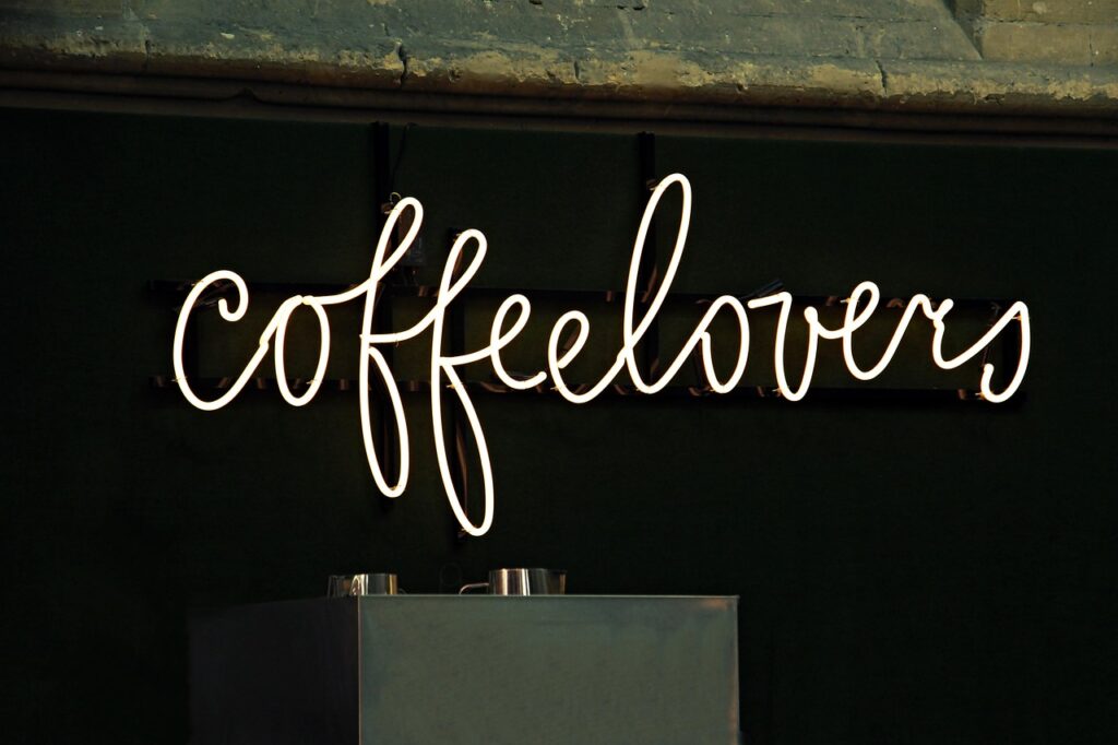
Lettering turns everyday words into designed words. A name on a gift tag, a short line on a greeting card, or a label on handmade packaging can feel more personal when the letters are drawn with care. If you sell, gift, study, or just like stationery, the right lettering tools and ideas can make practice easier without turning it into a stiff exercise.
Good lettering is not just neat writing. It is shape, spacing, rhythm, readability, and the right material working together. Public reports do not break out lettering as a single retail category in a reliable way, so any claim that gives an exact worldwide lettering market size should be checked with care. Better signs come from wider creative fields: the National Endowment for the Arts reported in 2023 that more than half of U.S. adults created or performed art between July 2021 and July 2022, and Etsy Inc. reported in its 2024 Form 10-K, filed in February 2025, that the Etsy marketplace had 89.6 million active buyers. Those sources do not prove every buyer wants lettering, but they do show steady demand for creative goods and personal visual expression.
Why Does Lettering Still Matter for Stationery and Creative Products?
Lettering matters because it gives words a handmade voice. On stationery, the message is often short, so each curve, gap, and line weight is easy to notice. A card that says “Thank You” has only two words, but the style can feel formal, playful, romantic, or rustic. That is why beginners should not see letters only as alphabet symbols. They are also part of the whole product.
Personal Style Gives Plain Words a Gift Feel
Personalized stationery works because people notice care. A plain kraft tag with one brushed name can look warmer than a printed sticker when the spacing is clean and the paper matches the ink. The point is not to add more curls or decorations. In many cases, one clear focal word is enough.
Market Signals Support Handmade Visual Goods
Etsy’s 2024 public filing reported gross merchandise sales per active buyer of $121 on a trailing twelve month basis for the Etsy marketplace. This is a broad marketplace number, not a lettering statistic. Even so, it gives stationery sellers and hobby creators a useful reading of the market. Buyers keep spending on goods that feel personal, special, and less factory-made.
Digital Layout Still Needs Human-Looking Letterforms
Lettering is not limited to paper. Social banners, product cards, printable labels, and journal downloads also need clear word shapes. Nielsen Norman Group’s classic web reading research, published in 1997 and still often cited in UX writing, found that most test users scanned new web pages instead of reading word by word. For digital lettering, the point is simple: the main word should be easy to read quickly, before the viewer looks at the small decoration.
What Is the Difference between Lettering, Calligraphy, and Typography?
These three terms are often used together, but they are not the same craft. Mixing them up can lead to the wrong tools or the wrong practice routine. Once you know the difference, it is easier to buy supplies, plan practice, and explain your work when you share or sell it.
Lettering Builds Each Word as a Drawing
In lettering, you draw letterforms for one specific design. You may sketch a word in pencil, adjust the width of the “M,” tuck a small “i” into a gap, and then ink the final piece. The letters are custom shapes made for that word or phrase. They may look handwritten, but the work is closer to drawing than normal writing.
Calligraphy Follows the Motion of the Tool
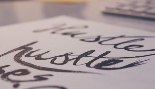
Calligraphy depends on strokes made by a pen, brush, or nib. Pressure, angle, speed, and ink flow create the thick and thin lines. A brush pen calligraphy alphabet can look close to hand lettering, but the method is different. You repeat controlled strokes until your hand learns the movement.
Typography Sets Reusable Letter Systems
Typography uses typefaces, font sizes, line height, spacing, and layout rules. It deals with reusable letters that can appear in many settings. A typeface can be used in thousands of words, while a lettering piece may be drawn for one phrase only. On a product label, typography can handle small details, while lettering can make the brand name or main message stand out.
Which Tools Should You Choose for Clean Lettering Practice?
Tools help, but they cannot fix rushed spacing. Many beginners buy a large marker set first, then find out the paper bleeds or the tips fray after one weekend. A smaller kit is usually more useful if each item has a clear job. A useful beginner kit includes:
- Smooth practice paper or marker paper for clean strokes
- A pencil and soft eraser for rough layouts
- Fine liners for outlines and small details
- Brush pens for thick and thin stroke practice
- A ruler or grid pad for baseline and margin control
Smooth Paper Prevents Ragged Edges
Paper changes the result more than many beginners expect. Rough paper can pull fibers into the pen tip and leave fuzzy edges. Smooth paper helps ink sit more evenly, which matters when you draw slow curves. For brush pens, a slicker practice sheet can also protect the tip. It is not an exciting purchase, but good paper saves pens.
Pens Match the Style You Want
Choose the pen for the style, not the style for the pen. Fine liners work well for monoline lettering, labels, tiny captions, and clean outlines. Brush pens are better for bounce lettering and words with more movement. Chisel markers can make bold poster letters. If a pen feels hard to control, practice larger first, because tiny letters show every wobble.
Simple Guides Keep Spacing Honest
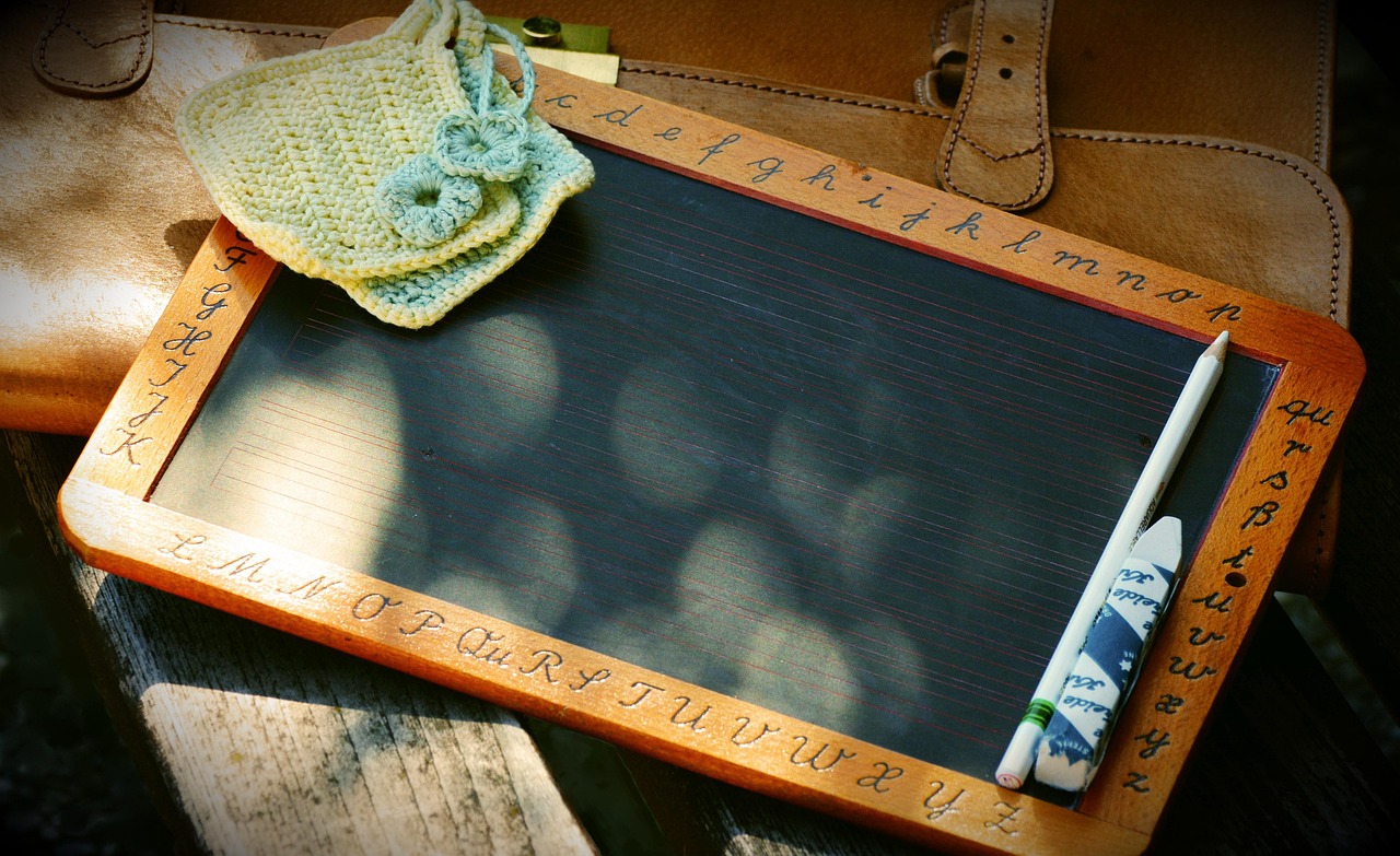
Guides are not only for school copybooks. A baseline keeps words from sliding downhill. A cap-height line keeps uppercase letters steady. Slanted guide lines help italic or script styles lean in the same direction. Use light pencil marks, then erase after the ink dries. The waiting time matters. Wet ink and an eraser can turn into a gray smear very fast.
How Can You Make Lettering Look Balanced and Readable?
Balance starts before ink reaches the final paper. Many messy lettering pieces fail because the word was never planned. You can avoid that by treating the first sketch like a map. The map does not need to look pretty. It only needs to show size, weight, gaps, and hierarchy.
Start with a Light Pencil Skeleton
Draw the word as simple shapes first. Use basic block letters, loose script, or plain ovals and stems. This skeleton shows whether the word fits the card, tag, or label. Leave extra room around descenders, swashes, and dots. A final flourish that runs into the edge of a tag rarely looks planned.
Control Spacing before Adding Decoration
Spacing is where beginner work often starts to look uneven. The gap between letters should look visually even, not mathematically equal. For example, the space beside a round “O” may need to be smaller than the space beside a straight “H.” Add shadows, dots, leaves, sparkles, or lines only after the main word reads clearly. See also: Gift Guide.
Use Contrast Rules for Digital Work
If your lettering will be used on a website, printable download, or product image, contrast becomes part of the job. W3C WCAG guidance states that normal text should have at least a 4.5:1 contrast ratio, while large text needs at least 3:1. Hand lettering can be decorative, but important words still have to be readable. Pale pink on cream may look soft on screen, but it may not be enough for key information.
How Can Lettering Be Used in Real Stationery Projects?
Real projects teach faster than endless alphabets. A project gives you size limits, message limits, and material limits. That can feel annoying at first, but limits make decisions easier. For stationery, the best lettering usually has one job: make the message feel worth keeping.
Greeting Cards Need Short, Clear Phrases
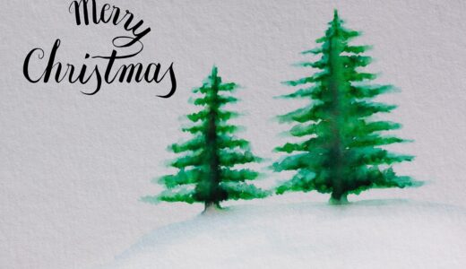
Greeting cards work best with short phrases such as “Happy Birthday,” “Miss You,” or “You Did It.” Keep the hero words large, then use simple print letters for any smaller text. A common layout is one main word in script and one supporting word in neat caps. This contrast looks clean without asking for advanced drawing skills.
Gift Tags Work Best with One Hero Word
Tags are small, so one strong name or word is usually enough. Try a bold first name, a simple border, and a tiny icon like a star, flower, or snowflake. The hole and string already take space, so leave a clear margin at the top. Nobody wants to thread twine through the middle of a letter.
Packaging Inserts Build a Warmer Brand Moment
For small shops, a package insert can turn a plain box into a better customer moment. A hand-lettered “Thank You” at the top, with typed care notes below, feels friendly and stays easy to read. This is where typography and lettering work well together. Lettering adds warmth, while plain type carries instructions, discount codes, or contact details.
What Practice Plan Helps Beginners Improve Faster?
A good practice plan should be easy to repeat, even on busy days. You do not need three hours, a perfect desk, or a full color set. You need repeated strokes, honest review, and a few small finished pieces. The U.S. Web Design System’s current typography guidance lists 45 to 90 characters per line as a readable line-length range for digital text. That guidance is for web typography, but the larger lesson also helps lettering: readable design depends on limits, spacing, and the way the eye moves.
Ten Minutes of Repeated Strokes
Spend ten minutes on basic strokes before drawing full words. Practice thin upstrokes, thick downstrokes, ovals, loops, and straight stems. Use one page for warmups and do not judge it like finished art. A small daily page is more useful than one large practice session once a month.
One Alphabet Style per Week
Pick one alphabet style for a week. It could be rounded sans serif, casual script, serif caps, or brush calligraphy. Write the alphabet first, then write five short words with mixed letter shapes. Words such as “market,” “thank,” “paper,” “bright,” and “hello” show different spacing problems.
A Simple Review before Buying More Tools
Before buying another pen, review three older practice sheets. Circle the best spacing, the cleanest curve, and the weakest letter. This small review tells you what to practice next. More tools are fun, of course, but a better baseline often improves your work more than a new metallic marker.
FAQ
Q1: Is Lettering the Same as Calligraphy? A: No. Lettering usually means drawing custom letterforms for one design, while calligraphy uses controlled strokes from a pen, brush, or nib.
Q2: What Is the Best First Tool for Lettering? A: Start with a pencil, smooth paper, a fine liner, and one brush pen. This small kit covers sketching, outlining, and basic thick-thin stroke practice.
Q3: How Long Does It Take to Get Good at Lettering? A: You can make cleaner simple pieces after a few weeks of steady practice. Confident spacing and style control usually take months of regular work.
Q4: Can Lettering Be Used for Business Packaging? A: Yes. Lettering works well for thank-you cards, labels, inserts, tags, and seasonal packaging, especially when paired with plain readable text.
Q5: Why Does My Lettering Look Messy? A: The usual causes are weak pencil planning, uneven spacing, rushed strokes, poor paper, or too many decorations added before the main word reads clearly.