What Is Fun Lettering and How Can Beginners Make Words Look Amazing?
What Makes Fun Lettering Different From Regular Handwriting?
Fun lettering is the more playful side of written words. The letters still need to be easy to read, but you can add bounce, color, shadow, pattern, and a bit of character. If you want more style ideas for notebooks, cards, and creative paper projects, the Lettering section is a good place to keep looking.
The difference is mostly the purpose. Regular handwriting is quick because it is often used for a note, a list, or a short message. Fun lettering slows the word down and lets it work as the design. A birthday card with “Yay” in thick bubble letters feels different from the same word written with a plain pen. The letters are the same, but the result feels different.
Playful Letter Shapes With a Clear Job
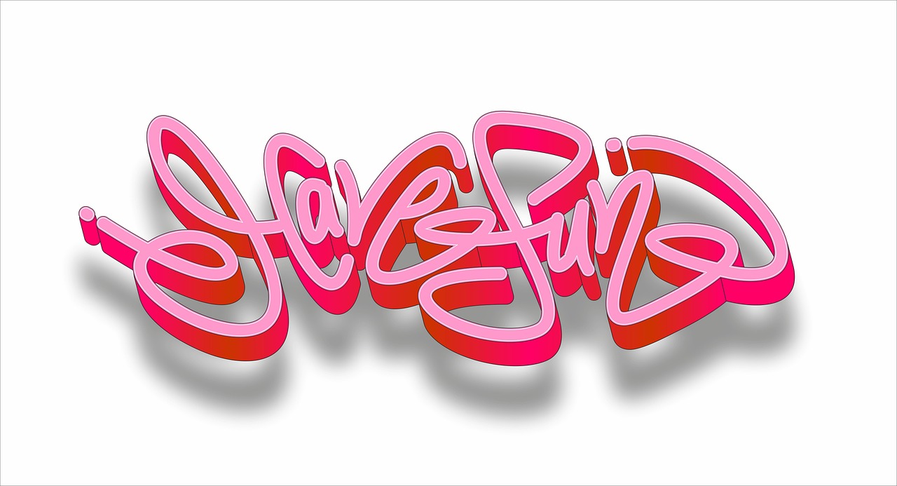
Good playful lettering starts with a job. A lunch box note should feel warm. A school poster has to be seen from a few feet away. A journal header can look nice, but it should not take over the whole page. Before you choose a style, decide what the word needs to do.
Bubble letters, block letters, serif styles, brush lettering, and doodle letters can all work, but they do not say the same thing. Rounded letters feel friendly. Tall narrow letters look neat. Chunky letters look strong and are easy to fill with color. It is better not to use every style in one word, even when a new marker set is right there on the desk.
Small Rules That Keep Words Readable
Readable lettering usually follows a few simple rules. Keep the letter height fairly even. Leave enough space inside closed shapes like A, O, P, and D. If you add shadows, place them on the same side of every letter. These small habits keep the page from looking crowded.
Fun does not mean random. Good casual lettering may look loose at first, but it still has a clear shape when you look closer. That is why a hand lettered quote can feel relaxed and still look clean.
Supplies That Change the Mood Fast
Paper, pens, markers, and pencils affect the final look as much as your hand does. A fine liner gives clean cartoon-style edges. A brush pen makes thick and thin strokes. A highlighter can make a plain heading look brighter in a few seconds.
For beginners, a pencil, eraser, black fineliner, and two colored markers are enough. Better tools are useful, but they will not fix tight spacing or rushed strokes. Start with basic supplies first, then try metallic pens, pastel markers, gel pens, or textured paper after your letter shapes feel more steady.
Why Does Fun Lettering Still Matter in a Digital World?
Digital design is everywhere, but handmade lettering still has a place because it feels personal. It also works well in photos, moves easily across social media, and gives people a break from screen work. Public data also shows that visual making and handmade art are still part of daily life for many people.
Handmade Marks Feel More Personal
The U.S. National Endowment for the Arts reported in its 2022 Survey of Public Participation in the Arts that more than half of U.S. adults created or performed art between July 2021 and July 2022. That number does not separate lettering, and no reliable public source appears to separate fun lettering as its own retail category. Even so, it gives useful background. Creative making is not a small corner of the market.
Lettering fits this habit because the starting point is low. You do not need a studio. You need a table, a page, and a few minutes. A name tag, gift label, calendar header, or sports team sign can become a small creative project. It does not have to turn into a full afternoon of work.
Visual Platforms Reward Distinctive Words
DataReportal’s Digital 2024 United States report recorded 239.0 million active social media user identities in the U.S. in January 2024. It also said 72.2% of the country’s internet user base used at least one social platform. The same report cited Pinterest advertising data showing 89.05 million U.S. Pinterest users in early 2024.
Those numbers matter for a visual craft. A journal cover, classroom board, or desk setup with neat lettering can be shared because people understand the idea quickly. Pinterest’s official 2024 trend report also said its model reviewed billions of searches from more than 480 million monthly users. People search for things to try, buy, and make, and lettering fits that behavior well.
Handwriting Practice Connects Sight and Motion
Hand lettering is not the same as normal handwriting lessons, but research on writing by hand gives helpful context. A 2012 study by Karin James and Laura Engelhardt, indexed by PubMed, found that brain activation during letter perception in pre-literate children was influenced by earlier handwriting practice compared with typing or tracing. This does not make lettering a magic learning tool. It does show that making letters by hand uses both sight and movement.
For adults and teens, that hand movement can make practice feel more grounded. You see the stroke as it forms. You feel the pressure, adjust the curve, and try again. It is slower than typing, and that slower pace is part of why people enjoy it.
How Can Beginners Start Fun Lettering Without Feeling Stuck?
Starting is easier when you stop chasing perfect alphabet sheets. A better first goal is control. You want letters that sit on the page, leave enough space, and look like they belong together. A wobbly line is not always a problem. If the rest of the word follows the same feel, it can become part of the style.
A Pencil Skeleton Before Ink
Sketch the word lightly with pencil before you use ink. Write the basic word first, then build around it. For bubble letters, draw a soft outline around each plain letter. For block letters, make the vertical strokes thicker and square the corners. For brush style, thicken the downstrokes and keep the upstrokes lighter.
This skeleton stage saves paper. It also helps you avoid the common problem of running out of room at the edge. Most people do it at least once. The fix is simple: plan the word shape before you start decorating it.
One Alphabet Style at a Time
Pick one style and repeat it for a week. Try rounded block letters on Monday. Add inner lines on Tuesday. Use dots on Wednesday, then add shadows on Thursday. The letters stay familiar while the details change, so the practice feels easier to manage.
UNESCO’s 2024 Framework for Culture and Arts Education, adopted in Abu Dhabi, describes arts education as a way to build observation, collaboration, reflection, creativity, and adaptability. Lettering practice fits that idea in a small and practical way. You look at shape, change your choices, and make something that carries a message. That is useful practice, even on a small page.
A Ten Minute Practice Routine
A short routine often works better than one long session followed by two weeks with no practice. Set a timer for ten minutes. Write three words: one short word, one medium word, and one longer phrase. For example, “Joy,” “Weekend,” and “Game Day Snacks.” This gives your hand different spacing problems to solve.
Use cheap practice paper for early drafts. Keep the nicer cardstock, dot-grid notebook, or marker paper for finished pieces. That small split helps you test ideas with less pressure. Nobody wants to worry about wasting the last sheet of good paper. See also: Gift Guide.
Which Tools Make Fun Lettering Easier on Paper?
The right tools depend on the surface and the look you want. Smooth paper helps brush pens move cleanly. Slightly toothy paper works well with colored pencil. Thin notebook paper may bleed if you use alcohol markers. Matching the tool to the paper is basic, but it prevents many beginner problems.
Smooth Paper for Clean Lines
Smooth marker paper, high quality notebook paper, or cardstock gives cleaner edges. If the paper fibers catch the pen tip, the stroke can look fuzzy. That edge may be fine for rustic labels, but it is not ideal for clean journal headers or product tags.
Test in a corner before you start. Make one thick stroke, one thin stroke, and one filled shape. If the ink bleeds through or spreads outward, change tools or place a scrap sheet under the page.
Pens With Predictable Ink Flow
Fine liners are useful for outlines, doodles, faux calligraphy, and small captions. Gel pens add shine and color, especially on dark paper. Brush pens give expressive strokes, but they show every pressure change, so beginners may need a little time with them.
If your hand feels tight, try a pen with a slightly larger barrel or work in shorter sessions. Lettering should not feel like holding a tiny screwdriver for an hour. Keep your wrist loose and turn the page when it helps.
Color Tools That Add Fast Character
Color changes the mood quickly. Pastels feel soft and friendly. Bright primary colors feel playful and ready for kids. Metallics help place cards, holiday tags, and award certificates look more finished. For cleaner work, choose two or three colors first, not twelve.
- Use one dark outline color for structure.
- Add one main fill color for the letter body.
- Pick one accent color for dots, stars, stripes, or shadows.
This three color plan keeps the page active without making it look like a marker test sheet.
How Can You Use Fun Lettering for Cards, Journals, and Displays?
Fun lettering becomes more useful when it has a real place to go. Practice sheets help, but finished projects teach layout, spacing, color balance, and message clarity. Start with everyday formats you already use, then try other paper goods and display ideas.
Greeting Cards With One Hero Word
For cards, choose one hero word: “Thanks,” “Congrats,” “Smile,” “Cheers,” or “Hooray.” Make that word large, then add a smaller plain sentence below it. The contrast keeps the card tidy and makes the message easy to read.
A simple card can use large bubble letters in the center, a thin black outline, pale yellow fill, and small blue stars around the word. It sounds basic, but it works because the eye knows where to look first.
Bullet Journal Headers That Stay Useful
Bullet journal lettering should help the page, not fight with it. Use clear headers for months, habits, meals, spending, workouts, reading lists, or school deadlines. If the header takes more space than the tracker, make it smaller next time.
Try one style for a full month. A matching set of headers can make a plain notebook feel more organized. It also lets you see progress over time. January’s letters and March’s letters usually do not look the same, and that small change feels good.
School and Retail Signs With Clear Distance
For classroom boards, event tables, sports day signs, or small shop displays, distance matters. Thick letters, strong contrast, and fewer decoration details usually work best. A sign that reads well from six feet away is more useful than a delicate sign that only looks good up close.
Public sources do not give a verified sales figure for fun lettering as a stand-alone category, so it is safer to avoid claims like “fastest growing” or “top craft trend” unless a current, reliable report supports it. The clear point is simple: lettering keeps its value because it brings together handwriting, design, paper goods, and personal expression in a way many people can try.
FAQ
Q1: What Is the Easiest Fun Lettering Style for Beginners? A: Rounded block lettering is usually the easiest. You can sketch normal letters first, draw a rounded outline around them, then add color or shadow.
Q2: Do You Need Brush Pens to Start Fun Lettering? A: No. A pencil, eraser, black pen, and two markers are enough for many styles. Brush pens are useful later, especially for thick and thin strokes.
Q3: How Long Should You Practice Each Day? A: Ten minutes is a good start. Short daily practice builds steadier spacing and cleaner shapes without making the process feel heavy.
Q4: Can Fun Lettering Be Used for School or Office Projects? A: Yes. It works well for posters, labels, notebooks, planner pages, desk signs, event boards, and presentation covers when readability stays first.
Q5: What Paper Is Best for Marker Lettering? A: Smooth, thicker paper is usually best. Test the marker first because thin paper can bleed, feather, or show ink on the other side.