Upper case in lettering and when to use it

What upper case means in lettering
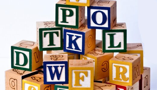
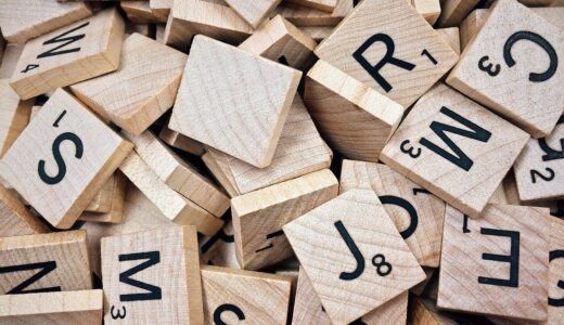
Upper case means the capital form of a letter, such as A, B, C, and D. In lettering, the term is not only about grammar. It also describes a visual structure: capital letters usually sit between a baseline and a cap height, giving a word a strong, even, and often formal appearance. The phrase comes from traditional metal type, where capital letters were commonly stored in the upper type case and smaller letters in the lower case. Today, upper case appears in handwriting, calligraphy, typography, signage, labels, planners, greeting cards, classroom materials, and many other stationery formats.
Most readers looking up upper case want a clear answer to three questions: what it means, how it differs from lowercase, and when it should be used. For lettering work, the answer is practical. Upper case is useful when text needs emphasis, order, visibility, or a clean display style. It is less suitable for long paragraphs, soft personal notes, or any design where comfortable reading and a natural rhythm matter more than visual impact.

Upper case, lowercase, capitals, and all caps are not the same thing
These terms are often used together, but they do not mean exactly the same thing. Knowing the difference helps writers, students, designers, and stationery makers choose the right style for the task.
| Term | Meaning | Lettering example |
|---|---|---|
| Upper case | The capital form of a letter | A, B, C, D |
| Lowercase | The smaller form of a letter | a, b, c, d |
| Capital letter | A common name for an upper case letter | The T in Tuesday |
| All caps | A word or phrase written entirely in upper case | NOTES, SALE, TEAM |
| Capitalization | The rule or choice of when to use capital letters | Names, sentence starts, headings |
In everyday writing, upper case and capital letters are often interchangeable. In design and digital text, however, uppercase can also refer to a case setting or character property. Style guides, fonts, and text editors may treat uppercase conversion as a formatting or text transformation decision. In lettering, the difference is more physical and visual: you are drawing capital forms, not simply pressing a key.
All caps deserves special attention. Using one initial capital at the start of a name is a grammar choice. Writing an entire phrase in capitals is a design choice. The two decisions create very different effects.
Why upper case changes the tone of a design
Upper case letters tend to look stable, direct, and structured because their forms often share a similar height. Many capitals use strong verticals, horizontals, diagonals, and broad curves. That makes them useful for headings, covers, labels, sports signs, classroom charts, certificates, and display lettering where the viewer may read from a distance.
The same strength can also become a limitation. A paragraph in all caps can feel loud or visually heavy. Because the letters occupy a similar height, words may appear more block-like than mixed-case words. In short text, that block shape can create impact. In long text, it can slow the reader down or make the page feel dense.
This is why many editorial and design style guides recommend using all caps selectively. The issue is not that upper case is wrong; it is that upper case carries a stronger visual voice. A label that says INDEX may look neat and useful. A full handwritten letter in all capitals may feel rigid unless that is the intended mood.
For stationery, tone matters. A planner heading in upper case can feel organized. A wedding place card in delicate capitals can feel elegant. A school reward sticker in bold all caps can feel energetic. A sympathy card in heavy all caps may feel too forceful. The same letter case changes meaning depending on size, spacing, tool, color, and context.
When to use upper case in lettering projects
Upper case works well when the text needs to be seen quickly, separated clearly, or given visual importance. It is especially useful in small design areas where long ascenders and descenders could make a layout feel uneven.
- Headings and section labels: Use upper case for planner tabs, notebook dividers, classroom labels, file folders, and journal sections.
- Short signs and display text: Upper case can improve visibility on posters, banners, event signs, and sports-themed lettering.
- Monograms and initials: Capital letters are common for initials because they create recognizable, decorative shapes.
- Stamps, stickers, and packaging notes: Short phrases such as FRAGILE, PAID, DATE, or IMPORTANT often work well in upper case.
- Practice sheets: Beginners can use upper case to study proportion, spacing, stroke direction, and letter families.
Use upper case more carefully for long quotes, journal entries, paragraphs, or instruction blocks. Mixed case usually feels more natural for extended reading because it gives words more varied shapes. If the text is more than a few words, consider using upper case only for the key phrase and leaving the rest in sentence case.
For more lettering ideas and related style topics, explore the Lettering section.
How to make upper case letters look balanced
Good upper case lettering depends on proportion more than decoration. Before adding shadows, flourishes, outlines, or color, set a clear structure. Most capital letters can be planned with four guide lines: baseline, cap height, center line, and side spacing. The baseline keeps the letters grounded. The cap height controls their top edge. The center line helps place crossbars and curves. The side spacing controls the rhythm between letters.
Start with letter families
Group capitals by structure instead of practicing the alphabet only from A to Z. Straight-sided letters such as H, I, L, T, E, and F help build control. Round letters such as O, C, G, and Q teach curve consistency. Diagonal letters such as A, V, W, X, Y, and Z help with angle balance. Mixed letters such as B, D, P, R, J, S, and U require more judgment because they combine curves with stems or unusual weight distribution.
Watch optical adjustments
Upper case lettering often needs small optical corrections. Round letters usually extend slightly above and below the cap height and baseline so they do not look smaller than flat letters. This is called overshoot in typography. The pointed top of A or the bottom of V may also need a subtle extension for the same reason. These adjustments are small, but they help a word feel visually even. See also: Gift Guide.
Use spacing as part of the design
Upper case words can look cramped if each letter is drawn with identical gaps. The space between H and I is not visually the same as the space between A and V. Instead of measuring only the blank area, judge the visual rhythm. Letters with open sides may need less space, while letters with vertical sides may need more. In all caps, careful spacing often matters as much as the letter shapes themselves.
Upper case choices for common stationery styles
Stationery design often combines function with personality. Upper case can support both, but the right treatment depends on the item and the reading situation.
| Project type | Useful upper case approach | What to avoid |
|---|---|---|
| Planner pages | Small all-caps labels for months, tabs, and categories | Using heavy all caps for every note area |
| Greeting cards | Decorative capitals for short messages or names | Overpowering emotional messages with very bold capitals |
| Classroom labels | Clear uppercase words with generous spacing | Overly ornate letters that children cannot recognize |
| Sports posters | Bold capitals for team names, scores, and chants | Too many competing all-caps phrases in one layout |
| Notebook covers | Centered uppercase titles, initials, or subject names | Small tight letters that blur when printed or photographed |
A useful rule is to decide the job of the text first. If the job is to organize information, upper case can be clean and efficient. If the job is to express warmth, mixed case may feel more approachable. If the job is to attract attention from a distance, bold capitals may be appropriate. If the job is to invite slow reading, all caps should be limited.
Common mistakes with upper case lettering
The most common mistake is assuming that capital letters are easier because they look simpler. In practice, capitals expose spacing problems quickly. Since many uppercase forms are large and open, uneven width, inconsistent angles, and poor alignment become visible.
- Making every letter the same width: M and W naturally need more room than I or J. Forced equal width can look mechanical unless you are intentionally drawing a monospaced style.
- Ignoring curve weight: Round letters can look lighter than straight letters if the stroke weight is not adjusted.
- Using all caps for too much text: A few words may look strong; a full paragraph may feel tiring.
- Adding decoration before structure: Shadows and highlights cannot fix weak letter proportions.
- Forgetting the reading distance: Tiny decorative capitals may look good close up but lose clarity on signs, labels, or photos.
Another mistake is treating uppercase as one style. A Roman capital, a block capital, a brush capital, a sans serif capital, and a playful bubble capital can all be upper case, but they communicate different moods. The case tells you the letter category; the style tells you the personality.
Frequently asked questions
Is upper case the same as capital letters?
In most everyday contexts, yes. Upper case letters are capital letters. The term upper case is often used in typography, editing, digital text, and design, while capital letters is more common in school grammar and everyday writing.
Should upper case be written as one word or two?
Both forms appear in English usage. Uppercase is common as an adjective or noun in technical and design contexts, as in uppercase letters. Upper case is also widely understood, especially when explaining the contrast with lower case. For SEO, using the target phrase naturally is more important than forcing one form in every sentence.
Why do all caps sometimes feel hard to read?
All caps can make words appear more uniform in height and shape. That can be useful for short labels, but it may reduce the natural word pattern readers expect in longer text. The result is not always unreadable, but it can feel slower or louder than mixed case.
When should beginners practice upper case letters?
Beginners can practice upper case early because capitals teach baseline control, cap height, spacing, and basic stroke direction. However, it is helpful to practice lowercase too, because most real writing and many lettering layouts use both cases together.
Can upper case look elegant instead of bold?
Yes. Upper case does not have to be loud. Thin strokes, wider letter spacing, careful alignment, soft colors, and classical proportions can make capitals feel refined. The final mood depends on style, spacing, scale, and context.
Key takeaway
Upper case is the capital form of letters, but in lettering it is also a design tool. It can organize information, create emphasis, support visibility, and shape the tone of stationery or display work. The strongest results come from using uppercase intentionally: choose it for short, important text; space it carefully; match the style to the message; and avoid turning every line into all caps unless the design truly needs that level of visual force.