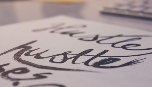
How Can You Create a Lettering Alphabet That Looks Clean and Professional?
A clean lettering alphabet gives you a full A to Z set you can use again on planners, cards, classroom posters, labels, scrapbook pages, and small product packaging. If you are trying hand-drawn letters for the first time, the lettering section can help you match style ideas with normal stationery work. This guide keeps the steps simple: start with shapes, check spacing, choose the right tools, practice in small blocks, and use the letters on real items.
Why Does a Lettering Alphabet Still Matter for Paper, Gifts, and Creative Work?
Decorative letters may look like a small hobby, but a full alphabet is a design system you can repeat. Public reporting does not give a clear global sales figure for lettering alphabet worksheets alone, so wider stationery data should be treated as market context, not direct proof. Grand View Research reported in 2024 that the global stationery products market was estimated at USD 112.15 billion in 2023 and was forecast to reach USD 151.96 billion by 2030. That says paper goods still have real market space, even when many people work and shop on screens. (grandviewresearch.com)
It Turns Practice into a Repeatable System
When you draw the same alphabet from A to Z, you guess less. You start to see shared parts: O, C, G, and Q all use oval shapes; H, I, and T need straight structure; A, V, W, and Y need clear diagonals. This matters when one birthday card turns into ten place cards, or when a small event needs a full group of labels. A set alphabet keeps the work from looking mixed together.
It Gives Stationery a Human Feel
Hand lettering adds small changes that printed fonts usually do not show. A light wobble in a curve, a softer dot over an i, or a heavier downstroke can make a card feel more personal. Cooper Hewitt, Smithsonian Design Museum noted in a 2013 article on Alexander Girard’s Alphabet textile that letters can work as texture and pattern, not only as readable language. That point fits paper craft well, because letters carry both the message and the feeling of the piece. (cooperhewitt.org)
It Helps Buyers See Care in the Details
For shops, gift makers, and stationery sellers, custom letters can make tags, packaging slips, and thank-you cards feel less generic. Small details do not replace product quality, but they do help a buyer notice care in the order. Etsy reported 89.6 million active buyers on the Etsy marketplace in 2024. That number does not prove demand for lettering itself, but it does show a large audience for unique and creative goods where personal touches can help. (investors.etsy.com)
What Makes a Lettering Alphabet Look Clean Instead of Messy?
Clean lettering starts with rules that the viewer may not notice at all. A beginner alphabet does not need to be perfect, but it does need to look consistent. If height, stroke rhythm, and spacing repeat from letter to letter, the page feels easier to read. Even a playful style looks better when the basic rules stay the same.
Baselines Keep Every Letter Grounded
Draw light pencil guides before you use ink. Use a baseline for the bottom of most letters, a cap height for uppercase letters, an x-height for lowercase bodies, and a descender line for letters like g, j, p, q, and y. These lines may feel slow at the start, but they save time once the word gets longer. They also stop the common problem of a word slowly climbing uphill across the page.
Stroke Contrast Creates Clear Rhythm
Brush lettering often uses heavy downstrokes and lighter upstrokes. Monoline lettering uses one steady stroke width from start to finish. Both styles can look clean, but mixing the rules by accident makes the alphabet look messy very quickly. Pick one rule before you write, then keep it through A, M, N, H, and the rest of the set.
Spacing Decides Readability
Spacing is about how the word looks, not just equal distance on a ruler. Round letters often need to sit a little closer than straight letters. A word like MOON can look too loose if every gap is measured the same way. Try the squint test: if one gap shows up like a white hole, move the letters closer. It is a small check, but it catches many spacing issues.
Which Lettering Alphabet Style Should You Try First?
There is no single best style for every project. The right choice depends on the surface, the pen, and the job in front of you. A notebook heading can be loose and quick. A wedding place card needs more control. Start with one alphabet you can finish, then add other styles after your hand feels steady.
Monoline Alphabet for Daily Notes
A monoline alphabet is usually the easiest starting point because every stroke has the same weight. You can use a gel pen, fineliner, pencil, or ballpoint pen, so there is no need to buy special tools first. It works well for study notes, planner headers, bullet journal pages, and classroom signs. Keep the corners a bit soft at the beginning, because sharp corners only look neat when they are planned and repeated.
Serif Alphabet for Classic Cards
Serif letters have small feet or caps at the ends of strokes. They work well on greeting cards, certificates, bookplates, and labels for handmade products. Beginners should keep the serifs short and even. If the foot on E is large and the foot on L is tiny, the whole alphabet starts to look patched together.
Brush Alphabet for Modern Display Work
Brush lettering gives more contrast, but it also shows every pressure change. Use larger paper while you learn, because small spaces make the strokes harder to control. Write slow downstrokes, lift pressure on upstrokes, and leave enough space between letters. Brush alphabets are useful for envelopes, quote cards, party signs, and bold packaging notes where one word needs to stand out.
How Do You Practice the Full Alphabet without Getting Stuck?
Practice often breaks down when someone copies a nice alphabet once, dislikes three letters, and stops. A better plan is to split the alphabet into strokes, shape families, and short practice blocks. A 2014 Psychological Science study, indexed by PubMed, found that students taking notes longhand performed better on conceptual questions than laptop note takers in the reported experiments. That does not make handwriting magic, and later debate exists, but it supports a useful point: moving the hand can make you look at form more closely. (pubmed.ncbi.nlm.nih.gov)
Start with Strokes before Full Letters
Warm up with straight lines, ovals, arches, loops, and pressure strokes. Two rows are enough for most practice sessions. Then build letters from those parts instead of drawing each letter as a separate shape. For example, n, m, h, and r share arches, while o, a, d, g, and q share oval bodies. This may feel slower at first, but it reduces awkward letters later.
Group Letters by Shape
Do not practice A through Z only in alphabet order. Grouping letters by shape helps your eye catch repeat problems faster. Try round letters together, then vertical letters, then diagonal letters, then looped letters. If your S looks strong but your C looks weak, put them side by side and compare the curve. They are related shapes, so one can help you fix the other.
Use Ten Minute Practice Blocks
A simple block can be one minute of warmups, four minutes of lowercase letters, three minutes of uppercase letters, and two minutes writing one real word. Date the page before you put it away. Keep the rough sheets too, because they show what changed. After two weeks, progress is much easier to see, and the old uneven page becomes useful instead of annoying. See also: Gift Guide.
What Tools Make Lettering Easier for Beginners?
You do not need a large kit to start. Too many pens can slow you down because each tool behaves a little differently. Start with paper that handles ink, a simple pencil guide system, and one or two pens that fit your chosen alphabet style. Once the basic letters are steady, it is easier to decide which tools are worth adding.
Smooth Paper Stops Ink Bleed
Rough paper can pull fibers into the pen tip and make the edges look fuzzy. Smooth notebook paper, marker paper, or a good practice pad gives cleaner lines. If you use brush pens, smooth paper also helps protect the tips. For final cards, test a corner first, because some nice-looking papers absorb ink too fast.
Pencil Guides Save Time
A ruler, grid pad, or light pencil line can fix many problems before you write the final letters. Draw the guides lightly, ink the letters, and erase only after the ink is fully dry. If you erase too soon, a clean card can get a gray smear across the middle. It is a common mistake, and it is easy to avoid with a few more minutes of drying time.
Pens Should Match Your Style
Fineliners fit monoline alphabets. Brush pens fit thick-and-thin scripts. Broad nibs and chisel markers help with block letters and gothic-inspired styles. Test each pen with the letters O, H, S, and R before using it on a finished piece. Those four letters quickly show whether the tool can handle curves, straight lines, joins, and legibility.
How Can You Use a Lettering Alphabet in Real Projects?
The fastest way to improve is to use your alphabet on finished pieces, not only on practice sheets. Real projects make you think about size, spacing, color, and how much decoration is enough. In stationery work, a little restraint often looks more professional than filling every corner. The aim is not to show every trick, but to make the message clear and useful.
Planner Headers with Simple Rules
Use one alphabet for all monthly headers, another smaller style for task labels, and plain writing for daily notes. This keeps the page easy to use. Pretty lettering should not fight the schedule or make the planner hard to read. For a weekly spread, three styles are usually enough: title, subtitle, and normal handwriting.
Greeting Cards with Focal Words
On a card, choose one focal word such as Joy, Thanks, Mom, or Celebrate. Give that word the most decorative alphabet, then keep the supporting words simple. White space is not wasted space, because it gives the main word room to stand out. Add a small flourish only where the eye needs a finish.
Product Labels with Consistent Brand Mood
If you sell or gift stationery, candles, soaps, notebooks, or handmade treats, make a small lettering sheet for your brand mood. Include uppercase, lowercase, numbers, punctuation, and two sample words. This stops the label from changing style every time you sit down with a pen. It also helps product photos look more consistent across a shop page or catalog.
FAQ
Q1: What is the easiest lettering alphabet for beginners? A: A monoline alphabet is usually easiest because it uses one stroke width and works with common pens.
Q2: How long does it take to learn a lettering alphabet? A: With ten minutes of focused practice on most days, many beginners see cleaner spacing and steadier shapes within two to three weeks.
Q3: Should you learn uppercase or lowercase letters first? A: Start with lowercase letters if you make planners and cards, because they appear more often in normal words. Add uppercase letters for titles and initials.
Q4: Can you practice lettering without brush pens? A: Yes. Pencil, fineliner, gel pen, or ballpoint pen can all teach shape, spacing, and rhythm before you buy specialty tools.
Q5: Why do your letters look uneven? A: Uneven letters usually come from missing guide lines, mixed stroke rules, or rushed spacing. Use pencil guides and practice by shape group.