How Can Chalk Lettering Make Signs Look Better and Sell More?
Why Does Chalk Lettering Still Work for Modern Signs?
Chalk lettering looks simple, but it has a clear use: it lets you put a message on a board today and change it tomorrow. If you sell stationery, run a café, decorate a classroom, or set up a wedding welcome board, a clean chalk sign can feel personal without looking careless. For more lettering supplies and ideas, visit the lettering section and compare tools before you start.
Handmade Style That Feels Personal
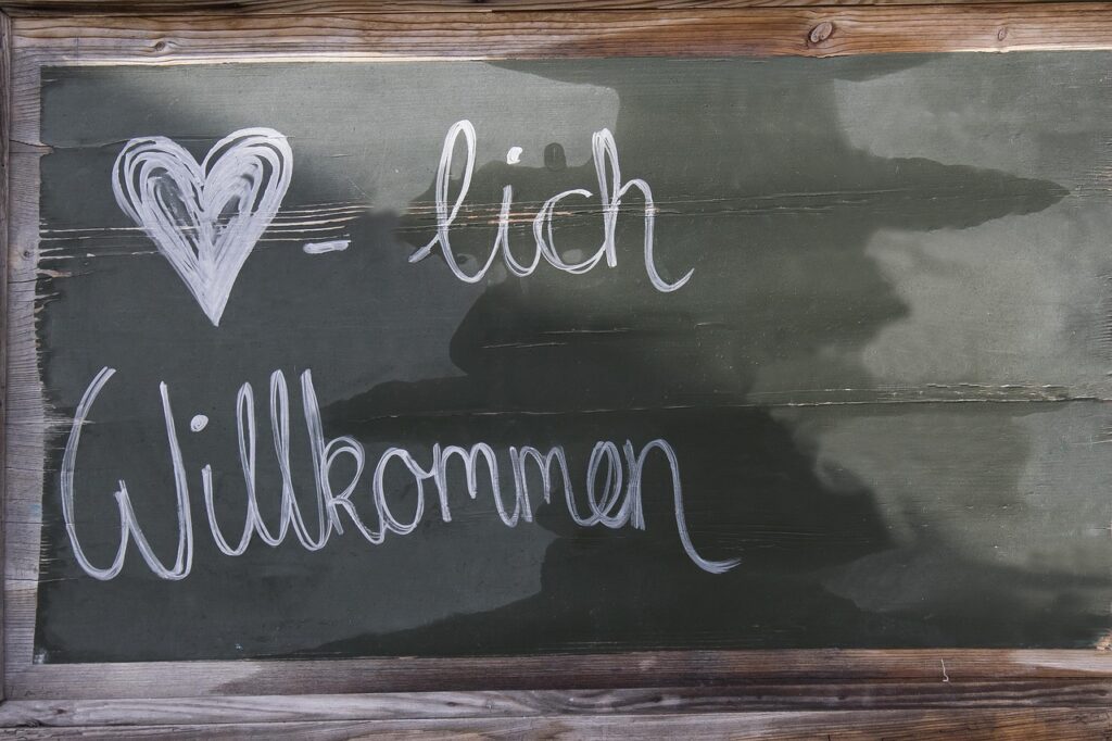
A chalkboard sign does not have to look perfect. Small hand drawn differences are often what make it work. A slightly curved baseline, a shaped capital letter, or a soft smudge around a shadow can make the sign feel more human than a printed poster. That matters for small shops and event tables, where people often decide in seconds whether a display feels welcoming.
Clear Messages for Walk by Buyers
Public data backs up the basic point that signs can affect buyer action. A FedEx Office consumer survey released in 2012 reported that 76% of American consumers had entered a store they had never visited before because of its signs, and 68% had bought a product or service because a sign caught their eye. The same survey said 52% were less willing to enter a store with misspelled or poorly made signs. That is a useful reminder for chalk lettering: handmade is fine, but careless writing can cost trust. (newsroom.fedex.com)
Flexible Signs for Seasonal Changes
Chalk lettering also suits seasonal retail because the message can be changed fast. The National Retail Federation reported that total Halloween spending in 2025 was expected to reach a record $13.1 billion, and 51% of shoppers planned to decorate the home or yard. This does not prove chalk lettering alone brings sales, and reliable public data for the exact chalk lettering niche is not available. Still, it explains why changeable display boards are useful during busy holidays, pop ups, craft fairs, and school events. (nrf.com)
What Tools Do You Need for Clean Chalk Lettering?
The right tool saves time. It also helps your letters stay readable after the first few minutes of use. You do not need a drawer full of special supplies, but you do need a board, a sketch tool, a writing tool, and something for cleaning edges.
Chalk Pencils for Sketching
A chalk pencil is useful before the real writing starts. Use it to draw light guide lines, mark the center, and place the largest word before you use a marker or soft chalk. For a menu board, sketch the main item first, then the price, then the smaller notes. This order keeps the sign from sliding into one tight corner, which happens more often than most people admit.
Soft Chalk, Chalk Markers, and Blending Tools
Soft chalk gives the old chalkboard look and blends well for shadows, clouds, banners, and vintage borders. Chalk markers give stronger color and cleaner lines, especially on non porous boards. A cotton swab, small sponge, or folded paper towel can clean small gaps inside letters. Keep a damp cloth close by, but do not soak the board because too much water can leave cloudy marks.
Boards With the Right Surface
The board surface changes the final result. A porous slate board holds soft chalk well and gives a traditional finish, but it may keep ghost marks after cleaning. A non porous chalkboard or glass board is easier to wipe and works well with liquid chalk markers. Before making a large sign, test one corner, let it dry, and wipe it off; that five minute check can save a lot of rework.
How Can You Build a Chalk Lettering Layout That Reads Fast?
A good looking sign is not enough if people cannot read it. Strong chalk lettering starts with a simple order: one main message, one support line, and only a few extras. If the board is for a busy shopfront, keep it even simpler. People may be walking, talking, holding coffee, or watching a child who has found the sticker rack.
One Main Message
Choose the one thing the sign must say. It might be Fresh Lemonade, Wedding This Way, Back to School, or Today Only. Make that phrase the largest and strongest part of the layout, then place the smaller words around it. For beginners, a practical guide is 60% main message, 30% details, and 10% decorative elements; it is not a rule, but it keeps the board under control.
Letter Height and Viewing Distance
Letter size has a direct effect on how far away people can read the sign. For highway sign research, the Federal Highway Administration notes that the MUTCD method estimates static sign legibility at about 30 feet per inch of letter height. A chalkboard menu is not a highway sign, of course. The useful point is simple: a two inch word will not read like a six inch word across a room, so key words need to match the real viewing distance. (fhwa.dot.gov)
Spacing, Contrast, and White Space
Contrast does a lot of the work on a chalkboard sign. The U.S. Access Board guidance for signs says characters should contrast with the background, and that textured or varied backgrounds can make reading harder. It also gives stroke thickness guidance for visual characters, such as 10% to 30% of character height for some sign contexts. For chalk lettering, this means white or bright lettering on a dark matte board is usually a safer choice than pale gray on weathered brown. (access-board.gov)
Which Chalk Lettering Styles Fit Shops, Events, and Classrooms?
Style should match the place where the sign is used. A bakery board can be playful. A classroom schedule should be calmer. A wedding sign may use graceful script, but guests still need to find the ceremony without squinting, so check the sign from where people will stand.
Casual Script for Warm Displays
Script lettering works well for words with feeling: welcome, handmade, fresh, cheers, love, and thank you. Keep script for short phrases because long script menus become tiring fast, especially when letters touch too much. If you want a stronger look, make one large script word and pair it with plain block letters underneath. That mix looks neat without making every word fight for attention.
Block Letters for Prices and Menus
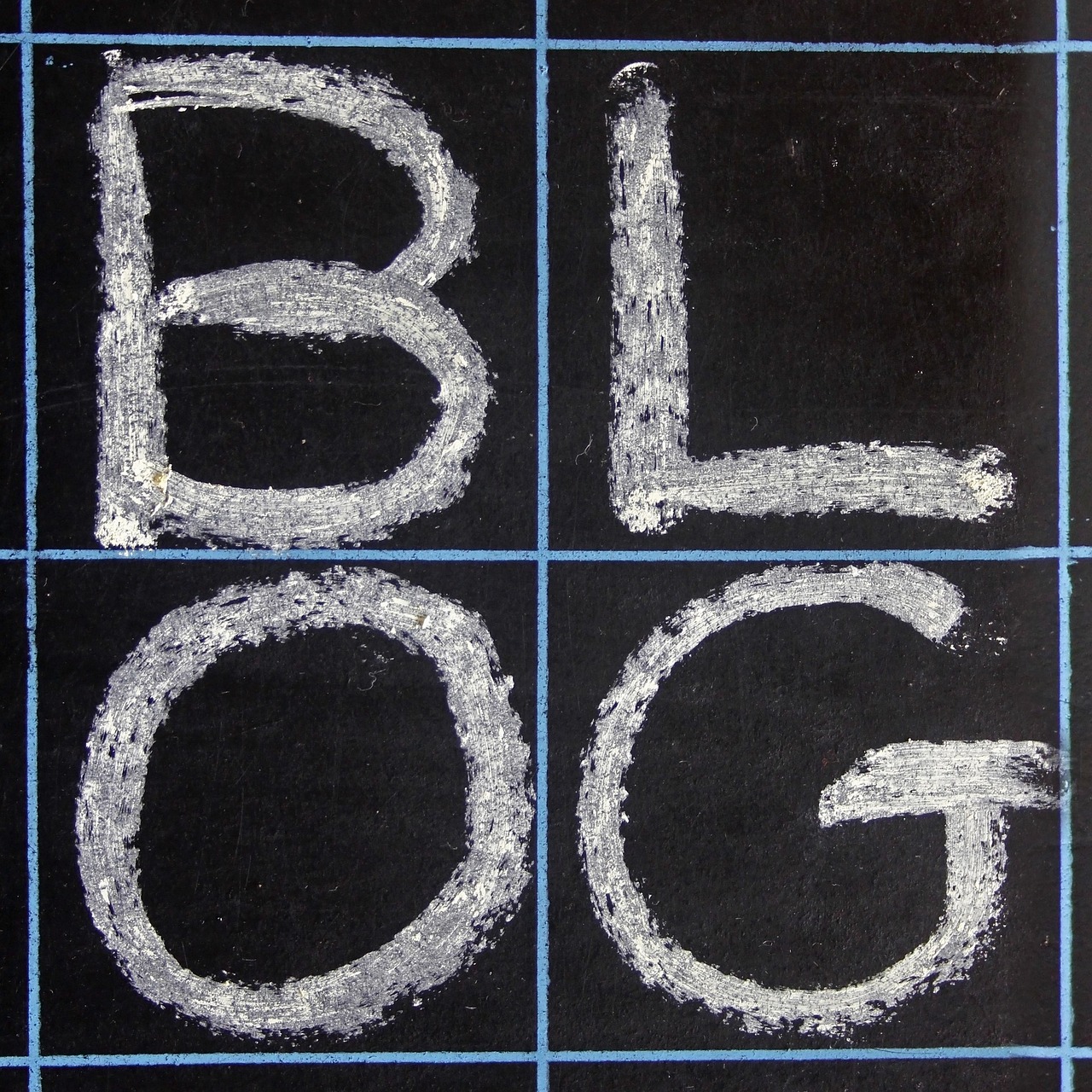
Block letters are the better choice for prices, times, names, arrows, and product lists. They are easier to line up and easier to read at a quick glance. For a café board, use block letters for Latte, Cold Brew, and Bagel, then save decorative script for Today’s Special. The board will feel planned instead of random, and later price changes will be easier to handle.
Decorative Borders That Stay Quiet
Borders should frame the message, not compete with it. Simple lines, small dots, corner leaves, stars, ribbons, or a small banner can help guide the eye around the board. Do not fill every blank area. White space is useful because it gives the main words room, and sometimes a small coffee cup sketch in the corner is enough. See also: Gift Guide.
How Do You Keep Chalk Lettering Safe, Durable, and Easy to Change?
Chalk work may look casual, but the materials still need basic care. Dust, product labels, sealing sprays, and cleaning methods can affect people and surfaces. This matters more in classrooms, kids’ craft areas, and small indoor shops with weak ventilation.
Low Dust Habits for Indoor Work
The U.S. Environmental Protection Agency says people spend about 90% of their time indoors, and its school indoor air guidance notes that some indoor pollutant levels can be two to five times higher than outdoor levels. EPA guidance also links particulate matter with respiratory issues, including asthma concerns. For chalk lettering, the practical step is simple: use low dust habits, wipe with a damp cloth, avoid heavy dry erasing indoors, and keep dusty boards away from food prep areas. These small habits are easy to follow and make the work area cleaner. (epa.gov)
ASTM D-4236 Checks for Art Materials
If your chalk markers or art supplies will be used in the United States, check the art material labeling before buying or selling them. The U.S. Consumer Product Safety Commission says consumer art materials must undergo a toxicological review for chronic hazards and should carry a conformance statement such as Conforms to ASTM D-4236 when practicable. That label is not just packaging copy. It helps buyers see that the product has been reviewed under the required art material labeling rules. (cpsc.gov)
Fixatives and Cleaning Without Damage
For temporary signs, skip permanent sealers. Use chalk markers made for the board surface, then clean them with the maker’s suggested method. For a sign that must last through an outdoor weekend, test a removable fixative or protective spray on a sample board first. Weather, humidity, and low cost board paint can react badly, and nobody wants a welcome sign with sticky rain streaks down the capital W.
How Can You Practice Chalk Lettering Without Wasting Supplies?
Practice works better when it looks close to the job you want to do. Random alphabets help, but small real projects teach spacing, wording, and corrections faster. Use small boards, offcuts, or black paper before you move to the final display.
Three Word Drills
Choose three word phrases and draw them in different layouts: New Arrivals Today, Coffee and Cake, Sale Ends Sunday, or Welcome Back Students. Set a timer for ten minutes so you do not overwork the layout. The time limit shows which letter shapes already feel natural and which ones need more practice. Take a quick photo after each try because mistakes are often easier to see on a phone screen.
Alphabet Families
Practice letters in families, not only from A to Z. Round letters like O, C, G, and Q share the same hand movement. Tall letters like H, T, L, and F help you train straight strokes. Script letters with loops need a slower hand, so this kind of practice feels less like homework and more like building muscle memory.
Before and After Photos
Keep before and after photos of every board. Photos show whether the main message reads from six feet away, whether the border is too busy, and whether the price line is too small. A simple folder on your phone can become your own style guide. After a few months, it is also useful for showing customers or team members what kind of chalk lettering works best.
FAQ
Q1: Is Chalk Lettering Hard for Beginners? A: It is easy to learn with steady practice. Start with block letters, light guide lines, and short phrases, then move into script later.
Q2: Are Chalk Markers Better Than Regular Chalk? A: Chalk markers are cleaner and brighter on non porous boards. Regular chalk gives a softer, classic look and is easier to blend.
Q3: How Do You Stop Chalk Lettering From Smearing? A: Let marker ink dry fully, touch the board as little as possible, and test a removable fixative if the sign must last longer.
Q4: What Is the Best Color for Readable Chalk Signs? A: White on a dark matte board is the safest choice. Add one or two accent colors if needed, but keep the main words high contrast.
Q5: Can Chalk Lettering Be Used Outdoors? A: Yes, but use weather suitable boards and markers, then test for rain and cleaning. Outdoor signs need bigger letters and less detail.