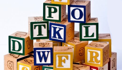
Uppercase letter guide for handwriting, lettering, and everyday design
What an uppercase letter means
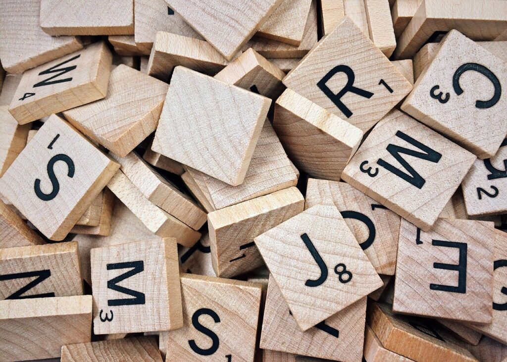
An uppercase letter is the capital form of a letter, such as A, B, or C, used alongside lowercase forms such as a, b, and c. In everyday writing, uppercase letters mark sentence openings, proper names, acronyms, headings, labels, and emphasis. In lettering and stationery design, they also influence tone. Depending on spacing, style, and context, uppercase can look formal, bold, decorative, instructional, ceremonial, or simply easier to scan.
The term comes from the history of metal type. Capital letters were traditionally stored in the upper case of a compositor’s type cabinet, while small letters were stored in the lower case. The physical cases are no longer part of most writing workflows, but the distinction still matters in handwriting practice, classroom materials, calligraphy, digital fonts, signage, greeting cards, planners, labels, and brand-style writing.
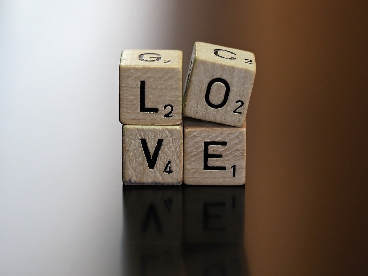
For readers working on hand lettering, brush lettering, or alphabet practice, uppercase structure is a useful foundation. A capital letter usually has a stronger silhouette than its lowercase partner, which makes it practical for initials, monograms, titles, and decorative first letters. You can explore related lettering topics in the Lettering section.
Uppercase vs lowercase in plain terms
Uppercase and lowercase are not just large and small versions of the same thing. They are related forms within a writing system. In the Latin alphabet, uppercase letters are A through Z, while lowercase letters are a through z. Many uppercase forms are more geometric and uniform; lowercase letters often include ascenders, descenders, and more varied word shapes.
| Feature | Uppercase letters | Lowercase letters |
|---|---|---|
| Common use | Sentence starts, names, acronyms, headings, labels | Most body text and continuous reading |
| Visual rhythm | More even height and stronger block shape | More varied heights and word shapes |
| Readability | Good for short labels and display text | Usually better for long paragraphs |
| Lettering value | Useful for initials, banners, monograms, and emphasis | Useful for flowing words, scripts, and natural handwriting |
In digital character systems, uppercase and lowercase letters are encoded as separate characters. For example, in the basic ASCII character set, uppercase A to Z occupy a different number range from lowercase a to z. This is why software can distinguish between “A” and “a,” and why password fields, file names, coding languages, and search tools may treat letter case differently depending on their own rules.
When to use an uppercase letter
The most familiar use of uppercase letters is capitalization. General English style guides, including widely used editorial references such as The Chicago Manual of Style and the AP Stylebook, treat capitalization as a way to identify sentence openings, proper nouns, formal titles in specific contexts, and recognized names. Rules vary by style guide, but the core uses are consistent across standard English writing.
At the beginning of a sentence
Use an uppercase letter for the first word of a complete sentence. This helps readers see where a new thought begins. It is one of the earliest capitalization rules taught in writing practice because it connects grammar, punctuation, and visual structure.
For proper names and specific titles
Names of people, places, organizations, holidays, and specific products usually begin with uppercase letters. For example, a handmade label might read “Emma’s Reading Journal” or “New York Travel Notes.” The capital letters show that these are specific names, not general descriptions.
For acronyms and initialisms
Uppercase letters are commonly used in abbreviations formed from initial letters, such as “USA” or “DIY.” Some acronyms become ordinary words over time, and style guides may differ on whether they remain all caps. For practical stationery, classroom, or planner use, the safest approach is to follow the spelling used by the organization, publication, or assignment instructions.
For headings, tabs, and labels
Uppercase works well for short functional text, including notebook dividers, file tabs, storage labels, calendars, planner sections, and worksheet headings. Because the letters have a firm, rectangular rhythm, they are easy to align and decorate. Length is the main limitation. A full paragraph in uppercase can feel dense and slow to read, while a short uppercase label can look clean and intentional.
Why uppercase letters matter in lettering and stationery
In lettering, an uppercase letter often acts as the visual anchor of a word or composition. It may start a quote, introduce a name, decorate a journal page, or stand alone as a monogram. Because uppercase letters are generally taller and more self-contained, they can carry flourishes, shadows, outlines, fills, and decorative textures while remaining recognizable.
For stationery and paper goods, uppercase forms appear in many practical formats:
- Greeting cards: A single uppercase initial can make a card feel personal and formal.
- Notebook covers: Uppercase titles create a clear focal point, especially on kraft, pastel, or textured paper.
- Planner headers: All-caps section names such as “GOALS,” “NOTES,” or “BUDGET” are compact and scannable.
- Gift tags: Short uppercase names are easy to read at small sizes.
- Classroom materials: Uppercase alphabets help early learners recognize letter names and basic shapes.
Uppercase is also useful when mixing lettering styles. A script lowercase word can be paired with a block uppercase word for contrast. For example, a planner page might combine a flowing “weekly” with a strong uppercase “REVIEW.” The uppercase word gives the layout structure; the script word adds movement. This contrast is common in hand lettering because it creates hierarchy without relying on many colors or complex illustrations.
How to form uppercase letters clearly by hand
Clear uppercase lettering starts with structure. Even decorative capitals need a stable skeleton. Before adding shadows, serif details, brush strokes, or flourishes, practice the basic proportions of each letter. Many beginners decorate too early, which can make letters inconsistent or difficult to read.
Use guidelines before adding style
Draw a baseline, cap height line, and optional center guide. The baseline keeps letters sitting evenly. The cap height line keeps them the same height. A center guide helps with letters such as E, F, H, K, and R. These simple lines are especially useful when writing on envelopes, flashcards, scrapbook pages, or labels where alignment is easy to notice. See also: Gift Guide.
Group letters by shape
Instead of practicing A to Z in order every time, group uppercase letters by construction. Straight-line letters include E, F, H, I, L, T, and Z. Diagonal letters include A, K, M, N, V, W, X, and Y. Curved letters include C, G, O, Q, and S. Mixed letters include B, D, J, P, R, and U. This method helps the hand learn related movements and makes practice more efficient.
Watch spacing as much as shape
Uppercase spacing can be tricky because letters do not occupy visual space equally. “I” is narrow, “W” is wide, and round letters such as O and C create open side spaces. In lettering, spacing should be optically balanced, not mathematically equal. If the gap between two letters looks too wide, reduce it slightly. If a pair feels crowded, add breathing room.
Keep decorative strokes secondary
Flourishes should support the letter, not hide it. A decorative uppercase letter still needs to be identifiable at first glance. This matters for classroom charts, invitations, notebook labels, and any design where the reader needs to understand the word before appreciating the ornament.
Common mistakes with uppercase letters
Uppercase letters are familiar, but they are also easy to overuse. The following mistakes appear often in handwriting practice, digital layouts, and stationery design.
- Writing too much text in all caps: All-caps paragraphs reduce natural word shapes and can feel visually heavy. Use all caps for short units, not long explanations.
- Ignoring letter width: A row of uppercase letters needs optical spacing. Equal gaps can still look uneven because letters have different shapes.
- Mixing styles without hierarchy: Combining serif, sans serif, script, and decorative capitals can look busy unless one style is clearly dominant.
- Over-flourishing initials: Initial capitals are attractive, but too many loops or shadows can reduce legibility.
- Using uppercase for emphasis in sensitive writing: In digital communication, long uppercase phrases may be read as shouting. For notes, labels, or messages, consider bold weight, color, or placement instead.
None of these points means uppercase is wrong. The better rule is purpose. If the text is short, functional, decorative, or needs a strong focal point, uppercase may be ideal. If the text is long, conversational, or intended for relaxed reading, lowercase or sentence case usually works better.
Practical uppercase letter ideas for paper projects
Uppercase letters are easy to apply across stationery projects because they work at many sizes and in many styles. A beginner can start with block capitals, while an experienced lettering artist can use serif forms, shadow effects, brush capitals, or illuminated initials.
- Alphabet practice cards: Write one uppercase letter per card, then add a matching word or small illustration.
- Monogram gift tags: Use one large uppercase initial, then add a name or date below it in smaller lettering.
- Planner section headers: Use compact uppercase words for categories such as “MEALS,” “WORK,” “STUDY,” and “IDEAS.”
- Envelope initials: Add a lightly decorated capital at the start of a recipient’s name for a personal touch.
- Classroom wall alphabets: Pair uppercase and lowercase versions so learners can compare the forms directly.
- Quote layouts: Set one important word in uppercase and keep the rest in sentence case or script lettering.
A useful test is the arm’s-length check. Place the project on a desk, step back, and ask whether the uppercase word is still clear. If it is, the structure is working. If not, simplify the decoration, adjust the spacing, or increase the contrast between the letters and the paper.
Frequently asked questions
Is an uppercase letter the same as a capital letter?
In everyday English, yes. “Uppercase letter” and “capital letter” usually mean the same thing. “Uppercase” is common in typography, computing, and design discussions, while “capital letter” is common in school grammar and handwriting instruction.
Should headings be written in all uppercase?
They can be, but they do not have to be. All-uppercase headings are effective when short, such as labels, tabs, and bold poster words. For longer headings, sentence case or title case is often easier to read.
Why are uppercase letters useful for beginners?
Many uppercase letters have simple, clear structures made from straight lines, curves, or diagonals. That makes them helpful for early handwriting practice, alphabet recognition, and basic lettering drills.
Can uppercase lettering be decorative and still readable?
Yes, if the main letter shape remains clear. Add style after the skeleton is stable. Shadows, outlines, serifs, and flourishes work best when they enhance the form instead of competing with it.
What is the best way to practice uppercase letters?
Practice by shape groups, not only in alphabet order. Work on straight-line letters, diagonal letters, curved letters, and mixed letters separately. Then combine them into short words so you can test spacing and rhythm.