Is Lettering Art Still the Best Handmade Style for Modern Stationery?
Why Does Lettering Art Still Feel So Personal?
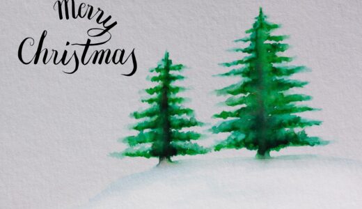
Lettering art still appears on greeting cards, journals, desk notes, planners, and small gift tags because it makes paper feel handled by a person, not only printed by a machine. If you are choosing supplies for a new project, the lettering collection is a useful place to start because the right paper, pens, and guide tools make early lines easier to control. This is not just about old-style charm. In 2022, the National Endowment for the Arts reported that 52 percent of U.S. adults did some form of art making, which shows that many people still want hands-on creative work, not only screen-made designs. (arts.gov)
The Human Line
A printed font repeats in the same way every time. Lettering does not, and that is part of its value. A small change in pressure, spacing, or curve tells the eye that someone shaped the word by hand. That is why a birthday card with one carefully drawn name can feel more personal than a pack of standard glossy cards.
A Small Mistake Can Add Warmth
Clean work still matters, but lettering art does not have to look stiff. A small wobble in a stroke or a slightly soft corner can make the piece feel more natural. The point is control, not rough work. You want the design to read as handmade, not rushed.
Lettering Makes Everyday Paper Feel Designed
A plain envelope, a study note, or a price tag can look more finished when one word gets careful treatment. The change does not need to be big, but it should have a clear purpose. Try one main word, one support line, and enough blank space around them. In most stationery work, that simple layout looks better than filling every corner.
What Makes Lettering Art Different From Calligraphy and Typography?
People often use these terms together, and there is some overlap. Even so, each craft has its own job. Knowing the difference helps when you choose supplies, plan practice, or explain your work to buyers if you sell handmade stationery or run a workshop.
Calligraphy Follows Writing Tradition
Calligraphy is usually written with controlled strokes from a nib, brush, or pen. It depends on rhythm, pressure, and letter forms built through writing. Copperplate, italic, and brush calligraphy all have rules, and those rules help keep the work consistent. They are especially useful for invitations, place cards, and formal paper goods.
Typography Designs Reusable Letter Systems
Typography works with typefaces and the way text appears across many uses. A typeface must perform again and again on menus, websites, labels, and books. Lettering art has more room to move because it can shape one word for one design. That makes it useful when the message needs a more personal look.
Lettering Draws Each Word as Artwork
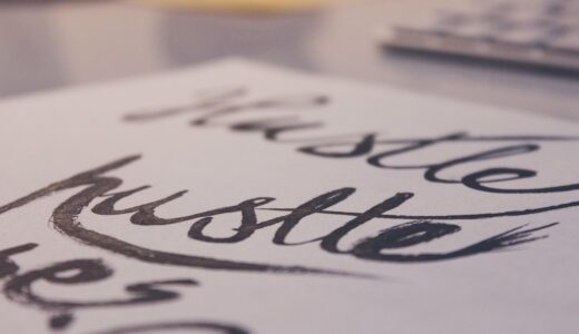
In lettering, you draw the letters rather than only write them. You can sketch a bold word, redraw the shadow, thicken one side, and adjust the spacing until the phrase feels balanced. This process takes more planning than plain writing. It works well for cards, posters, stickers, and display signs.
Which Tools Help Beginners Create Cleaner Lettering Art?
Good tools will not replace practice, but poor tools can make practice hard. Scratchy paper damages brush tips, and bleeding ink makes lines look fuzzy. A pencil that smudges too much can turn a clean sketch into a gray mess. Start with basic tools, then upgrade when your hand and projects need it.
Smooth Paper That Protects Tips
For brush pens and fine liners, smooth paper makes a real difference. Use marker paper, smooth practice pads, or good notebook pages that do not feather. For finished cards, test one corner before doing the full design. Some textured papers look good in product photos, but they can make small details harder to draw.
Pens With Predictable Ink Flow
Beginners usually do well with a small brush pen, a medium brush pen, and a black fine liner. The small brush pen helps build control, while the medium pen teaches thick and thin contrast. The fine liner is useful for outlines, small details, and careful corrections. It also helps when a design needs sharper edges.
Pencils Rulers and Erasers for Structure
Lettering art often starts with a rough pencil map. Light guide lines keep x-height, slant, and baseline steady, so the final word does not drift across the page. A ruler helps with banners, borders, and frames. Use a soft eraser, but wait until ink dries because one early rub can spoil a nearly finished card.
- Use two guide lines for simple uppercase lettering.
- Use three guide lines for lowercase letters with ascenders and descenders.
- Leave margins before adding flourishes or shadows.
How Can You Use Lettering Art on Stationery and Gifts?
Lettering art works best when it has a clear job. A word can guide attention, mark a date, name a person, or make a package feel more special. Before choosing colors or flourishes, decide what the piece must do in real use. That choice saves time and keeps the design from becoming crowded.
Greeting Cards With a Clear Focal Word
For greeting cards, one large word usually carries the feeling: thanks, congrats, love, cheers, or hello. Keep the support message smaller so the main word stays clear. If every word shouts, the card loses focus. A clean card can be finished with black ink, one accent color, and a neat envelope.
Journals Planners and Study Notes
Lettered headers make journals and planners easier to scan. Use bold block lettering for monthly pages, soft brush lettering for mood trackers, and small caps for study notes. This is not only decoration. A clearer page helps you return to the right section without searching for too long.
Packaging Tags and Desk Displays
Gift tags, thank-you inserts, and small desk cards are good places to use lettering because the space is limited. A 2-by-3-inch tag forces you to choose what matters. Put the strongest word in the center, keep the border light, and avoid adding too many small decorations. Blank space is often part of the finished look. See also: Gift Guide.
How Can You Build a Lettering Art Practice That Looks Professional?
Practice does not need to take an hour. Short and steady sessions often work better because your hand stays alert. Public data also shows why visual sharing matters. Pew Research Center’s 2025 survey found that 84 percent of U.S. adults use YouTube, 50 percent use Instagram, and 37 percent use Pinterest, all places where lettering tutorials, process clips, and finished stationery photos can reach interested viewers. (pewresearch.org)
Daily Drills in Ten Minutes
Choose one stroke family each day: ovals, straight lines, compound curves, or entrance strokes. Repeat it slowly for ten minutes, and do not chase speed at the start. If the first row looks better than the last row, stop sooner next time. Tired hands often make poor spacing and pressure choices.
A Three-Step Sketch to Finish Process
Use a process you can repeat: pencil skeleton, refined outline, final ink. The pencil skeleton sets size and spacing, and the outline fixes weight and style. Final ink gives the piece a cleaner finish. This simple workflow helps prevent the common beginner habit of decorating a weak structure.
Simple Photos for Online Sharing
If you share your work, photograph it near a window, keep the background plain, and crop straight. These small steps make the lettering easier to see and more useful for buyers or students. DataReportal’s 2026 U.S. report counted 254 million active social media user identities in the United States in October 2025, while noting that such identities may not equal unique people. The practical point is still clear: visual craft is often found on screens before it is bought, saved, or tried at home. (datareportal.com)
How Can Sellers and Brands Use Lettering Art Without Losing Its Handmade Feel?
For shops, classrooms, and stationery brands, lettering art can add character without turning every item into slow custom work. The goal is a repeatable style with enough small changes to keep it alive. Be honest about time, materials, and buyer expectations. That matters more when the product moves from a single sample to regular orders.
Limited Palettes and Repeatable Layouts
Pick two or three house colors and a few layout types: centered quote, arched name, banner label, or corner flourish. Repeatable choices make product photos cleaner and help buyers recognize your style. Too many colors may look fun on the worktable, but they can look messy in a shop grid. For small brands, a steady look often sells better than a mixed set with no clear line.
Clear Pricing for Custom Work
Custom names, dates, and short quotes should cost more than ready-made pieces because they take extra sketching and proofing. They also carry more back-and-forth with the buyer, which is still labor time. The U.S. Bureau of Labor Statistics reported that craft and fine artists had a median annual wage of $60,560 in May 2024, while craft artists were listed at $38,480, and it also noted that self-employed artist earnings vary widely. Treat those figures as labor context, not a promise of easy income. (bls.gov)
Honest Use of Trends and Data
Trends can help with color, wording, and product themes, but they should not replace your own judgment. Reliable public search-volume data for the exact phrase “lettering art” is not freely available from a single official source, so do not make up numbers for planning. Use your own shop analytics, customer questions, and small test batches before buying large stock. This keeps risk lower and gives you better feedback from real buyers.
FAQ
Q1: Is lettering art the same as calligraphy? A: No. Calligraphy is written with controlled strokes, while lettering art is usually drawn and refined as a custom composition. They can look similar, but the process is different.
Q2: What is the best beginner project? A: Start with a simple greeting card using one large word and one small supporting line. It teaches spacing, balance, and ink control without becoming too complex.
Q3: Do you need expensive pens to start? A: No. A pencil, smooth paper, one fine liner, and one small brush pen are enough for early practice. Better paper is often more helpful than a bigger pen set.
Q4: Can lettering art be used for business packaging? A: Yes. It works well on thank-you cards, labels, tags, inserts, and limited-edition packaging. Keep the layout repeatable so production time stays manageable.
Q5: How long does it take to get good results? A: With ten minutes of focused practice most days, many beginners see cleaner strokes in a few weeks. Professional-looking work takes longer because spacing, layout, and finish all matter.